OPI Bright Pair with Paige Premium Demin
 This spring and summer, color meets fashion as OPI’s brightest new shades for nails “pair up†with Paige Premium Denim. Bright Pair by OPI includes six trend-setting new Brights by OPI Lacquers, which perfectly match the bright new hues of Paige’s Roxbury Ankle Skinny and Canyon Shorts.When I first previewed the Bright Pair collection I was unsure of how this latest addition to the Brights by OPI summer collections would stack up against seasons past. Especially considering how much I loved the Mod Brights from last year. This spring and summer, color meets fashion as OPI’s brightest new shades for nails “pair up†with Paige Premium Denim. Bright Pair by OPI includes six trend-setting new Brights by OPI Lacquers, which perfectly match the bright new hues of Paige’s Roxbury Ankle Skinny and Canyon Shorts.When I first previewed the Bright Pair collection I was unsure of how this latest addition to the Brights by OPI summer collections would stack up against seasons past. Especially considering how much I loved the Mod Brights from last year.
This year OPI added a twist by teaming up with Paige Premium Demin to create a line of six shades to match the bright hues of Paige creator Paige Adams-Geller‘s summer palette. Read on to check out the polishes and pics from the launch party hosted by the Ron Herman boutique in West Hollywood. |
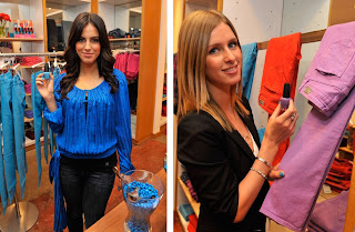
Suzi was joined by Paige Adams-Geller, actress Jessica Lowndes, 90210‘s Adriana, and socialite Nicky Hilton at the Ron Herman boutique where nail techs gave complimentary manicures to shoppers.
I have to say that formula-wise, OPI has impressed me again. They just keep making it better and better. All of these shades applied smooth and even, the consistency thin but well pigmented. Two coats and you can stick a fork in it!
No Room for the Blues is a mid-tone sky blue that is just a tad darker than Just Groovy (summer 2007) and Misa Right Here Now, No More Later. They’re close enough to not need all three but if I had to choose, I’d go with No Room For The Blues based on its formula and pigmentation.

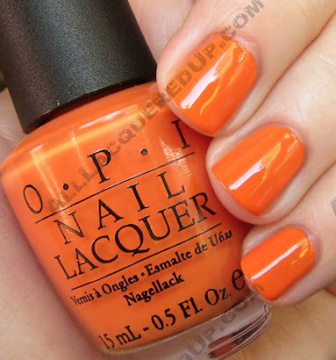
On the Same Paige is a brick red-orange, emphasis on the orange, creme. It’s fiery and vibrant but has just a touch of that slightly muted brick feel. Reminds me of brand new paver stones before the sun and weather wash them out.

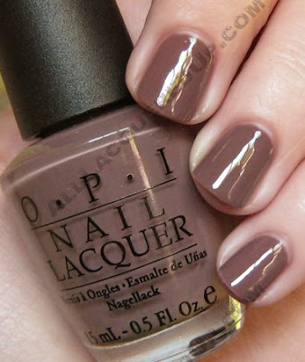
Over the Taupe is described as a mushroom and I see that but it reminds me of watered down hot chocolate. When I saw the promo pic a few months back, all I could think was, it’s a summer version of You Don’t Know Jacques!. But here’s the thing, YDKJ! was new and fresh when it came out and Over The Taupe feels tired.
Shorts Story isn’t your typical hot pink. It has a touch or raspberry to my eye. It’s bright but I think the creaminess keeps it from being too overpowering.

A Grape Fit! – Can I just complain for a second? OK seriously, where have these amazing mid-tone purples been all my life? I’ve been suffering for years trying to make lavender somehow work when dark plums weren’t cutting it and now I’m being hit with an onslaught of amazing grapes. Between this, Lippmann Call Me Irresponsible, FP Lavender Highlight and RBL Purple Haze I am SET!

In My Back Pocket feeds my love of orange for summer but because it’s SUCH a dead ringer for Osaka-To-Me Orange it’s not a necessity in my collection. However, if you missed out on Osaka its first time round, don’t make that mistake again.
 The OPI BrightPair collection is available now. Bottles retail for $8.50. OPI is carried at professional salons including Beauty Brands, Beauty First, Dillard’s, JCPenney, Pure Beauty, Regis, Trade Secret, and Ulta.
images: Wire Image and All Lacquered Up










I don’t know if you’ve tried Opi’s “Can You Dig It?” … I’m wondering if it’s close to “A Grape Fit”? I love that color!
reading this makes me really want to go out and get some new finger nail polish…if i was back home all i would have to do is walk to rite aid…i love the blue, pink, and purple =)
I wonder how Over the Taupe compares to Sally Hansen Salon Dusk. It looks like they might be similar, with Dusk beign a bit darker.
This is a great collection. I didn’t really expect myself to like it. Especially A Grape Fit and No Room For The Blues.
By the way, ALU is one of my favorite blogs. Okay, probably my favorite one (: I think its because of the fact that you take good pictures and we have the same nail length and shape.
I’m digging this collection, especially the A Grape Fit! Swatch request please…how does No Room for the Blues compare to Essie’s Shelter Island? I have them both but would return or give away one if I don’t need both. I just recently found ALU, and I am in LOVE LOVE LOVE!!
I don’t really know what you’re talking about with the formula for No Room For The Blues. It’s a real PITA to apply. Looks great when you’re done, but dang, PITA
Yeah, I’m with you about the mid toned purples. I have Done Out In Deco because I loved that color! But only to put it on and not like it on my nails. I died a little. But A Grape Fit! and FP Lavender Highlight is more my scene.
Quick question about Illamasqua.. How long did it take for you to receive your shipment?
I know the site says 7-10 days to the US but is that business days or does it include weekends?
I want to order but am afraid of it being seized by customs and being stuck there for months or something.
Just wondering how long I can expect it to take. Thanks!
Toni Jo – I have Can You Dig It? and it’s much deeper, more plum.
Jessica – Do you have any stores nearby? You can always resort to online. It’s not instant gratification but everyone loves mail.
Anon – I don’t believe I have Dusk. If I do, I’ll add it to my swatch request list.
Anon#2 – Wow, that’s so flattering. Thank you!
Aaren – Shelter Island isn’t as dark and it’s more jelly-like whereas NRFTBlues is more creamy in finish.
Shojo Flash – I’m sorry your bottle was a pain but mine really applied very well. I was honestly expecting the worst and was pleasantly surprised. I remember a few years back when Strawberry Margarita came out. Some people, myself included got bottles with a stringy nasty formula. Others raved. It’s a mystery, that’s for sure.
Erin – I’m with ya. Done Out In Deco did me NO favors!
Anon#3 – I’m not sure how long it takes to receive. I’m sure it depends on how they ship it and how the package is marked. A lot of international sellers will mark packages as “gift” to prevent duty taxes. I’m sure if you email their customer service, they’ll be able to give you a good idea of how long it should take.
I didn’t want to like this collection, I’m kind of tired of OPI colors. But dang it! I love it, except for the mushroom, that color does absolutely nothing for me. I totally get your purple complaining, I’ve been doing it myself!
Has anyone done a comparison of Over the Taupe and Sephora’s Metro Chic? They seem similar and I’d be curious to see them next to each other
yeah, YDKJ was so great, but now I feel meh about the mushrooms.
I guess we are Over the Taupe.
lol!
I need a Grape Fit–that purple rocks.
Stef – I’m with ya. I was “meh” until I saw them in person. It’s the formula. It’s sooo good it sucks me in.
Nicki – Metro Chic leans more gray/lavender than OtheT which looks more and more like chocolate milk to me.
Firepail – Thank you for the giggle. You totally brightened my day!
I am actually quite excited by On the Same Paige! I think it will go nicely with my predominantly grey and black wardrobe…
Thanks so much!! I think I'll definitely be buying A Grape Fit then <3
I love love OVER THE TAUPE!!!! I usually wear dark shades but I found that this is a great nuetral for all skin tones!!! Not too pink or not too grey. Kinda warm like hot choclate.:)
I have No Room for The Blues. It’s actually more greenish in person, but still a lovely bright sky shade.
I’m looking for a really vibrant, warm orange… any thoughts on how On The Same Paige and China Glaze’s Oh How Street It Is match up?