ALU’s 365 of Untrieds – Essie Da Bush from the Resort 2011 Collection
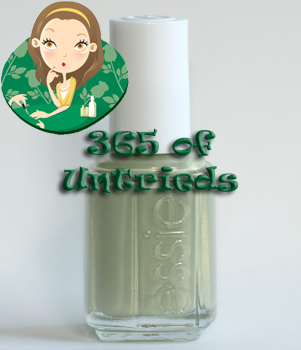 365 of Untrieds is my personal challenge to weed through the polishes in the ALU stash that I’ve been wanting to try but just haven’t gotten around to.Essie Da Bush was released in late spring/early summer as part of the Essie Resort 2011 collection. Shortly after its launch I kept hearing raves for the color that left me staring at my bottle, thinking, “What the eff??” What’s with all the hype over this bland looking, neutral grey/green/cream concoction.
I’m all for odd colors but in the bottle, Da Bush, did nothing fore me. Even the name turned me off. So all this time it’s sat in one of my untrieds bin, taunting me. I could almost hear it saying, “Just give in. You know you’re going to love me.” Well, we’ll just see about that! |
Formula & Application: Essie is a 3-Free brand. The square bottles are embossed with the essie logo and the smooth plastic caps include an embossed e on top. The brushes are thin, round and shorter than most. The bristles are very flexible, allowing you to easily fan out the brush to cover your nail width.
Da Bush has the watery, squishy texture we’ve come to expect from Essie cremes only it’s pretty well pigmented. I probably could have gotten away with two medium coats but I like to apply my polish as thin as possible to avoid chipping so three thin coats did the trick for me. Plus I nicked two of my nails while they were still wet with the second coat so a third layer was necessary to prevent starting from scratch. Call me lazy but it worked.
![]()
Essie Da Bush is a soft artichoke green creme. It’s what I imagine artichoke soup would look like. It’s a bit greyed but with a pale lightness that feels spring/summer appropriate. It’s definitely a unique flower, or so I thought.
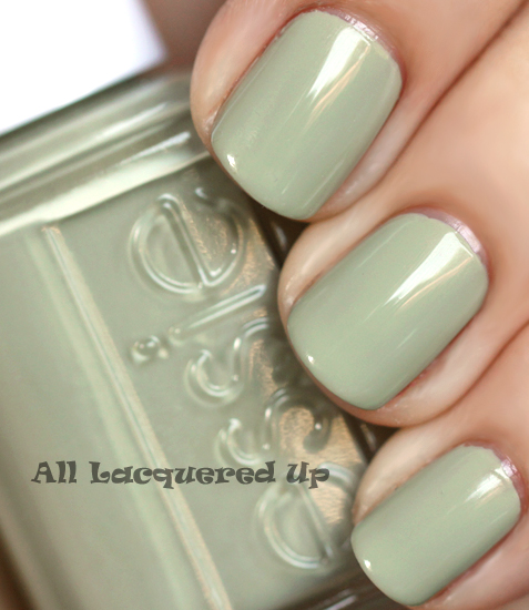
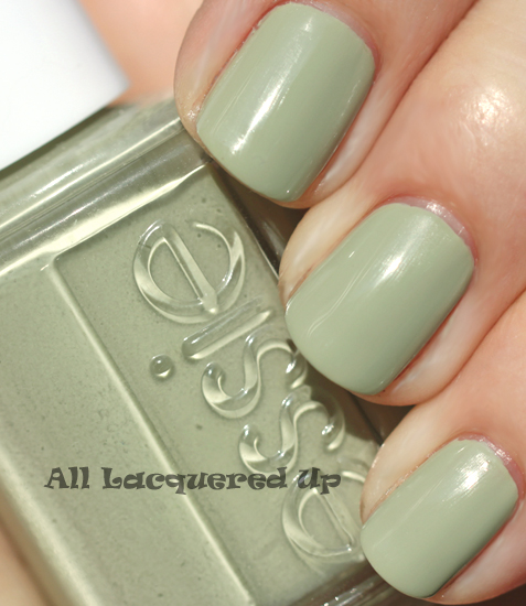
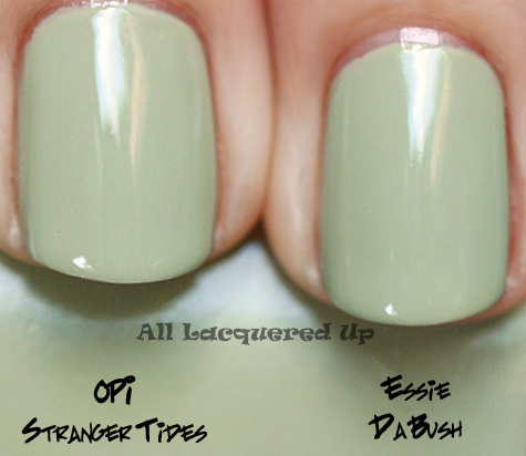
After I was done being wowed by how cool and different this color is I went on the hunt for any type of comparison. I started with MAC In The Buff which I remember being described as “avocado” though it’s more like a browned avocado and NOTHING like Da Bush. After searching through my permanent stash I started in my untrieds and came across OPI Stranger Tides from the Pirates of the Caribbean collection and surprise, surprise, surprise we have a match!
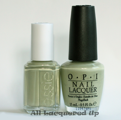
Now I don’t know who spied on who here but how much of a coincidence is it that the two biggest nail brands on the planet came out with the EXACT SAME SHADE at the EXACT SAME TIME? I don’t say dead-on dupe very often but there is no other way to describe this pair. I almost mislabeled them in this photo because I forgot which polish was which. And they both have the same pigmentation and consistency.
That’s too many “sames” for me not to suspect a little industrial espionage. Intriguing, no? Now I wish I had purchased the Sinful Pirates dupe to see if it’s a match as well. I smell a Rite-Aid trip in my immediate future.
![]()
Bottom Line: Da Bush and OPI Stranger Tides may be identical but it doesn’t make the color any less unique. It’s certainly not a shade for everyone as it’s kind of dirty and odd but that’s what I love about it. Give me a green that I don’t have anything even remotely similar to and I’m a happy nail polish fanatic. Of course you don’t need both polishes but if you’re at all into funky neutrals, I suggest you pick up one of them.
365 of Untrieds Stash/Share Verdict: It’s a toss up as both colors are great so I flipped a coin and decided to STASH the Essie and SHARE the OPI.
Essie Da Bush is available as part of the Essie Resort 2011 limited edition collection. Essie nail polish is available at professional salons and spas and also in the retail version at drugstores and grocers nationwide. Online shoppers can head to Essie.com, Head2ToeBeauty.com, and TransDesign.com. Essie nail polishes retail for $8/ea for a .5oz bottle.
Thoughts on Da Bush? Do you love quirky colors like this or is this too funky for you? Do you have a preference between Da Bush and Stranger Tides? Has anyone compared either one to the Sinful version? Do you have any other polishes with this type of hue? The last artichoke polish I can recall is CND Okie Dokie Artichokie and it was much darker than these two.
Disclosure: Product samples were provided by Essie and OPI. For more info view my Disclosure Policy.









Maybe it’s just occupational fatigue, but honestly, the color is just a little too Correctional Facility Interior for me.
I like OPI formula better….
I’d like to see this with CND’s Emerald Shimmer Effects on top. I would stash the Essie one only because that is where my polish obsession started.
I have Stranger Tides; it’s certainly an interesting color, but not the best shade on me. I don’t see myself reaching for it all that often!
I bought the Sinful Pirate colors and they are more colorful than the OPI colors. They arent as dulled down. The green is a more minty green.
Strange color. It’s almost like an office-friendly shade for people who want to cheat and wear a color other than nude.
I thought Stranger Tides was a little Ho Hum in the bottle, but being a pirate fanatic with a huge polish fetish, I bought it. I LOVE it, it’s not my usual cup of tea, but something about it just speaks to me!I put a simple coat of NYC glitter polish over it and it looked like, this is a weird comparison, one of those ice skating costumes that is made to look kinda nude, but sequin covered. It was so weird cool that I kept it on for five days!
I don’t have either of these colors, but I’m curious to see how the sinful one compares. I don’t care about brand names- I’ll go for the cheaper one every time!
In your picture the Da Bush looks slightly deeper than the Stranger Tides. I have both polishes as well and I noted that while they are identical in hue, the color of Da Bush is slightly more saturated.
Essie no longer gives a full .5 ounce in their bottle. If you look carefully, you will see that all of the Essie polishes whether the retail or professional line have .4 ounces in the bottle and I’m not sure any of their embossed bottless have ever contained a full .5 ounce! If you don’t see the difference, share the Essie; there’s still a full .5 ounce in the OPI bottle.
I addressed this in my first review of one of the Essie retail colors. Essie didn’t change the volume of their bottles. Labeling standards changed. Before they only had to state volume to one decimal place but now it’s two so instead of rounding up to .5 they are labeled as .45 or .47. I can’t remember offhand.
I remember you clearing this up for us. And yes, it was a change in the labeling standards like you restated here. Essie always has had the same volume it has now in it. Other polishes have not all complied with the new label laws yet. There is a grace period still in effect. You will start to see the print matter change in the next 12 months. There still will be some grandfather clauses in effect for older polish already produced and in the wherehouses, ditto for tons and tons of empty bottles made. It’s going to take some time before we see other companies going the route we notice with Essie doing already.
The main deciding factor really should be the esthetics: On me Stranger Tides is a little less flattering than Da Bush, but then I see a difference between the two polishes.
For anyone interested:
Essie bottles contain 13.5ml or 0.456oz. which they round up to 0.46 oz.
OPI bottles contain 15ml = 0.507oz. which they round down to 0.50oz.
This means that there is 10% less polish in the Essie bottle.
both are amazing, no way I’m giving away either one You’re a strong woman!
Haha one of my friends already saw this post and claimed Stranger Tides so it’s definitely going
I agree – unless you are a HUGE OPI collection collector and have to hand on to Stranger Tides just for that reason alone – I go with the Essie over the OPI. The OPI has too much chalky look to it – despite the entire collection is supposed to be grayed/muddied – this one reeks of chalky white and is a really hard shade for anyone to wear. Retailers are suck with this shade out of the collection.
I would like to find the Sinful Colors collection myself. We don’t have Rite Aids where I live in Florida, and I’ve been to 3 different Walgreens looking for the Adventure Island display! All they have is the Swirly one & the Beverly Hills one. Did I miss out? (I know that AI’s Verbena is also in the Beverly Hills collection.)
My Rite Aide does not carry Sinful Colors. They are a smaller one and don’t have a lot of what other RA’s have…so I missed out on Sinful for some time until I ran into it when I had time to snoop at a CVS or maybe it was a Wal-Mart I think miles and miles from home base. I was sent one Sinful bottle as a give away with a few OPI’s & one China Glaze I bought from a nice lady on eBay. It’s a purplish shade and so watery & thin on pigment. I immediately decided if all Sinful is like this one, I want nothing to do with it!
I don’t know if it’s my monitor but da bush definitely looks a little more green than stranger tides. Either way, I want it!!
I was going to say that it was gross just like the OPI (like you said, looks like asparagus soup) but you beat me to it!
Stranger Tides is on the list of polishes I want to buy (if I’ll ever order something from the US).
It’s a really beautiful color. I love that it looks at little “dirty”
If I’m really lucky I might get one in Germany when it’s on sale (OPI polishes usually cost 16
I do like this color. I passed on purchasing the OPI Stranger Tides when I saw it–didn’t look like a color I would like in the bottle. I may have to rethink that. It hasn’t been as popular as the others colors in the collection, as I have seen several still in the shops here and there. I think I see slightly more depth in the Da Bush one in the side by side comparison but it may just be the light. I will have to see if I can find one or the other. I like it on you!
Hmm…all I could think of when I saw this color was “The Exorcist.”
I grabbed DaBush right off as I was on a green thing that day and had picked up finally Sew Pyched as well. I figured since the resort collection was new, it would be all picked over super fast and I would need to turn to eBay to find what I wanted. I did not buy Stranger Tides – in fact I bought nothing of POTC Until I ran into a 3 bottle collection on eBay new of Planks, Sparrow & Steady as she Rose – I got them for $4.50 – all 3 plus minor shipping. They came yesterday and now I am glad I have them. I have not worn DaBush much, despite all the hype about it. I personally like Your Hut or Mine and Fair Game in the Resort Collection this year the best on me. I can see myself swapping DaBush down the road unless I get into wearing it as a first coat for something else over it that I have not stumbled into as have not been feeling (or taking the time) to be creative of late. thanks for showing us the super close similarities in these 2. Of the 2 I like Da Bush better – more depth of color.
Generally, I shy from really dirty greens, but shades like this, I love.
I don’t have Da Bush or Stranger Tides, but I do have the Sinful version (woot woot cheap-o in the house) and I love how that one looks on me. I’ve also seen comparisons between Stranger Tides and the Sinful one, and they look positively identical.
I had an American Apparel color similar to this I ended up just giving away. It just wasn’t flattering on me, and I kind of loathed looking at it.
Cool color but I’m not feeling the love it would look awful on me
“Artichoke” is a good description for this color…I have Stranger Tides and truthfully, I’m not wowed by it. I never woulda guessed how close it is to Da Bush though…I almost bought it recently thinking it would be more mint. Good thing I skipped it!
I have both and I definitely feel like da bush is a tad darker, and because of that I like stranger tides better, also partially because da bush is such a stupid, stupid name.
I just love OPI Stranger Tides. It looks much more olive/sage green against my skin tone than in the bottle. I can’t stand the name ‘Da Bush’, I would have chosen to keep the OPI over Essie for the name alone.
I’m so glad I read all of your post. I saw your nails and wante da bush but I have stranger tides (just haven’t worn yet).
I can’t find Stranger Tides anywhere, I’m going to go get Da Bush!!
When I started reading your review, I thought “I want it!” but I have Stranger Tides (and like it) so I guess I’m set.
i just like that colour……
I’d have to agree with the commenters above who find Da Bush (very odd name) to be a smidgen darker. Definitely one or t’other on my wish list though. And I like the idea of adding a subtle glitter on top…
I love Essie’s colors but their formula leaves something to be desired. It is too thin, streaks and does not cover well. I’ve never had this issue with other polishes, including Zoya, CND or OPI. I’ve polished many a nail – used to be manicurist for about 5 years so I know of what I speak. Wish Essie would reformulate. I really like the Da Bush shade.
Essie has several different formulas they use. I bought the entire Summer Collection from a few years back…it was a pink/orange/coral collection. Only the reddish coral, called Escapades, had great opacity, the rest were all sheer, watery, pains. But, that’s something I find with all the brands. There is not one brand who has perfect polishes. There’s always a winner and a loser. But, luckily, we have this great blog to reference.
I love OPI’s Stranger Tides, definitely my favourite from the Pirates collection
I bought the mini collection specifically for On Stranger Tides, it isn’t here yet and this post has made me squeeing with joy! Can’t.freaking.wait.
I don’t know about anyone else but I have always loved muted dusty colors even when I was a kid so you can imagine I’m really enjoying the neutrals that have been coming out. I’m such a happy camper!
Now my dilemma is should I buy a full size so I can franken up some variations? Hmmmmmm.
That’s a great colour on you!! I’ve never seen anything like it
Being a pirate fan, stranger tides has to win for me. Even putting that aside though, why would you wear something called “Da Bush” when you could be wearing something called “Stranger Tides” instead?
Totally artichoke-ish:)
And yeah, dupes. Maybe because they come from the same factory in the US, just each brand have their own formula
love this color, so similar to chanels khaki vert! btw guys, I made a nail polish rack, check it out, its my first video on youtube!
http://www.youtube.com/watch?v=UNAYpyKqP7Y
The first time I wore Stranger Tides I decided to mess around and use a matte topcoat on it, expecting it to look chalky. I found I preferred the matte look! No chalkiness and it mellowed some of the yellowish undertones in the color. I don’t think I’ll buy the Essie polish since I already own the OPI and I, too, find it odd that the two companies released identical colors in collections for the same season.
I have Stranger Tides and it’s GORGEOUS with China Glaze White Cap on top.
Love the color! Thanks for the comparison-I almost bought both! I think I’ll have to go for the Essie. I like the Essie bottle better. It is hard to choose between the two though because they are dead-on and around the same price.
The upcoming Fall 2011 collections from Misa and FingerPaints both have a shade that looks very similar (at least as far as I can tell from the promo photos online). Hmm… “industrial espionage”, indeed!
Italian brand Kiko also makes a very close dupe: http://www.kikocosmetics.com (number 349) though they say it’s a limited edition, but it’s been out and frequently re-stocked for months now.
If you live in Italy, Spain or Portugal and you’re looking for a cheap version of this, try looking in a Kiko store, they come from
I love Kiko! Very reasonably priced. We have the stores here in England too. I’m currently wearing the 349 shade and it is almost identical.
It really does look like artichoke soup! lol… I’m not a fan of that particular shade of green… If I had to choose, I’d most probably stick with the OPI.
I have Stranger Tides and I’m really liking it for summer. I like that it’s green, but a subdued green. I also like OPI for Sephora’s Caught With My Khakis Down, which is a darker color, but again, not bright screaming green. I did notice that it Da Bush was almost exactly like Stranger tides in the bottle, but sprang for the OPI.
This is a great subtle color, with a hint of fun!
Awww these colors kill me. I love all the swatches I’ve seen of them, the pale sludgy green just does it for me! I’m fairly tan or I guess slightly olive in complexion though, and they read a lot more neutral or dirty grey on my hands. Booo.