A new look for All Lacquered Up
Welcome to the all new All Lacquered Up. This site refresh has been a long time coming and so necessary. I didn’t want to make drastic changes, just some simple tweaks to make your experience better.
So what’s new?
First, my poor Gallery hadn’t been updated in eons due to technical issues but it’s FINALLY working again. Praise Jeebus! I’m in the process of adding my backlog of photos but have uploaded over 200 new images already. Images are arranged by color so you can see every blue nail polish I’ve ever photographed, in one place!
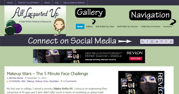
Second, I’ve made changes to the Navigation menu to help you find certain features or information easier. I’ve also made it easier to find my Social Media channels so we can connect on other platforms.
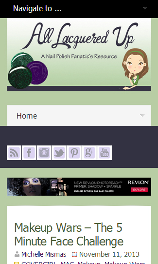
The biggest and most important change is something you’ll only notice if you view ALU on mobile or tablet devices. I don’t know about you but I’m glued to my phone and do a lot of my blog reading that way. Having a site that wasn’t mobile friendly was simply unacceptable to me. Now, no matter where you view ALU, the site will conform to your device.
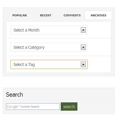
Search – If you are looking for posts in a certain category, from a certain date or just want to search for a specific term, all of that is in one simple space on the right sidebar.
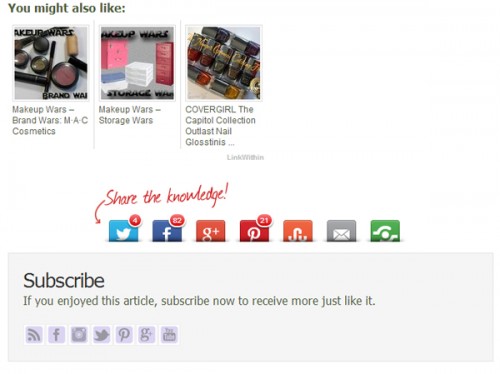
Finally, if you read something here that you like, I’ve made it easy for you to share it with your friends.
I really hope you like the new and improved All Lacquered Up and PLEASE report any technical issues you may experience so I can get them fixed right away. MWAH!!










Loving the new look on my iPhone!
Thank you! I’m so glad
I do a lot of reading from my phone as well. I thought it seemed different today! Nice!
Thank you! So glad you like it
This is great! I love being able to look at the polishes by color and season
I’m so glad you find that helpful. I tried to organize things how I would want to view them as a reader.
Fantastic job, I especially like the mobile friendly layout and the social media buttons at the bottom
Thanks! I wanted some clean and easy that wasn’t too much of a departure from the old look.
Love! It runs more smoothly on my phone than the other did for some reason.
So glad to hear it!
Very lovely! Love when sites are easy to read on my tablets and phone. Really enjoying the changes. 8-}
Thank you!
Yay, someone who cares about us non computer readers! I use my iPad or phone sometimes, and mobile friendly sites are great! Thanks heaps!
You’re so welcome. If I was more tech savvy this would have happened sooner.
I like it. The new design looks great.
Thank you so much! I’m so happy with how it turned out.
It’s looking great! Love the freshness of it.
Thank you so much Rochelle!