Urban Decay Bang and Chaos Nail Polish for Summer 2014 – Swatches & Review
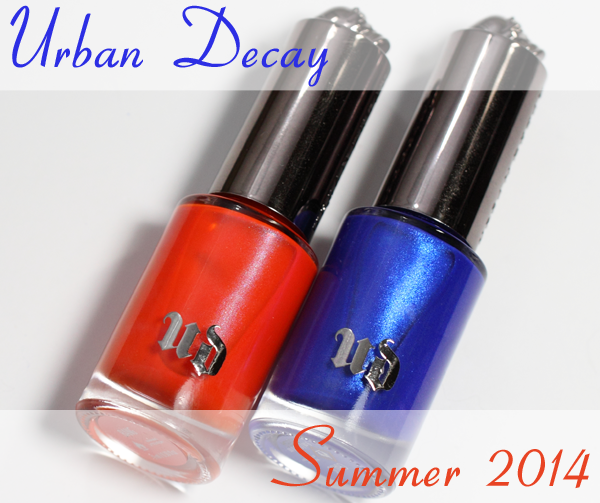
Because I have a good friend who went to Syracuse, it’s hard for me to see blue and orange together and not think of their school colors. Which is exactly what crossed my mind when the new Urban Decay Summer 2014 nail colors, Bang and Chaos arrived, in the midst of March Madness.
I’ve made my feelings about bright blues very apparent (hint: I LOVE them) so, obviously, I’m biased. However, everyone I’ve seen while wearing Chaos has flipped for the shade as well, so you know it’s good.
![]()
Formula & Application
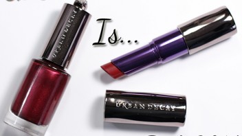
Urban Decay nail polish is 5-Free (Formaldehyde, Toluene, DBP, Formaldehyde Resin, Camphor). The weighty, round glass bottles are topped with a chrome cap with the brand name embossed on the side and a raised skull on top.
The brush is round, thick and dense with firm bristles. Due to number of bristles, it picks up a lot of polish and does fan out some on the nail. I found the brush to be easy to control, making precise, even polish placement a breeze.
In the past, the new Urban Decay formula has delivered pigmented, smooth, two coat coverage colors and with Chaos that tradition continues. However, with Bang, your results may vary. I used three thin coats to conceal my free edge but depending on how heavy handed you are with polish application, you could get away with two.
![]()
Urban Decay Bang is a vivid, reddish orange with a subtle hint of pearl shimmer. You can see the pearl on the nail in direct lighting but it’s pretty nonexistent otherwise. It’s worth noting that this shade dries with a satin finish, I assume due to some neon pigment in the mix, so a glossy top coat is necessary.
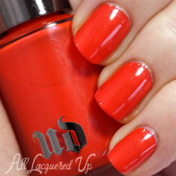
Urban Decay Bang
Urban Decay Chaos is an electric, mid-tone blue shimmer that borders on ultramarine. It’s so much more striking and bold in person which makes it very hard to capture on camera. The light blue shimmer really comes alive on the nail and is so much more pronounced than Bang.
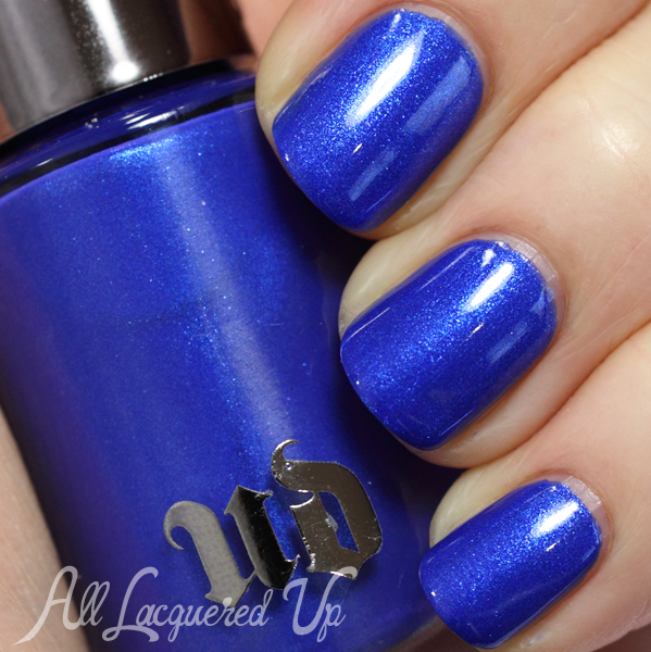
Urban Decay Chaos
![]()
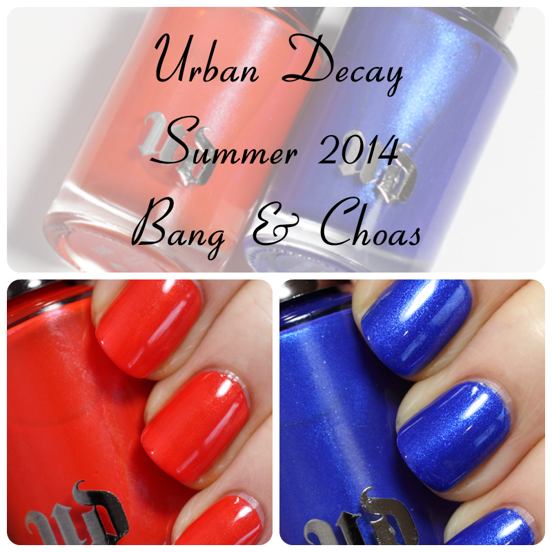
Bottom Line: Chaos is really the star of this show and given the prominence of bright blue nail colors this season, it’s clearly on-trend. I love everything about this polish, the silky smooth consistency, the pigmentation and, of course, the shockingly cool color. This is a “must” in my book. Bang, on the other hand, is nice but not necessarily note-worthy. However, this color pairing makes for a great mani/pedi combo.
Urban Decay Bang and Chaos from the Summer 2014 collection is available now at UrbanDecay.com, Beauty.com, Macys.com, Ulta.com and coming soon to Sephora.com. Urban Decay nail polish retails for $15/ea for a .3oz bottle.
What do you think of UD’s new nail colors? Do you plan to pick up either shade? Or both? Have you tried UD polish since it relaunched last fall? Thoughts?
Disclosure: Product samples were provided by reps for Urban Decay. Affiliate links appear in this post. When you purchase through an affiliate link, you help support this site. For more info view my Disclosure Policy.







Both look great and are nice colors for the season too.
In the event of you wanting to do some dupe-testing, I would really really really love to see how Chaos compares to China Glaze Frostbite!
I am disappointed in these colors I have both the winter colors and love them. The blue here looks nice but I will definitely pass on the orange.
I think UD should make more polish. That’s what I think. A LOT more polish.
I actually like that they don’t flood us with too much polish. I’d rather see a few really great colors than recycled shades.
Blue and orange? That’s Gator country here in FL :-). Chaos looks like a dupe for China Glaze Frostbite, except Chaos may be slightly more violet? I’m wearing Frostbite now and same as you, rave reviews, even from the “I like my manis to look natural” crowd.
I’m a FL Gator and these two are definitely Gator approved! I think I need to find a way to get my hands on these despite the fact that I already have 3 or 4 orange and blue polishes.
I was/am born and raised in Syracuse so I thought the same thing when I opened this post. Go SU!
I haven’t tried the new Urban Decay colors, but I sure remember with fondness my bottle of “Uzi” (a metallic grey) that I had many years ago. Loved the color & how it applied. I won’t say how many years ago lest I date myself. These colors are just meh in the photos, but I’d like to see the blue in person since you said it doesn’t show it’s true self in the pics.
Bang is a great looking blue, a polish color I am in love with also. I am really trying not to get anymore but I feel that object is doomed to failure, lol.
I adore these both, as I have the other “new” UD polishes. I agree with you on Chaos being the star – cobalt shades are my favorite! I paint, my husband paints, and worked in an art supply store – from an art background, I know how expensive blue pigments are (especially cobalt), so that color just feels special and rare to me. Anyhow, Bang is nice too. Of course these 2 colors (blue and orange) are complimentary on the color wheel, so it’s a perfect pair. I have UD’s (incredible!) new Revolution lipstick in Bang, as well, so I couldn’t pass up the chance to have its polish companion. UD’s packaging is just phenomenal. Weighty, expensive-feeling, and with a cute skull! The brushes are the best I have ever used, too, So flexible and precise. Last, I agree with appreciating the micro-collections each season. They are high quality, on trend, and so not half-assed like some other collections recently released. (I am looking at you, OPI!)
WOO SYRACUSE LOVE
As a Syracuse native, I approve these colors. And I wore Chaos all the time during basketball. GO ‘CUSE.