Nubar Spring 2015 Pop! Swatches & Review
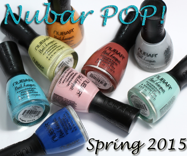
Nubar Spring 2015 – Pop!
As I told you last week, grey, aqua and mint are some of my favorite shades this spring. The Nubar Spring 2015 Pop! collection hits on all those spots and more. I’ll admit, it’s been a minute since I’ve been giddy about a Nubar collection, but this one is giving me butterflies. Keep reading to see why.
![]()
Formula & Application
Nubar nail polish is 5-Free (Formaldehyde, Toluene, DBP, Formaldehyde Resin Camphor). The brand is also PETA certified as cruelty free. The bottles are topped with a curved, matte cap that is designed to rest comfortably between the thumb and forefinger.
The brush is thick and round though the width doesn’t impede application. In fact it’s one of my favorite brushes, as documented in my Top 10 Brushes list. It has a bit of resistance which allows for control but the bristles are flexible enough to fan out nicely across the nail bed.
The majority of the polishes in this collection have a smooth, self-leveling texture with excellent pigmentation. They are thin but not squishy, delivering full coverage in two coats. The only exceptions are Spotlight (yellow) and VIP (orange) which both have a thick consistency that goes on pretty streaky, requiring three coats.
![]()
Nubar Choirgirl is a pale dove grey creme. It’s got a cool blue undertone, like RGB Dove, only with better pigmentation.
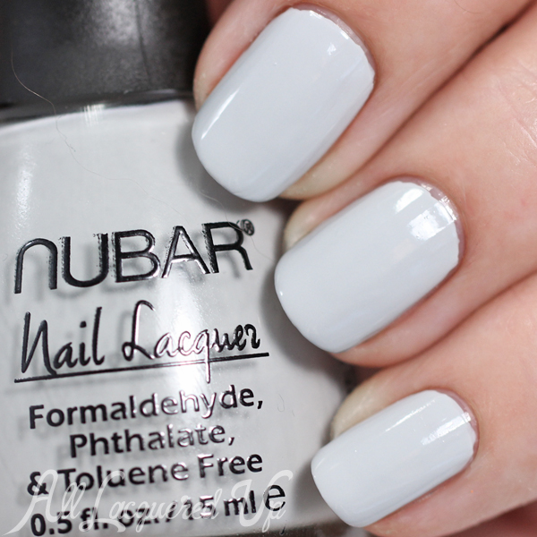
Nubar Choirgirl
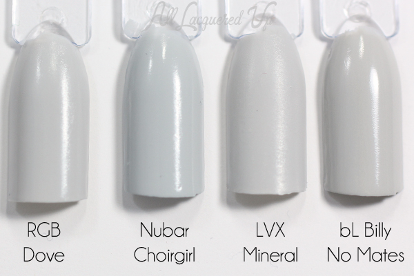
Nubar Choirgirl comparison
Nubar Cover Girl is a baby pink creme. It reminds me of Zoya Dot except Cover Girl is a touch darker with a much better formula.
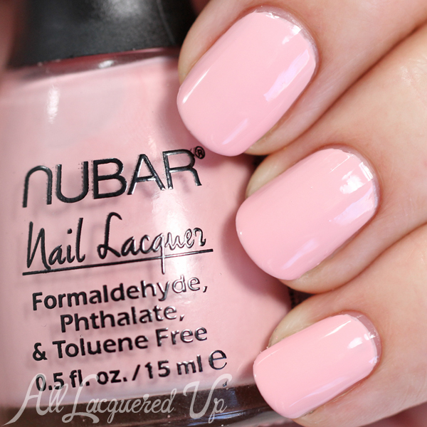
Nubar Cover Girl
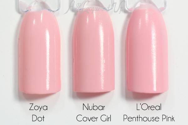
Nubar Cover Girl comparison
Nubar Encore is a hard color describe. Is is a browned red? A reddish brown? Or something else entirely. Maybe this is Nubar’s interpretation of Marsala. It’s unusual with a woody, earthy feel. It’s darker than OPI Gouda Gouda Two Shoes but in the same color family.
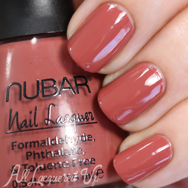
Nubar Encore
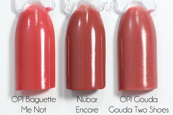
Nubar Encore comparison
Nubar Fan Club is a bright blue creme that leans towards turquoise. Like a bright aquamarine. It’s deeper than JINsoon Blue Poppy but a similar hue.
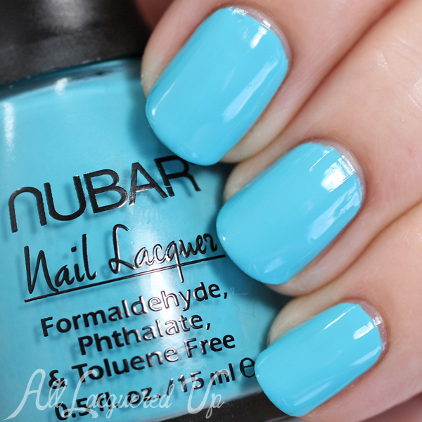
Nubar Fan Club
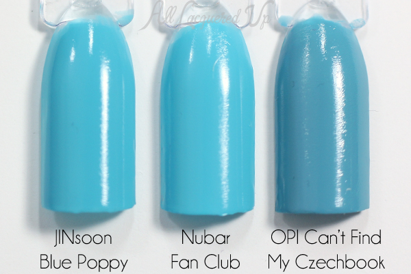
Nubar Fan Club comparison
Nubar Media is a different take on the cobalt blues that were so popular last year. This is like a cross between royal blue and cobalt and I have nothing like it. Essie Mesmerize is the only thing that comes close and it’s not as bright.
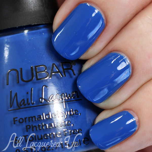
Nubar Media
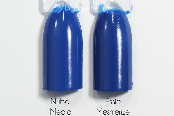
Nubar Media comparison
Nubar Prima Donna is a minty aqua creme. It’s the perfect complement for my new Botkier bag. Given that it’s a little darker than most polishes in this color, it’s unique to my collection.
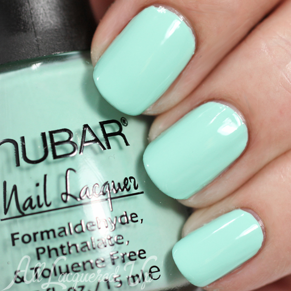
Nubar Prima Donna
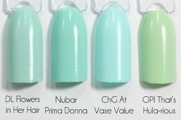
Nubar Prima Donna comparison
Nubar Spotlight is a lemon chiffon creme with a green undertone. It was my problem child in terms of application but a pretty color.
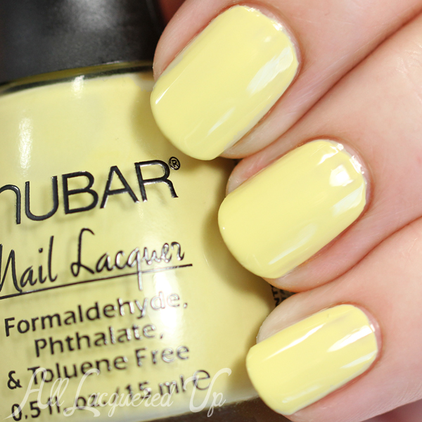
Nubar Spotlight
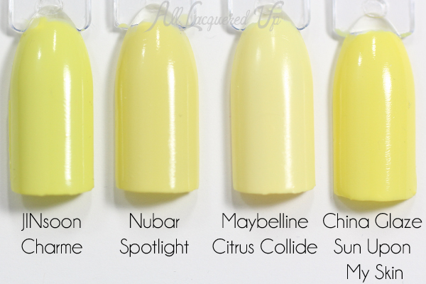
Nubar Spotlight comparison
Nubar VIP is a golden orange creme. It’s giving me this fake cheddar cheese vibe. Do you see it?
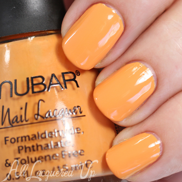
Nubar VIP
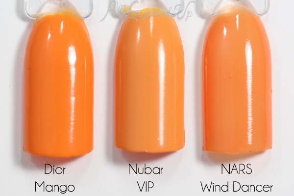
Nubar VIP comparison
![]()
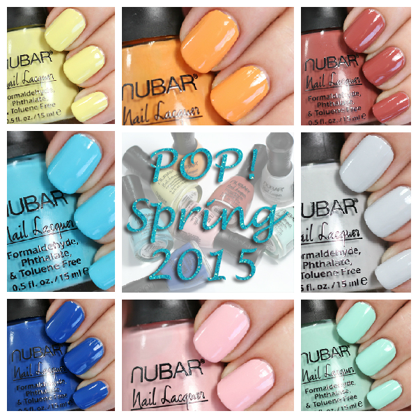
Nubar Pop! Spring 2015 swatches
Bottom Line: I’m kind of in love with this collection. Okay, I am, except for Spotlight and VIP because of application issues and not wanting to look like I stuck my fingers in Cheetos dust and top-coated it. I’m not even that into baby pink or browned reds but the formulas are so good, I can’t hate on ‘em. Obviously, the blues and greys are my life force here but the collection as a whole is pretty solid.
The Nubar Pop! Spring 2015 collection is coming soon to ByNubar.com, and available now on Amazon.com.
Thoughts on this collection? Do you see any must-have shades here? Have you spotted Nubar in stores near you?
Disclosure: Product samples were provided by reps for Nubar. Affiliate links appear in this post. When you purchase through an affiliate link, you help support this site. For more info view my Disclosure Policy.






These are nice!
Thanks Lisa!
Thank you for posting the comparisons – they are incredibly helpful!
You’re welcome, Emi! Thanks for letting me know.
LOL VIP reminds me of the cheese color from the Velveeta Shells & Cheese mac & cheese Kinda makes me want some mac & cheese to be honest… Its been hours since my lunch break! lol
Ha! I wish I liked box mac & cheese but I’m kind of a cheese racist. I only eat white cheese.
Media is gorgeous. I’m looking for an orange and thought VIP might be the one, but I can’t get your description out of my head! That’s funny–I don’t want Cheetos fingernails. I love when you do the comparison swatches. Thanks!
Sorry I ruined it for you. There are a LOT better oranges out there. And you’re so welcome.
I seriously love your honesty. Please don’t change
Thanks Anna! I won’t, promise
I love these! Please tell me how Prima Donna compares to Essie Mint Candy Apple. That’s in my top five faves.
Hi Mary! Mint Candy Apple is lighter and less blue.
Did they make a sudden change to Cover Girl and V.I.P? I’ve seen this collection swatched other places and those 2 were sheer, squishy jellies. I’ve been keeping an eye out for you to post this collection and as always thanks for the beautiful swatches.
Hi Sam! You’re so welcome. I’m not sure what happened. I didn’t know they were different until you commented and I looked up other posts. That’s so odd.
Thank you thank you thank you for adding comparisons on swatch sticks! They are immensely useful!
You’re so welcome!
Such an awesome post, I love the comparisons, I’m already a huge fan of yours, and this post is a perfect example
Of why!! Thanks so much for all your work, so this fellow nail polish lovin’ gal can make an informed purchasing decision:)