Sally Hansen Spring 2015 Tracy Reese Swatches & Review
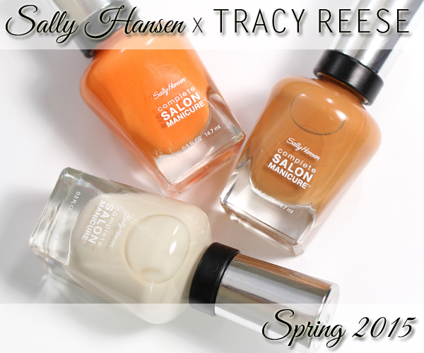
Sally Hansen Spring 2015 Tracy Reese
I’ve been hoarding the Sally Hansen X Tracy Reese collaboration colors ever since they brought the amazing Arabian Nights into our lives in 2008. Their synergistic partnership rolls on with the Spring 2015 collection, their eighteenth, to complement a dancer-inspired runway collection full of dramatic silhouettes and bold patterns.
![]()
Formula & Application
Sally Hansen Complete Salon Manicure nail polish is 5-Free (Formaldehyde, Toluene, DBP, Formaldehyde Resin and Camphor). The formula is designed to serve as base coat, color and top coat. Plus it packs in ingredients to help promote growth, strength, extended wear and high shine. The claim is a 10-day wear and as I’ve shown in the past (click here), it lives up to that.
The hefty glass bottles are topped with a smooth chrome cap that has a rubberized grip around the base. The grip makes opening the bottle easier and keeps the brush from slipping while polishing. The flat, curved brush is attached to a long paddle that needs to be wiped to avoid drips. Note: I believe the bristles have changed because they are softer and easier to press and fan out without worry of dragging the polish. I noticed this with the other spring CSM releases as well.
Each polish applied differently so I will address that below.
![]()
Sally Hansen X Tracy Reese Swatches
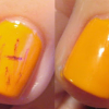
Sally Hansen Desert Poppy is a bright tangerine creme. It looks a lot like Zoya Sharon, maybe a bit more red. The formula is smooth with a glossy finish, though I needed three coats to get it opaque. There’s something about certain orange and coral shades. They apply streaky and show my ridges and need more coats even though they look so pigmented.
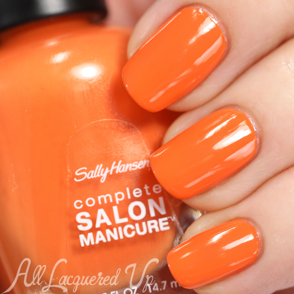
Sally Hansen Desert Poppy
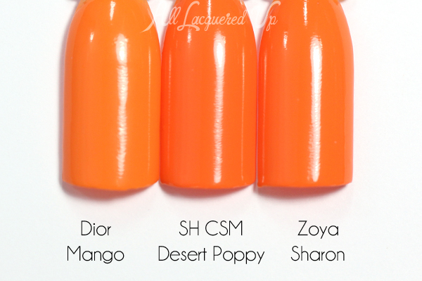
Sally Hansen Desert Poppy comparison
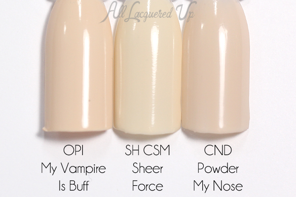
Sally Hansen Sheer Force is a super pale cream creme. The name implies that it is meant to be worn sheer, but it’s too streaky and milky for that. Though to get it opaque, I needed four coats, so I’m not really sure how it’s supposed to look. It looks yellow-ish next to the vanilla-hued OPI My Vampire Is Buff, and the greyed CND Powder My Nose.
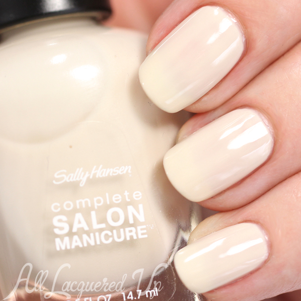
Sally Hansen Sheer Force
Sally Hansen Sheer Force comparison
Sally Hansen Tupelo Honey is a warm brown clay creme. Actually, it reminds me of those old-time caramel suckers, Slo Pokes. I remember getting them as a kid in the 80′s. A more updated reference would be Werther’s candies. Anyway, the formula is flawless and I barely needed two coats.
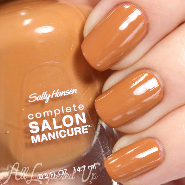
Sally Hansen Tupelo Honey
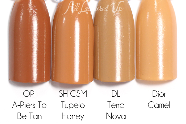
Sally Hansen Tupelo Honey
![]()
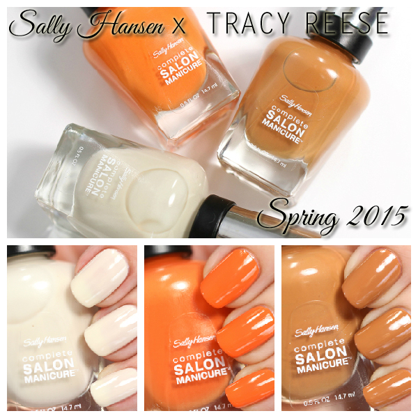
Sally Hansen Spring 2015 Tracy Reese swatches
Bottom Line: Tupelo Honey is a beautifully made polish, it’s just not suited to my coloring. Though given that Tracy Reese is a woman of color, it’s my opinion that this collection was designed with a diverse range of skin tones in mind. I wish Sheer Force was better constructed because it does a great job of representing the organza layers in the Tracy Reese spring collection. Desert Poppy is a fun color but not overly unique.
The Sally Hansen Spring 2015 Tracy Reese colors are available now at drugstores and mass retailers nationwide. As I mentioned the other day, I haven’t spotted them on shelves but Curly Comedy found a display that includes the other designer shades, and some I’ve not heard of.
Now that we’ve seen all the Sally Hansen designer collabs, which one is your favorite? Do you plan to pick up any of the Tracy Reese shades?
Disclosure: Product samples were provided by reps for Sally Hansen. Affiliate links may appear in this post. When you purchase through an affiliate link, you help support this site. For more info view my Disclosure Policy.





Wow, that orange! I was thinking it was similar to a polish I have been wanting since I first saw it last year swatched online, OPI Orange You Stylish!, but it looks brighter and more red. Thank you for this review!
Yep, the one from the Coke collection is more subdued and yellow-orange.
I’m sucker for neutrals so Tupelo Honey is def on my want list! I would buy this whole trio though- all the colors are gorgeous!
I’m so glad. I hope you can find them all.
Fresh colors these are.
Thanks for stopping by, Lisa.
I remember Slo Pokes! I grew up on a similar but darker candy Sugar Daddy. Tupelo Honey is closer to the color of Sugar Babies. Man I haven’t had those since I was a kid!
Yum, Sugar Babies. Great comparison.
I think my favorite of all of them was the Prabal Gurung collection. I just am not fond of the colors in this collection. I have a few oranges and browns in a few ranges and mostly I have them for specific nail art I’ve done. Halloween, fall nail art, etc., but they aren’t the colors I normally gravitate towards, unless they have a shimmer or flecks like the Capitol Collection from the Glosstinis a couple years ago.
I hear you, Amanda. They’re not normally my colors either. Give me a blue or green any day. The Prabal collection is my favorite as well.
these are all a miss for me.
Sorry to hear that, Kel, but good for your wallet, right?
Very nice shades!
Thank you!