CND
CND Holiday 2007 Preview
Wow, the polish brands are really throwing a lot at us, huh? No sooner does the CND Imperial Anarchy collection debut do we get to see what’s in store for the holiday season. I’m still wearing sandals, I’m certainly not ready to start thinking about gift shopping.
CND is hitting us with three holiday party themed lacquer sets and a new Creative Scentsations fragrance. Each polish set includes a freebie and a nail art how-to guide.
The Glamour set includes:
Rich Ruby – a metallic burgundy, Deep Velvet – a metallic purple and a free baggie of clear rhinestones to bling out your manicure.
Festive includes:
Hollywood – a red with gold shimmer, Black Platinum – a charcoal silver metallic and a free bottle of Mother Of Pearl – a clear glitter.
Count Down includes:
Smooch – a new shimmery white, Pucker Up – a sheer pink and a free bottle of Air Dry top coat.
Finally scrub and moisturize your skin with Creative Scentsations newest fragrance Black Currant and Fig.
I still have to officially test everything but just from looking at the bottles Deep Velvet and Smooch look like shades I’ll love and Pucker Up looks like it’s a jelly finish. I’m hoping to have swatches up soon.
Creative Nail Design becomes CND
To many of us from the MUA nail board, this really won’t be a hard transition. Creative Nail Design has always been CND to us. Well now they’ve made it official. The same great products and formulas will now come out under the CND name. The new packaging and design will being rolling out over the next 18 months so don’t be surprised if your beloved Solar Oil bottle looks at all different.
Excerpts from CND’s Press Release August 15, 2007 – As a leader in professional nail care, Creative Nail Design has steadily grown its business over the last 28 years helping to shape an industry that has reached sales of a staggering $7 billion in the U.S. alone. Now the company is poised to lead the way into the future with a sleek new brand identity, a flagship education facility and a premier salon. The company, still incorporated as Creative Nail Design, will now be recognized simply as CND. The brand’s new look signifies an overall revitalization that demonstrates CND’s freshly unified and streamlined identity and enables the company to maintain its leadership position while continuing to grow its business in an ever-changing and competitive global marketplace.
CND revealed a modern logo that incorporates Creative Nail Design’s iconic sweeping “C†and a newly designed and unified packaging system for the company’s 300-plus professional and consumer retail products. Because CND products are available in 90 countries and used in 8,000 salons worldwide, they will now have a uniform tri-lingual packaging system that supports CND’s goal to reinforce a consistent global brand identity in all of its international markets. The new packaging will be rolled out in phases over the next 18 months, beginning with the launch of three new Brisa™ gel color collections this fall. In conjunction with the new logo and packaging design, CND introduced a myriad of new print materials, a new website (
http://www.cnd.com/) and a new large-scale trade advertising campaign, all featuring the new logo and directional imagery to support the streamlined CND brand. “We’re rolling out a new generation of ads that are as memorable and expressive as ever. Our campaign includes new corporate ads to launch CND’s fresh look, and category ads to support each of our main product categories: enhancements, spa, essentials, color and hand & body,†explains Kim Natale, Director of Marketing for CND.
Creative Imperial Anarchy
 I know you all have been dying to know what this collection was going to look like. While the color blobs give you a clue, they don’t do much else.
Well let’s just say that Creative got it right. The Imperial Anarchy collection is filled with bold, rich, highly pigmented lacquers. I don’t care if Creative polishes take longer to dry than other brands, there are some shades here that are must haves.
Due to popular demand, I am going to attempt to give you full mani swatches as often as possible. It’s a killer on my nails and cuticles but sometimes you have to suffer for beauty and art. Also, in attempt to deter the picture thieves I’ve FINALLY learned how to watermark with Photoshop. So I apologize if it detracts from the pictures but it’s a necessary evil.
First up, Crowned. Described as a “vintage copper metallic”, Crowned applied very well for a metallic. I saw some slight brush stroke marks but they were nowhere near as bad as others I’ve used. The shade is a muted, softer version of OPI’s Burning Love which to me is the color of copper wire and hard to pull off.
With all the swatches below, I only needed 2 coats because these lacquers are so pigmented. Most of them didn’t even need a second coat, I was just hiding my own application errors. I planned to use a top coat to make sure each shade looked it’s best but it wasn’t needed.
Regal Revenge a “dark fuchsia creme”, went on so smoothly that I regretted not buffing my nails before swatching. An imperfection on my index finger caused a bump that should not reflect on the Regal Revenge’s quality. The slightly dusty quality of the shade keeps this from being a summer bright and will go well with the pop art inspired fashions that rocked the fall runways or as a nice punch of color with a smoky gray ensemble.
House of Rebels isn’t browned or orange enough for me to consider it a “brick red creme” but it’s definitely deeper than your traditional true red (i.e. OPI Got The Blues For Red) and extremely glossy. It’s not quite a one coat red but it’s very close. There’s no pink undertones like Burn from the Flash Point collection had. Look out for this color or ones similar on the young Hollywood set this fall.
Crimson Uprising is a “shimmery crimson” that leans towards berry due to a slight pinkish undertone. I would consider it more frosty than shimmery but definitely not metallic. The application was too good for it to be called a metallic. The sliver and red shimmer give the shade depth and warmth. I wouldn’t say it’s entirely unique but it’s definitely pretty.
Rock Royalty is the first of my two “must have” polishes from this collection. It was described in Creative’s press release as a “dark purple creme” but from the close-up shot you can clearly see it’s not. The shimmer is comprised of very fine flecks of purple and pink that really only show up in direct sunlight but they’re there. The color itself is simply stunning. It’s what I had hoped the way too sheer OPI You Ottaware Purple would be. It’s not so dark that you can’t tell it’s purple yet it’s dark enough to be vampy.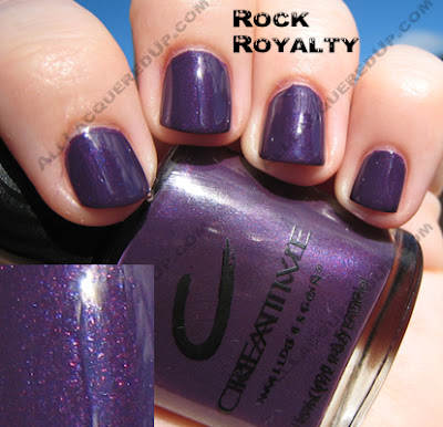
The piece de resistance is Hyde In The Dark. A “metallic anthracite” or as I like to call it, sparkly gray goodness, it’s not a metallic in the traditional sense, it’s a thousand times better. Loaded with shimmer and glitz, this is what gunmetal gray should look like. Now I don’t know what makes this formula different but it applied the best of all the polishes. I took pics of this one in both shade and sunlight to show off it’s glory.
 So everyone, what do you think? Are any of these tickling your fancy?
*edited to add: Imperial Anarchy will release in September. I don’t have an exact date.*
Creative Nail Design Fall Preview
 The Creative Nail Design team was all over the Fall 2007 runway shows. From New York to Paris, London, Sydney and Dubai, they were creating the hottest nail looks for the fall collections. Team RED worked on 105 shows, custom blending shades, creating ornate nail adornments and premiering the Imperial Anarchy collection.
Flipping though the Creative Fall/Winter 2007 Look Book I see luxe, rich jewel tones and cool steely grays graced the tips of the runway models.
At shows like Giles Deacon, Behnaz Sarafpour and Catherine Malandrino graphite and matte mid-tone grays were featured.
Gold, like Creative Pharaoh’s Gold made an appearance at the Miss Sixty, Baby Phat and Ashish shows.
Purple reigned at 3.1 Phillip Lim, Diesel and Julia Clancy.
Pop art brights jumped off the runways of Heatherette and Karen Walker.
And of course, Red Red Red. Though this year, red wasn’t just about fashion, it also helped raise nationwide health awareness. Designers like Betsey Johnson, Carmen Marc Valvo and Narciso Rodriguez came together to promote Heart Truth and Creative Nail Design has joined the effort.
Red was also featured at the Jason Wu show, nails by Creative Team Red.

Creative Summer 2007 – Flash Point
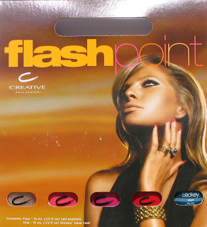 So I just got my blue-tipped claws on the summer collection from Creative Nail Design. It’s called Flash Point and consists of a nice selection of brights and a metallic sheer.
I have to be honest with you all, I’m not wowed by this lineup. But I know that having so many polishes makes me extremely jaded. After seeing hundreds of red and pink polishes over the years, it takes a lot to get me jumping up and down over a color.
That’s not to say that these aren’t pretty colors or that Creative doesn’t make a great product. They absolutely do. The pigmentation in their lacquer is fantastic. It’s just that for the hard core collectors, there isn’t a truly unique shade here. I’m sure it must be hard for all the brands to come up with 4+ collections a year and try to make them special and trendsetting.
 Let’s talk about the colors. I was so excited to read that Glow is a “nude gold shimmer” only to have my heart sink when I saw how sheer it is. But fear not, there is a silver lining on this one folks. For any of you still on the hunt for the discontinued FingerPaints Snow Angel, you can stop searching and pick up a bottle of Glow. The shimmer/glitter is a bit less dense but otherwise they’re dead on dupes. That’s a reason to rejoice!
Flare is a medium carnation pink creme. It’s a great pedi color that will compliment most skin tones. Even without my full on self-tan happening, holding Flare against my skin instantly warms me up.
I held Scorch up to my Bright Pink Lemming Wheel (or nail art wheel) and it falls somewhere between OPI La Pazitively Hot and Zoya Fergie (closer to Fergie). The pink shimmer is very fine and gives Scorch a lot of depth in bright light.
Describing Burn as a “bright hibiscus red creme” does absolutely nothing for a plant killer like me. I have murdered many an expensive flora over the years. In dissecting a color what works best for me is comparison. So in Burn’s case, I look to my collection.
Although it’s described as a creme, I see some minute shimmer up close. And even though Burn is slightly on the orange side, it’s nothing like OPI Cajun Shrimp. I think the fuchsia shimmer that prevents that from happening. China Glaze Hot Lava Love comes close but Burn is brighter and much more pigmented.

A close up look at Burn and Scorch
 Opinions? Got suggestions for duplicate shades? Let’s here it!


