Blue
OPI Summer 2008 Preview – Retro Fun in the Sun
Like a frothy beach party flick (think Gidget, Beach Blanket Bingo), the OPI Retro Fun In The Sun collection will be surfing onto shelves this summer. Filled with kitschy, fun shades the lacquers are perfect for those long sunny days of lazing in the sand. To add to the fun, each bottle comes with a retro ponytail holder. Takes me right back to elementary school when I had a ballerina jewelry box filled with hair ties in every color imaginable.
“In summer, glamour really moves from the city out to the sand, and these shades combine a retro pin-up-girl look with a beach party attitude – think ponytails, Frankie and Annette, and romance under the stars,†says Suzi Weiss-Fischmann, OPI Executive VP & Artistic Director. “The colors are rich, playful, and sexy – a great way to accessorize one of fashion’s most colorful summers ever!â€
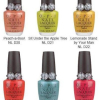
Peach-a-Boo! – Take a peek at this apricot sparkle!
Sit Under the Apple Tree – A tempting, light apple green.
Lemonade Stand by Your Man – You’ll stay loyal to this refreshing yellow.
Give Me a Coral Sometime – I’ll answer in this inviting pink-orange.
Sea Ya Later, Sailor! – A fun, flirtatious turquoise shimmer.
Calendar Girl – A pin-up, perfect pink-red.
Like previous beach themed OPI collections (It’s Summer for Shore, Surf Party) I’m expecting the Retro nail polishes to have a unique shimmer that will make the nail girlies go gaga. I can’t wait to see them in person and find out! Will this line become just as collectible? We’ll just have to wait and see.
The Retro Fun in The Sun collection drops (I’m so street) in June and will be available at salons including Pure Beauty, Regis, Trade Secret, Ulta, Beauty Brands, Beauty First, Dillard’s, and JCPenney. MSRP $8.50 ($9.95 CAN)
OPI Summer 2008 Preview – Mod About Brights
The Brights are back everyone! OPI is adding to their ever so popular Brights series with a set of 6 vivid creme polishes dubbed the Mod About Brights collection.
“The mod look is back in a fresh, new way, both in fashion and beauty,†says Suzi Weiss-Fischmann, OPI Executive VP & Artistic Director. “The six shades in Mod About Brights capture the fun and edginess of the mod ‘invasion’ of the Sixties, but with a bright twist that makes them exciting and current for 2008. And with fashion right now being all about color and vivid, graphic prints, these are the shades that are perfect for fingertips and toes.â€
Yet again I’m getting giddy with delight over a fab looking green hitting the mass market. You know the frankeners on MUA will be adding black to Green-wich Village to try and duplicate RBL Recycle. And a royal blue creme… catch me as I swoon. If these cremes are as fantabulous as the ones from India, I’ll be in heaven. I’ve been on such a creme kick lately. Between that and my recent pink love you would think I had a polish lobotomy.
So here’s the line up and descriptions courtesy of OPI.
Mod-ern Girl – A pop of coral with more than 15 minutes of fame.
Brights Power – A brilliant orange that fashionistas find fab!
The “It†Color – This must-have yellow is the color to be seen in.
That’s Hot! Pink – Bright pink that sizzles with style.
Green-wich Village – A vivid green that’s downtown mod.
Dating a Royal – A royal blue that sets crowns spinning!
The Mod About Brights collection retail for $8.50 ($9.50 CAN) and will be avaiable in May at salons including the major chains; Beauty First, Beauty Brands, JCPenney, Dillard’s, Regis, Pure Beauty, Ulta, and Trade Secret.
China Glaze Summer 2008 – INK
Tattoos are a controversial topic. You either love or hate them. They’re regarded as both beautiful and tacky, depending on who you ask. But no matter what your opinion is, tattoos are extremely personal; a memorial, an artistic expression, a memento of a wild escapade, a drunken regret, a terrible reminder of past events or loves. Inspired by this colorful body art, China Glaze has put together a collection of neons that you can use to create your own tattoo-like nail designs.
Tattoo art has moved out of back alley parlors onto the couture collections of fashion’s top designers. INKâ„¢ by China Glaze is a collection of neons for brilliant self expression. Customize and personalize
…Ink My Nailâ„¢.
INK includes six bold new shades, a set of nail decals and rhinestones, a black nail art lacquer with fine tipped brush, a limited edition bottle of their yummy smelling Orange Cuticle Oil AND the six existing neons from the WOW collection. Now that’s a lot of neon. A quick word about the finish. As with other neons I’ve used, these all dry to a semi-matte finish. It must have something to do with the type of pigment used to create neon shades. So if you’re looking for high gloss you’ll have to add a shiny top coat. Therefore I’ve shown all the lacquers with two coats of color on the nail and no top coat; exceptions are noted.
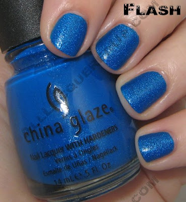
Blue Sparrow is a royal blue peppered with light blue glitter. The glitter leaves a gritty feel to the dried polish so between that and the matte finish you really need to use a coat of a thick glossy top coat to bring out the lacquer’s true brilliance. I’m showing you the color without top coat but I included an up close swatch with a coat of Seche Vite.
 Celtic Sun is a neon yellow with a hint of green undertones. The polish is shown with three coats on the nail yet the smile line still shows through. I personally prefer a more lemony yellow. This color has a very 80s retro feel to me. It’s a shade right out of the Wham! Wake Me Up Before You Go Go video.
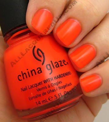
 Japanese Koi is the shade of a perfectly ripe tangerine. It’s got a slightly pink base that keeps it from being day-glo orange.
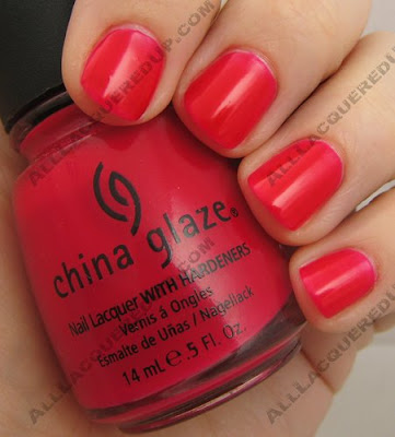
 With it’s hot pink base Rose Among Thorns is no average rose. I found this image of the beautiful Cerise Rose and thought this could have been the inspiration for the shade.
  Sacred Heart is a dusty red that is unlike any red I own. There’s something about the satin finish on this one that reminds me of the skin on cherries. Odd reference I know, but it keeps popping in my mind.
  Flying Dragon is my personal favorite from the collection. It is a deep purple that has a reddish tone to it in person. The red and blue glitter really makes this polish unique. Like I mentioned above, the finish is my only real issue with both glitters. For some reason this seems to be a bigger problem with Flying Dragon. According to a rep for China Glaze it is the unfortunate downside of blending neon with glitter. Their suggestion, two coats of Seche Vite to avoid a rough finish.
 The INK collection is available now in salons and online at 8ty8Beauty and coming soon to Head2ToeBeauty.
So who’s going to be sporting bold, bright neons this summer? Which colors are standouts?
China Glaze Spring 2008 – Ecollection
It seems like “going green” and focusing on the environment is on everyone’s minds and it is affecting every aspect of our daily lives. And if it’s not everyone, it certainly should be. Now more and more beauty companies are starting to get on the “green” train and China Glaze is no exception. This Spring they introduce the ecollection a set of polishes with an earth conscious theme that comes in recycled paper packaging.
To preserve the beauty of our world’s colors, tread lightly and leave only footprints. In Blahniks or Birkenstocks, going green is always fashionable.
Overall I’m a fan of this collection. I’ll admit the grouping is odd in terms of shade until you read the names and reflect on the theme. So let’s talk formula. As you may already know this new Big 3 Free formula that was introduced last summer is thicker than the old formula and therefore requires a bit of getting used to. I’ve found that it applies best in two medium coats. Too thin and it pulls/drags on the nail, too thick and you get bubbles. All the manicures pictured below were done with two medium coats of lacquer.
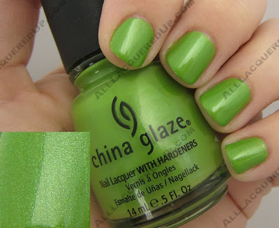
Tree Hugger reminds me of a green apple but with multi-tonal green shimmer. It’s like the perfect spring shade for me. Just looking at it makes me happy. I could go on and on about how gorgeous this polish is but it really speaks for itself.
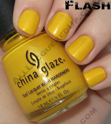
 Solar Power can only be described as “taxi cab yellow.” It is a loud and proud shade and with the yellow trend popping back up for spring/summer Solar Power, with it’s golden shimmer, fits right in. I have to admit that I prefer the jelly finish of last year’s Yell-O-Neil from the Surf collection. Simply because its glass like look is so completely unique.

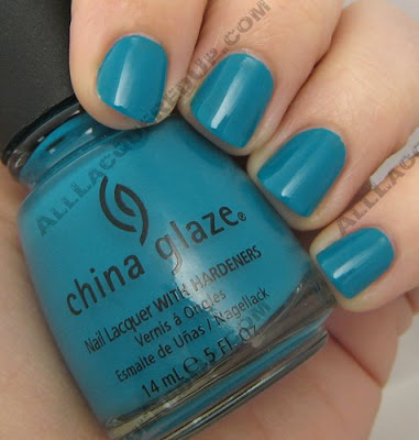
 Shower Together is a slightly lighter version of the oh so popular Aqua Baby from the Patent Leather collection. It’s like Aqua Baby and For Audrey had a baby which makes this blue green stunner is a color I could just swim in. Doesn’t it look like pool water?
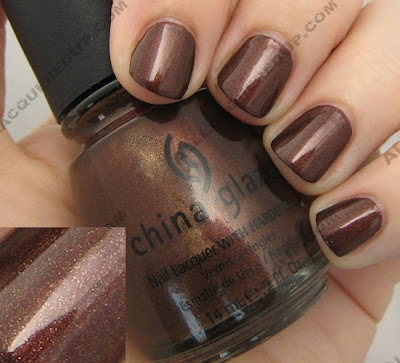
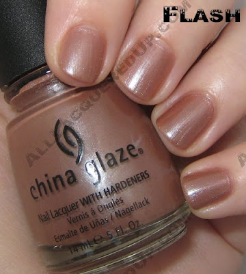
 Unplugged isn’t a shade I normally think of when I look towards Spring but it adds a nice balance to the collection. A red based brown with ribbons of gold shimmer running throughout, the overall color is that of a deep bronze with flecks of gold.
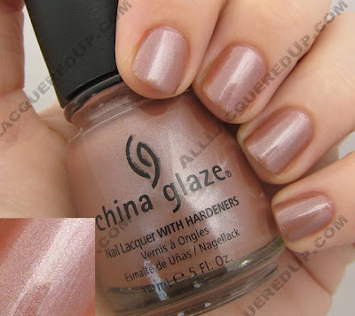
 Hybrid is a pinky beige with silver shimmer. In other lighting it’s a dusty nude rose. So hard to describe which is what makes it stand out. Does anyone else think it’s similar to Chiaroscuro but without the green shimmer? I’m just not sure I love this on me. What do you think?
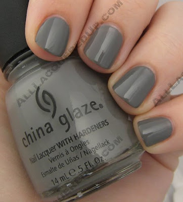
 Recycle is a shade a lot of us have been longing for. A mid-tone gray creme that reminds me of rubber wire coating. Even though some of the MUA nail girls have franken’d their own gorgeous grays, I love being able to get it without the muss and fuss. Gray is going to be the next big shade in polish, especially in fall so, I’d get this one now before gray becomes a scarce commodity.
 The China Glaze ecollection is available now in salons and online at 8ty8Beauty and Head2ToeBeauty
Thoughts? Questions? Comments? Weigh in lovelies!
Tracy Reese for Sally Hansen Fall 2008 Preview
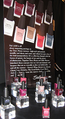 Backstage at the Tracy Reese Fall/Winter 2008 show I had the pleasure of previewing the Fall Sally Hansen Salon line. Tracy Reese collaborated with the wizards at Sally Hansen bring us yet another fabulous fashion inspired collection. According to the reps I met, the team from Sally Hansen sits down with Tracy to review her swatches and takes them back to the R&D department. In turn, they create 60+ shades from which Tracy hand picks the finished collection and names them with her creative team.
Fall 2008 is all about surprising pairings on the Tracy Reese runway: high-tech and natural, metallic and sheer, and rustic and refined are just a few of the bold juxtapositions. It’s a collection charged with the forces of nature, the beauty of art, and the power of abstraction. Together Tracy Reese and Sally Hansen translated these concepts into ten rich and dramatic nail lacquers that are as wearable as they are fashionable – on and off the runway.
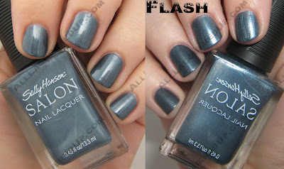
As I reported earlier, Torrid Bloom was the shade chosen for the “Veiled Nail” runway look. The other colors include; Raven’s Wing, Moonstone, Quartz Chameleon, Divinity, The Good Earth, Cruel Heart, Alchemy, Torrid Bloom, Night Lily and Stormy Blue. I was lucky to bring home a sample bottle of Stormy Blue to test out. It was the shade that called to me the most. You know how I love my blues and Stormy Blue is this amazing metallic steely blue. I heard it being called, “the new navy.” With all the grays I’ve seen coming down the pipe, this shade is the perfect mix of last fall’s navy trend and new mid-tone grays. Given it’s metallic quality, brush strokes were minimal and the bit of glittery sparkle you see in bright light makes this one a must have for blue lovers.
 Moonstone and Raven’s Wing were my other immediate favorites. Moonstone, a silvery gray shimmer, and Raven’s Wing, a black sparkler, are both high on glitz and very chic. The visible silver glitter in Raven’s Wing sets it apart from the black shimmers we’ve seen in the past.
The Tracy Reese for Sally Hansen Fall collection won’t be out for a while but it’s always fun having something to look forward to.


