Brown
OPI La Collection De France for Fall 2008
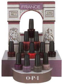 The much anticipated Fall collection from OPI, La Collection De France, hit shelves last week and sent my fellow fanatics into frenzy. Ever since the unofficial images hit the net, people have been curious about what the colors will look like in person. I have to say that while there are a few AMAZING shades in the collection, overall I can’t help but say “meh!” But you girls know me; I like new, different, unexpected. And while this extremely wearable palette represents the chic, sophisticated air of France, overall it doesn’t intrigue me.
Where formula is concerned, the shimmers are barely noticeable (exceptions noted) while the cremes have continued to impress me the way India and the Mod Brights did. Excellent coverage, smooth application and a glossy finish. What more can a girl ask for?
My OPI France Hits:
Parlez Vous OPI? is the clear winner and stand out for me. I’m so feeling the smoked out shades for Fall, I can’t even stand it! And this smokey violet creme is a total knockout. If there is one color (besides dove gray) that I’ll be wearing multiple times this Fall, it’s this one.
You Don’t Know Jacques! ended up surprising me. This muddy browned gray didn’t look at all flattering in the bottle but on my nails, LOVES IT! In the same way that China Glaze Wagon Trail felt gritty and grungy, You Don’t Know Jacques! gives off the same edge. The creme finish just makes it a bit more chic.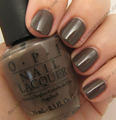
Louvre Me Louvre Me Not is a fun pop of juicy grape color in a collection with such subdued tones. And the shimmer in this one is more prominent, making this a great shade for us funky nail lovin’ gals.
Baguette Me Not is another one that caught me off guard. I didn’t think much of it in the bottle but it really works with my skin tone. And I’m diggin the slightly dusty quality. So, is it a deep melon, a reddish orange, a browned red? It’s like describing the wondrous taste and texture of sushi in that I can’t quite articulate it, I just know I like it.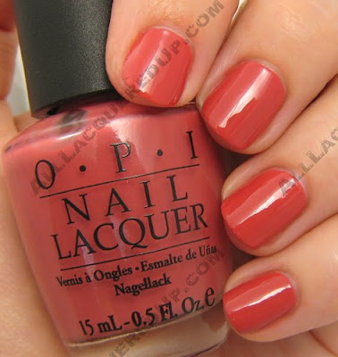
The Misses:
What’s there to say about Tickle My France-y? It’s a nice, neutral, nude. How’s that for alliteration? But seriously, it’s a great basic. Very work friendly and I like that it’s not sheer. Finding flattering opaque neutrals can be a challenge.
Crepes Suzi-ette reminds me of the reddish brown shade MAC put in the N Colour collection, Naturally Rich. That one didn’t work for me and neither does Crepes Suzi-ette. It applied beautifully but is just way to blah for me. I could see a darker skinned person pulling this off or perhaps even a red-head. Just not me.
I wanted to like I’m Fondue Of You. I really did. The shimmery slightly bronze bottle shade drew me in. I honestly expected this to be a winner. But on my nails, it just kind of dies. I love me some chocolate brown but this was too light and too red and not shimmery enough for my taste.
And the I’ve Seen It Befores:
A Oui Bit Of Red has visible shimmer in the bottle though when applied, it disappears. I do like that it makes my nails look like little Red Hot candies, which is fun but, it’s not a red I haven’t seen before. I know, what red really is? Like the LBD (little black dress) it’s a staple.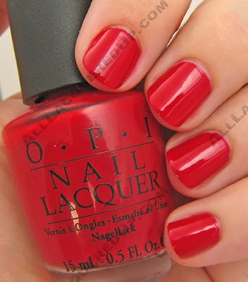
Bastille My Heart is a deep candy apple red with that same subtle shimmer. Pretty but, yawn inducing. Next!
Yes… I Can-Can! and We’ll Always Have Paris (below in that order) both have a reddish grape base that has been deepended to a vampy plum. The shimmer in Yes… I Can-Can! is really the only difference. The silver sparkles do stand out some on the nail but I can’t really say either polish is more unique than the vampies from past Fall collections (Russia, Chicago, 25th Anniversary).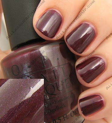

Eiffel For This Color looks to be a Lincoln Park After Midnight twin. I’ll have to do a swatch test and report back. Again, it’s another almost-black plum with shimmer. Do I like it? Yes! Will I wear it? For sure. Does it make me want to run out and buy a backup? Not so much.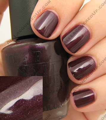 The OPI La Collection De France is available now at professional salons and chains like Trade Secret, ULTA, Regis, JC Penney in addition to the online e-tailers I have listed on the right.
So what are your thoughts on the collection? I’m sure by now some of you have already scooped up your favs. What were your Hits, Misses and Seen It Befores?
China Glaze Spring 2008 – Ecollection
It seems like “going green” and focusing on the environment is on everyone’s minds and it is affecting every aspect of our daily lives. And if it’s not everyone, it certainly should be. Now more and more beauty companies are starting to get on the “green” train and China Glaze is no exception. This Spring they introduce the ecollection a set of polishes with an earth conscious theme that comes in recycled paper packaging.
To preserve the beauty of our world’s colors, tread lightly and leave only footprints. In Blahniks or Birkenstocks, going green is always fashionable.
Overall I’m a fan of this collection. I’ll admit the grouping is odd in terms of shade until you read the names and reflect on the theme. So let’s talk formula. As you may already know this new Big 3 Free formula that was introduced last summer is thicker than the old formula and therefore requires a bit of getting used to. I’ve found that it applies best in two medium coats. Too thin and it pulls/drags on the nail, too thick and you get bubbles. All the manicures pictured below were done with two medium coats of lacquer.
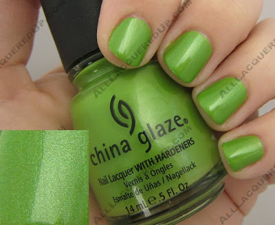
Tree Hugger reminds me of a green apple but with multi-tonal green shimmer. It’s like the perfect spring shade for me. Just looking at it makes me happy. I could go on and on about how gorgeous this polish is but it really speaks for itself.
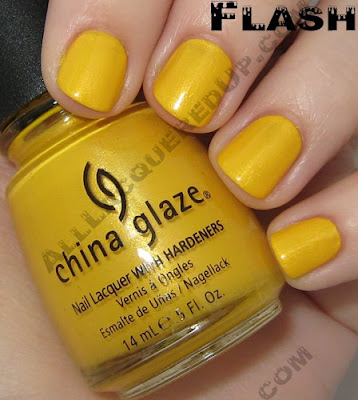
 Solar Power can only be described as “taxi cab yellow.” It is a loud and proud shade and with the yellow trend popping back up for spring/summer Solar Power, with it’s golden shimmer, fits right in. I have to admit that I prefer the jelly finish of last year’s Yell-O-Neil from the Surf collection. Simply because its glass like look is so completely unique.

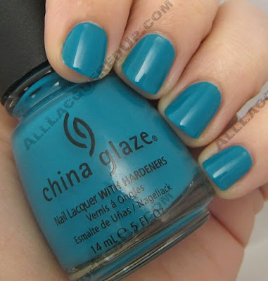
 Shower Together is a slightly lighter version of the oh so popular Aqua Baby from the Patent Leather collection. It’s like Aqua Baby and For Audrey had a baby which makes this blue green stunner is a color I could just swim in. Doesn’t it look like pool water?
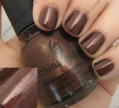
 Unplugged isn’t a shade I normally think of when I look towards Spring but it adds a nice balance to the collection. A red based brown with ribbons of gold shimmer running throughout, the overall color is that of a deep bronze with flecks of gold.
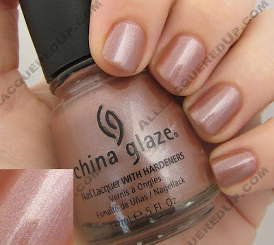
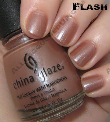
 Hybrid is a pinky beige with silver shimmer. In other lighting it’s a dusty nude rose. So hard to describe which is what makes it stand out. Does anyone else think it’s similar to Chiaroscuro but without the green shimmer? I’m just not sure I love this on me. What do you think?
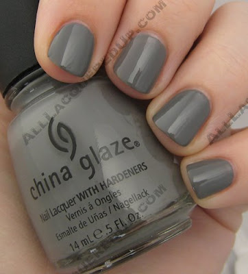
 Recycle is a shade a lot of us have been longing for. A mid-tone gray creme that reminds me of rubber wire coating. Even though some of the MUA nail girls have franken’d their own gorgeous grays, I love being able to get it without the muss and fuss. Gray is going to be the next big shade in polish, especially in fall so, I’d get this one now before gray becomes a scarce commodity.
 The China Glaze ecollection is available now in salons and online at 8ty8Beauty and Head2ToeBeauty
Thoughts? Questions? Comments? Weigh in lovelies!
Fanatic Feedback – Matching Tips and Roots?
 So I was reading this post from the Jet Set Girls about matching your nail polish to your hair color. She wore Naturally Rich from MAC’s N Colour Collection and had people comment on how well it worked with her auburn locks. To be honest, I’ve never thought about that pairing. Only about how the color works with my skin tone or outfit. Just off the top of my head, I think that Misa Chocolate Icing would be my hair match due to it’s reddish undertone.
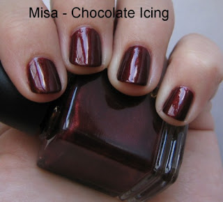
What about you? Have you ever purposely matched your tips to your roots? What lacquer best matches your tresses?
Lippmann
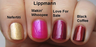 At DramaQueenie’s request I swatched some of my other Lippmann polishes. Of the four, Nefertiti is the only color that I consider truly unique. That being said, they all have a great depth of color and offer 2 coat coverage. The application is flawless. It flows from the brush so well that I hardly need to think about what I’m doing.
Black Coffee is just a bit lighter than my bottle of Misa Chocolate Icing and a bit more bronze. Chocolate Icing is supposed to be a dupe for Lippmann Brown Eyed Girl. I would say they’re different enough to own both Brown Eyed Girl and Black Coffee but I would probably say that to justify the purchase regardless.
Nefertiti is an understated gold. It’s more matte with micro sparkles that only come out in the light. It’s a way of doing gold without doing GOLD. For comparison sake, I would say that OPI I Get A Kick Out of Gold is more champagne.
Love For Sale is my least favorite of the group. It’s pretty but not something I would recommend. There are so many interesting shades from Lippmann that if you need a purpley wine shade, save your money and get a less expensive brand. Possibly something like OPI Don’t Wine… Yukon Do It! or China Glaze Drama Queen.
Makin’ Whoopee is a color I received as a bonus in mini size. I wasn’t expecting it which makes it all the more fun. It’s not a color I would have picked but I’m glad I have it. It leaves a very glassy finish, even without a topcoat and has an amazing glow about it. I’ve been racking my brain and can’t come up with a comparison for it. Feel free to make suggestions for twins to this and any of the colors.
Finally, a bottle pic. If only I had 6 fingers to swatch them all on one hand.

You can purchase Lippmann products directly from their website, at fine department stores (e.g. Nordstrom & Neiman Marcus), Bath & Body Works Flagship stores and online from the B&BW website.
