Pink
Essie Winter 2009 Sweet Time of The Year Swatches & Review
For Winter, Essie wanted something whimsical, fun and refreshing. She created these confections with that in mind. Rock Candy is your typical Essie pink sheer. It’s a bit milky and I ended up using three coats to get it even. You know I’m not one for sheers so it’s not really my style.
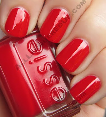
 Lollipop is unique in that it applied like a glaze. Not jelly-ish and not creamy more like a lip gloss. Though in spite of its texture the color is opaque in two coats. Very unusual and candy-like for such a traditional red hue.
 Mint Candy Apple is the pièce de résistance. You know how I’ve swooned over the other mint greens to date and this one is in a class all its own. This really does look like pastel after dinner mints. Oh how I love those. So delicious and melty in your mouth. This beauty is creamy, slightly blue and unfortunately for your wallets, utterly unique. Even though it took three coats for a completely even, opaque finish, I. Don’t. Care. It’s gorgeous!
I swatched it next to every mint green I own and not a one comes close. Lined up against its predecessors it totally stands out.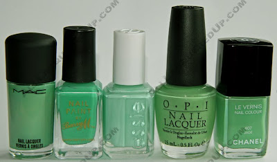
The Essie Winter 2009 collection launches in November though I’ve heard rumors that it will go on sale on Essie.com tomorrow October 15th.
What do we think Fanatics? Who’s up for mint green-a-palooza this winter?
butter LONDON Fall-Winter 09 Swatches & Review
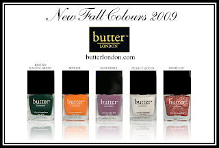 I’ve been champing at the bit to get my hands on butter LONDON‘s British Racing Green ever since I eyed it backstage at Vena Cava during Mercedes-Benz Fashion Week last February. A couple months ago we got a peek a the rest of the Fall/Winter collection and now I finally have it in my hot little hands.
A set of five diverse and unique shades, Creative Director Nonie Creme designed this collection to give women colors with personality that punch up the muted tones seen on the runways. Check them out after the jump!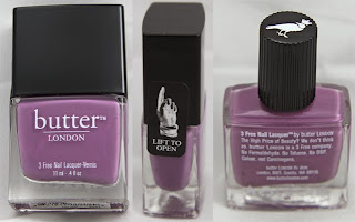 First off, let’s talk about what’s new for Fall 2009; a revamped butter LONDON bottle. Hearing your criticism regarding the hard to remove outer cap, bL has replaced it with an easy glide version. No longer shall we debate whether you’re supposed to polish with the outer cap on or off. The decorative raven printed on the inner cap solves that mystery.
Now on to the polish. The formula with these is on par with a couple noted exceptions. Rosie Lee, being a clear based glitter, required three coats as did Pearly Queen (the frosty white). Unfortunately my travel schedule to NYC limited my time so rather than wait until next week when I return, I did some quick one finger swatches for you.
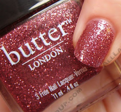
Of course I had to do a full mani with British Racing Green. How could I resist?? The shade reminds me of a vintage MG convertible only better because of the shimmer. We’re not talking standout sparkle but the shade is so vivid that even in incandescent light I can pick up on it. Hand this polish a prize because it’s a winner!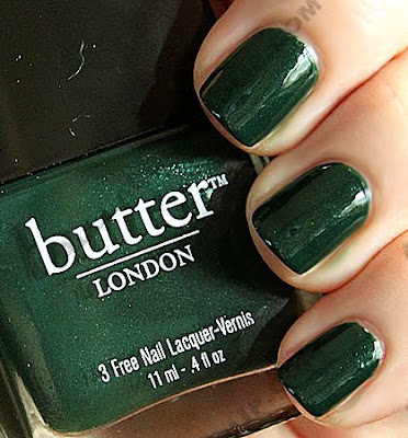 The name Rosie Lee kind of speaks for itself. A sweet, dazzling rosy pink it becomes foil-like in the sun.
 Scoundrel is a medium reddish lilac creme that’s just dark enough for me to avoid “alien hand” syndrome. It’s not bright but it definitely has a kick!
 Can you say pumpkin? Minger‘s warm undertones give this nontraditional fall bright a sesonally appropriate feel.
 Pearly Queen is my only disappointment in the bunch. It’s plagued with brush stroke issues and the hue just doesn’t work on me. To put up with brush marks I better LOVE the color.
 The butter LONDON Fall/Winter 09 collection retails for $14/ea or get the Fashionista’s Favourites Fall 2009 pack and receive all 5 polishes for $45. The collection is on sale now at butterLondon.com and coming soon to Beauty.com.
What do we think Fanatics? Are you dying over British Racing Green like I am? Which fall bL’s do you plan to purchase?
Chanel Jade Nail Collection Swatches & Review
OPI Matte Collection Review, Swatches & Comparisons
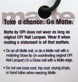
 When I got my hands on the new OPI Matte nail polishes, I immediately started swatching them on my fingers. This was my first time using a true matte polish and all I could say was, “Wow, that’s MATTE alright!” I’ve never seen anything like these before. Think about dipping your fingers in flat wall paint and that’s the look we’re talking about here fanatics. Not at all like the satin-esque finish I got from using Orly Nails For Males top coat for my matte & glossy nail art experiment. It’s like the black hole of nail polish, no light lives here. When I got my hands on the new OPI Matte nail polishes, I immediately started swatching them on my fingers. This was my first time using a true matte polish and all I could say was, “Wow, that’s MATTE alright!” I’ve never seen anything like these before. Think about dipping your fingers in flat wall paint and that’s the look we’re talking about here fanatics. Not at all like the satin-esque finish I got from using Orly Nails For Males top coat for my matte & glossy nail art experiment. It’s like the black hole of nail polish, no light lives here.
I’ve got swatches, a full review and comparison shots for you after the jump! |
Alpine Snow Matte is the polish version of painting Wite-Out to your nails. It’s chalky and blindingly bright. I know you’ve weighed in on the matte look but what do you think about OPI’s version? Will you be running out to buy them?
 Even though original Alpine Snow is used as a french tip shade, next to the matte version it looks almost off white. Now because Orly Matte has a tinge of color to it, it altered the color of Alpine Snow making it more creamy.
 Gargantuan Green Grape Matte is also very chalky and as much as I love a green, I’m not in love with this. It reminds me of a faded dried out pressed leaf. Unfortunately I don’t own the original version (I know, I know sacrilege) so I can’t compare them for you.
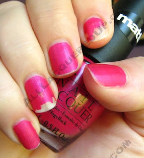
 As much as I’m not a pink girl La Paz-itively Hot Matte is my favorite polish in the collection. It’s the shimmer in it that gets me, making the finish a bit more satin than the rest.
 As you can see La Paz Matte is NOTHING like the original. La Paz is a hot pink but the matte version is more rosey and deeper in hue. Both colors are actually more vibrant in person but my camera just can’t capture that.
 I showed you You Don’t Know Jacques Matte in my second matte/glossy nail art experiment but here it is on its own. Is it just me or does it look like I rubbed dirt on my nails? I don’t hate the color but the finish just isn’t doing it for me. It doesn’t have the same uniqueness as the original (below).
 Lincoln Park After Dark Matte is the same almost black plum that the world has come to know and love. In most light it looks pretty black, in natural/sunlight you can see the purple undertones. It’s warmer than a flat black just like it’s shiny finish sister.
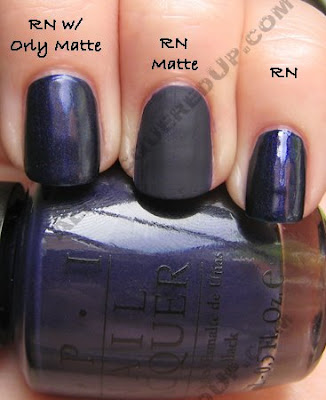
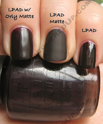 Now after seeing La Paz Matte I had high hopes for Russian Navy Matte, expecting that same slightly satin, shimmer-filled finish. But that’s not what we got. Instead it’s a lifeless blue-black hue.
 In this case, I much prefer the satin version using Orly Matte.
The OPI Matte collection officially goes on sale in July and can be found online at our fave e-tailers and in professional salons like Regis, ULTA, Trade Secret, JCPenney.
Sally Hansen HD Hi-Definition Nail Color – Part 2
 Last week I showed you the first half of the new Sally Hansen HD Hi-Definition collection and now I’m wrapping up the back end and including a couple comparisons for you. Last week I showed you the first half of the new Sally Hansen HD Hi-Definition collection and now I’m wrapping up the back end and including a couple comparisons for you.
I should note that I was not aware that there are actually eight shades in the collection. A reader pointed out that I am missing a pink named Digital. I incorrectly assumed that Opulent Cloud was the eighth polish in this lineup but it will actually launch closer to fall. Check out the rest of the colors, after the jump! |
Lite has got to be one of my favorite yellows of late. It’s the yellow brick road in a bottle. I love how it glows on the nail and its pigmentation is way more impressive than its HD sisters.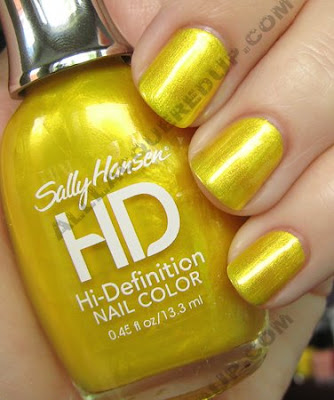 Looking through my collection of yellows, OPI Lemonade Stand By Your Man is a very close twin to Lite. The only major difference is opacity. After three coats, the OPI still has a VNL (visible nail line). And just for funsies I threw in China Glaze Yell-O-Neil which is way more French’s mustard than the rest.
 Three D is a warm coral that flashes hot pink. It’s not quite as vibrant as the other HDs and therefore not really wow-tastic. Of all the colors in this collection, this is the one I’d pass on.
 Hi Res is much more rosy in person and extremely vivid, not an easy one to capture. It’s packed with pigment so three coats were barely necessary, though I did it anyway for consistency.
 After seeing Blu in part one, reader moonchaii asked to see it next to Illamasqua Fern and China Glaze Frostbite. I’d say it falls somewhere in between the two.
The Sally Hansen Hi-Definition Nail Color collection ($5.95) officially launches in July at drugstores and mass retailers like WalMart, KMart and Target though readers have already begun spotting them on shelves around the country.
So now that you’ve seen all the shades, which ones are your favorites? Which ones are a pass?


