Pink
Givenchy Maharani Pink for Spring-Summer 2009
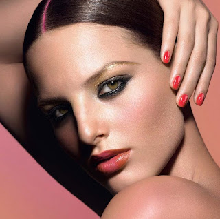 After falling in love with my first ever Givenchy polish during the holidays, I was excited to see what Spring/Summer would bring. Inspired by vibrant Indian saris and Bollywood screen sirens, Givenchy’s artistic director Nicolas Degennes created a stunning palette of pinks and oranges that are truly covet worthy. After falling in love with my first ever Givenchy polish during the holidays, I was excited to see what Spring/Summer would bring. Inspired by vibrant Indian saris and Bollywood screen sirens, Givenchy’s artistic director Nicolas Degennes created a stunning palette of pinks and oranges that are truly covet worthy. |
For such a tiny bottle, Maharani Pink packs quite a wallop. I’m so, so in love with the formula. It’s got that kind of thick jelly consistency but it flows, oh how it flows. And the pigmentation is spot on. Two coats and you can put a fork in it. Will you just look at that shine? It feels wrong to add a top coat to a polish that looks like this.
Maharani Pink is a warm coral pink leaning towards carnation. I love that it’s vivid without being “bright.” You all know I’m not that much of a pink girl yet here I am, all giddy-like over this totally not me shade. It’s all in the finish, I’m telling you.
Of course I understand that shelling out $15 for bottle of lacquer isn’t in everyone’s budget so I looked to the ALU stash for alternatives. Now even though the Sally Hansen is a LE DC’d shade, it’s the only similarly hued jelly I could find. I only swatched it to show off the pigmentation in Maharani Pink. I’d say MP’s closest dupe is CND Flare though its finish is more creamy. A very different overall look.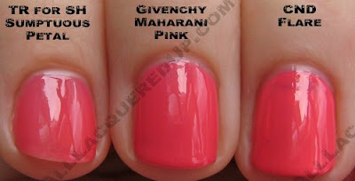 The Givenchy Spring/Summer collection is scheduled to release in February. Vernis Please! lacquers retail for $15/ea and can be purchased online at Sephora.com
 or at Sephora locations throughout the US.
What do we think? Yay or Nay?
Zoya Twist Collection for Spring 2009
 You kids know how into the whole gray trend I’ve been. Since last spring, I’ve told anyone who will listen about how amazingly cool gray looks on nails. Of course it didn’t really hit until last fall (look at me being ahead of the game!) and I’m pleased to see it carrying over to spring in Zoya’s newest collection, Twist. You kids know how into the whole gray trend I’ve been. Since last spring, I’ve told anyone who will listen about how amazingly cool gray looks on nails. Of course it didn’t really hit until last fall (look at me being ahead of the game!) and I’m pleased to see it carrying over to spring in Zoya’s newest collection, Twist.
Like I mentioned in the preview, when I look at Twist, I see a light and airy version of fall’s big trends with a cranberry splash and two traditional pinks thrown in for good measure. Berry lips were big last fall and now we’re seeing that translated to tips for spring. Both OPI and Sally Hansen included a berry creme in their collections. An interesting “twist” for sure. |
Let’s start with my obvious fave – Harley. Harley is a warm mid-tone gray shimmer. The light bronze ribbons of shimmer keep this one from being too cool for the olive skinned girls to pull off. If you haven’t tried gray yet, this is one you’ll definitely fall for.
Harley’s closest living relative is OPI “Sheer” Your Toys though SYT is a bit more blue-gray. I showed it next to Sephora by OPI Run With It! just for comparison’s sake but as you can see, they’re very different animals.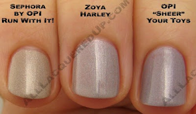
Malia is about as light as I can delve into purples with my skin tone. It’s not love at first sight but it’s a far cry better than what lavender does to me. Malia’s violet hue looks warm next to my skin even though it’s much cooler toned in the bottle. This one gave me some streakiness during application though I was able to smooth it out with very steady strokes.
Moxie is a dream to apply. Zoya’s creme formula tends to give me issues due to its thicker viscosity but Moxie flowed on perfectly. This bold berry really stands out against the other shades in this collection, making it the odd man out yet refreshingly unexpected at the same time.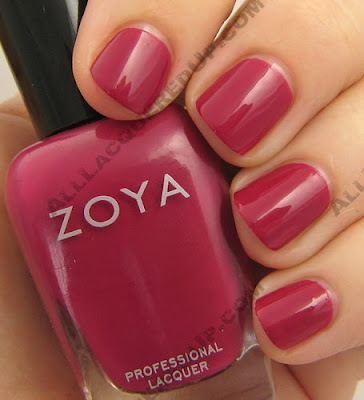
Moxie isn’t the most unique girl at the party with Tracy Reese for Sally Hansen Beet Stain and OPI Miami Beet (from the upcoming South Beach collection) as convincing dupes but I can say that she applies better than the Sally Hansen and is more pigmented than the OPI.
Cassi is a salmon pink shimmer. A nice warm pink for conservative girls and pink fans alike. Two coats gave nice, even coverage.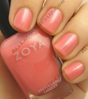
Barbie looks exactly as the name implies, Malibu Barbie pink. It totally reminds me of the pink Barbie convertible I had as a child. Vibrant and cool-toned, there is a subtle hint of shimmer in the bottle but on the nail it’s barely apparent.
Jo is the other big winner in Twist. A total jackpot of a blue. I’d dare to call it cornflower but the subtle way it leans towards purple keeps me from doing so. Whatever you call it, it’s unique, stunning and totally unlike any polish I own. Like Gabriel Byrne said to Winona Ryder (as Jo) at the end of Little Women, “such a little name for such a person,” Zoya’s Jo is such a color.
The Zoya Twist collection is available online at Zoya.com and at salons and spas across the country. Check the salon locator on Zoya’s website to track one down.
So what do we think? What are you loving? Hating? Indifferent about?
Lancome Pink Irreverence – Sassiness & Piha Black
 Of course in my world where all things revert back to Grease, I see pink and black and instantly think Pink Ladies. I mean, can you think of anyone who rocked the pink and black better than Rizzo? Don’t you DARE say Michelle Pfeiffer in Grease 2 or we just can’t be friends anymore. CAN’T. I love me some Grease 2 but it’s so NOT the same thing.
So getting back to the polish. The new Le Vernis lacquers in this collection play up on Aaron’s whole contradictory theme with a delicate sheer pink and inky black sparkler. When I say inky, I’m not kidding. When Piha Black was created, Lancome was not playing. Holy pigmentation, batman! That color is no joke. The formula is aces as well. For a milky sheer, Sassiness has the no streaks thing down. Oh and the flat brush is a winner as well.
Sassiness is meant to be worn sheer but you know me, I have to try and make anything as opaque as possible. With detached nail beds like mine, can you blame me? Unfortunately, even after three coats, we’re still at level sheerness. Perfect for you sheer lovers, not so much for moi.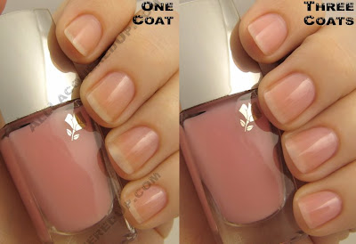
Piha Black totally has that black sand glittering in the sun thing going on without all the grittiness. It’s glassy smooth with evenly dispersed silver speckles.  I put this one head to head against my fave black of 2008, Dior Black Sequins. As you can see, the micro-glitter in Black Sequins is more random and prominent while Piha Black’s shimmer is more even and subtle. Though the color intensity is pretty dead on even.
 Lancome’s Pink Irreverence collection is available now at Lancome.com and your local Lancome counter. Le Vernis nail lacquers retail for $18/ea.
images: flickr.com, leavemethewhite.com, Lancome and All Lacquered Up
MAC Hello Kitty Nail Lacquers
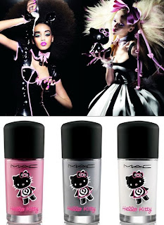 Who’s ready for an early peek at the MAC Hello Kitty nail polishes? You know, I was pleasantly surprised to see that some of you were unaware of the MAC/Hello Kitty collaboration when I previewed it a couple weeks ago. The last thing I want is to inundate you with info you’ve seen a million times before. So I’m really excited to be able to give you an advanced look at the nail lacquers before they hit shelves on February 12th.
For this collection, MAC is debuting two new creme polishes and bringing back Vestral White (creme) from last holiday’s Antiquitease collection. Unfortunately, I gifted Vestral White away so I don’t have it to show you but it’s a true, opaque white. And how utterly cute are those bottles? I’m beyond happy that MAC FINALLY adorned the nail lacquer bottles to match a collection.
What impressed me most about the two new shades is their opacity. They’re both highly pigmented which is fantastic though that raised the viscosity. I ended up needing three coats only to even out the surface because the formula doesn’t do so on its own.
Note: I received sample bottles without the Hello Kitty logo.
On The Prowl has got to be the truest gray I’ve found. Not too cool, not too warm. There’s no blue or brown in its base. If you’re looking for the perfect gray creme, this is it. And before you ask, NO, I don’t think the gray trend is over. I’m still loving it and will be wearing On The Prowl in the coming months. As you can see, On The Prowl falls somewhere between Rescue Beauty Lounge Concrete Jungle and China Glaze Recycle on the gray scale. Though the RBL’s base is more blue while Recycle’s is brown.
Something About Pink is the perfect complement to the Hello Kitty collection’s girlish side. It’s exactly what I would expect to counter the grittier feel of On The Prowl. Something About Pink is a cool toned hot pink that looks even more vibrant in person. The finish is uber-glossy and would make an excellent pedicure shade for summer. Going through my stash, I discovered that I own way more hot pinks that I thought. That was unexpected. Though I don’t have anything that matches Something About Pink dead on but I did find some close calls. OPI I’m Indi-a Mood For Love and NARS Schiap are both a tinge darker but tonally very similar.
The MAC Hello Kitty collection will be available online at MACCosmetics.com on February 10th and hits MAC Counters on February 12th. I know I’ll be online to get a HK adorned On The Prowl and some other goodies. What will you be buying? In case you haven’t seen the rest of the collection, my buddy Jamie was at the preview last November and has additional product images on The Beauty Life.
images: iswii.net and All Lacquered Up
Tracy Reese for Sally Hansen Spring 2009
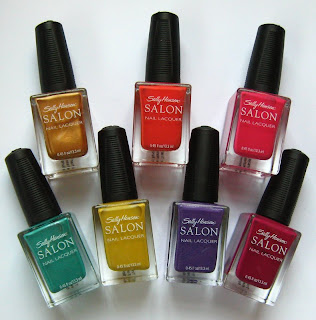 Are you kids ready to dive into Spring? I know I am. I’ve been sitting on the Tracy Reese for Sally Hansen Spring collection for way too long and I’ve been dying to gush. With a heavy floral inspiration these shades came straight from the runway to the bottle. I couldn’t be more excited about these polishes if I tried. Every one is a winner. Even the yellow! Are you kids ready to dive into Spring? I know I am. I’ve been sitting on the Tracy Reese for Sally Hansen Spring collection for way too long and I’ve been dying to gush. With a heavy floral inspiration these shades came straight from the runway to the bottle. I couldn’t be more excited about these polishes if I tried. Every one is a winner. Even the yellow!
You know, I’m not sure why but every time I use a creme from the SH Salon line, I am so impressed with the formula and how it applies. As if I didn’t already know how fantastic it is. It’s so weird. I’m sitting there, painting my nails thinking, “My word, this is outstanding! Why am I not wearing these more often?” Riddle me that and you win a prize (not really but you know what I mean). Seriously, these polishes are all hyper pigmented, smooth and glossy. The hues are vibrant. The tones are true to bottle color. Shall I go on? I could just keep yammering away but seeing will make you a believer. |
Tassel was the shade selected for the Tracy Reese runway show. This rich, warm gold was the perfect neutral complement to Tracy’s designs. You have no idea how happy I am to find a metallic that applies smoothly. No brushstroke city. No streaking or unevenness. I did need three coats to get it opaque and perfect but it was worth it.
I showed you Night Hydrangea in a NOTD post a few weeks back. For me, this is pretty much the perfect purple shimmer. It’s that elusive “purple in every light” we’re all looking for and it does so without hitting neon territory. I KNOW tons of you will be hunting this one down.
Nasturtium brings out my love of coral that has been hiding the past few years. You don’t even know I was such a coral fiend. One of my first bottles was Essie Carousel Coral and it set me off on a streak for pretty much an entire summer. Nasturtium is just so effortlessly spring and casual that I can’t help but love it.
Honeydew – THANK YOU Tracy Reese for throwing in something for us green lovers. It has this light, watery feel that isn’t full on green yet not blue either. Does that make it teal? Aqua? Blue-green? Green-blue? Does it matter? It’s stunning! Naturally, Honeydew is the shade I popped open first and all I could say was, “come to momma you gorgeous thing!” This is the only one whose shimmer does more than add depth. It’s clearly visible.
When I saw Forsythia, all I could think was, “Oh no! Pantone’s color of the year, Mimosa, has leaked into the polish world!” My polish fears had come true. But you know what? Forsythia is a lot less golden than Mimosa and much more flattering than I expected. Its muted tone differs from the day-glo yellows we’ve seen in years past. Is it the easiest shade to pull off? No but I’m oddly drawn to it.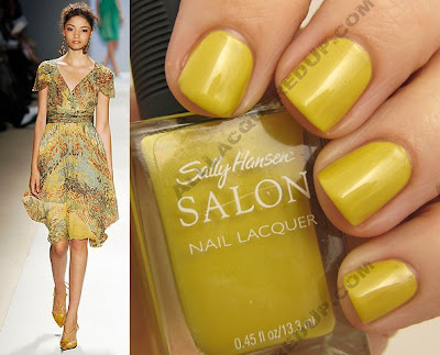
Beet Stain is a kissing cousin to Fall’s Night Lily, only a tinge more red so, if you missed out on it last season, now is your chance. It seems the berry trend that was so prominent in makeup last season is carrying over to spring for nails. Zoya put one in their spring collection as did OPI.
Azalea is a bold red-pink creme. It’s a bit softer than what you’d think of as a “hot pink.” A perfect pedicure shade for when we finally get to break out our sandals. The Tracy Reese for Sally Hansen Spring color collection is set to hit shelves in March but you know the drill. These babies aren’t easy to find and when they finally go on sale, they’re gone in a flash. So keep your peepers on your local drugstore displays and let us know when you find them. We all want to know!
images: Vogue UK, Janice from Specktra.net and All Lacquered Up


