Purple
Sally Hansen HD Hi-Definition Nail Color – Part 1
 Remember the Sally HD Hi-Definition line I told you about back in March? Well the wait is almost over. The collection will be on store shelves soon, July to be exact, and come in a rainbow of shades. The Tracy Reese designed, Opulent Cloud (click to view), will launch along with seven vivid, liquid crystal filled polishes. Remember the Sally HD Hi-Definition line I told you about back in March? Well the wait is almost over. The collection will be on store shelves soon, July to be exact, and come in a rainbow of shades. The Tracy Reese designed, Opulent Cloud (click to view), will launch along with seven vivid, liquid crystal filled polishes.
Are you scratching your head about how HD and nail polish go together? Unlike other HD beauty products, this isn’t going to make your nails look slimmer or flawless like a high def foundation intends to do. It’s working off the theory that liquid crystals, like those used in Hi-Def LCD TVs, will produce a true, vibrant multi-dimensional hue. Take a peek at the first half of the HD rainbow after the jump! |
The first thing I noticed about the formula is how thin and smooth it is. Using the same bottle shape and brush as the Lacquer Shines, the polish applies extremely even and dries quickly. The only downside is the pigmentation. I needed three medium coats to go opaque and even though it dried glossy, the first and second coats were a bit satin-esque. Odd. The overall finish looks like a cross between metallic and shimmer. It’s not all that brush-strokey yet not 100% blended either.
The end result is stunning. When Sally Hansen says vivid, they aren’t kidding. It’s not that the actual hues are uber-unique it’s just that they’re so alive. Pictures really can’t do justice to the vibrancy. The shades play with the light, changing at each angle. Not necessarily a duo-chrome effect more like they’re lit from within.
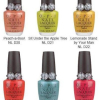
Cyber is a shimmering grape with a slight pink undertone. You know I love a purple so I’m all over this one.
Blu was the hardest shade to capture. To quote Danny Zuko, “it’s electrifying!!!”
Pixell Pretty is a pretty true Turquoise, a little bluer than Honeydew.![]()
Hi-Def is a bright green apple that reflects gold. I can’t tell if it’s just the liquid crystals catching the sun or if there is actual gold shimmer in the color but it’s a very fun. The Sally Hansen Hi-Definition Nail Color collection ($5.95) launches in July at drugstores and mass retailers like WalMart, KMart and Target.
Stay tuned for my review of the second half of the collection. In the meantime, what do we think? Is HD the future of polish or just a gimmick? Are there any colors you’re just dying to own?
New Nail Paints from Barry M
 You know what I love about Barry M’s Nail Paints? The names! I LU-ove the simplicity of their naming system. Tangerine, Racing Green, Red Wine, Orchid, etc. Don’t get me wrong; fun, tongue-in-cheek names are great too but when I have to rack my brain to remember what the actual polish color is because the cutesy name has nothing to do with the color, it’s frustrating. There’s nothing hard in remembering Coral. You know what I love about Barry M’s Nail Paints? The names! I LU-ove the simplicity of their naming system. Tangerine, Racing Green, Red Wine, Orchid, etc. Don’t get me wrong; fun, tongue-in-cheek names are great too but when I have to rack my brain to remember what the actual polish color is because the cutesy name has nothing to do with the color, it’s frustrating. There’s nothing hard in remembering Coral.
So recently Barry M released some new Nail Paint shades; Mint Green, Bright Purple, Fuchsia, Block Orange, Acid Yellow. After hearing about Mint Green being a dupe for one of the season’s must-have but sold out shades, MAC Peppermint Patti, I had to see for myself. Check it out, along with Bright Purple and Cyan Blue, after the jump! |
As I said the last time I reviewed Barry M, the formula is thick with pigment but it flows evenly on the nail. Mint Green did need a third coat but the others were perfect in two.
Mint Green isn’t a dead on MAC P.P. dupe but it’s close enough that you’d have be looking for the differences to notice. For me, it’s actually better than P.P. because of the formula. Mint Green applies like a dream which makes it the winner in my book.
 Cyan Blue is exactly as the name implies, it’s the shade on the outside of the cyan printer refill box. I went looking for an existing polish that’s even remotely close and came up empty handed. If you took China Glaze Aqua baby and added a bit of white and a drop or two of blue, like OPI Just Groovy, you may come close. To make a long story short, I LOVE IT!
 Bright Purple is a vivid, Barney-esque hue, only without the annoying songs and children following it around. It’s uber glossy, perfect for summer toes and a great addition to my collection.
Nail Paints by Barry M retail for £2.95 and can be purchased online directly from BarryM.com. The £8 US Shipping charge is a bit prohibitive but get a group order going or save up for a major haul and it’s worth it. Trust!
Have any of you tried Barry M since I first reviewed them? What do you think?
OPI Bright Pair with Paige Premium Demin
 This spring and summer, color meets fashion as OPI’s brightest new shades for nails “pair up†with Paige Premium Denim. Bright Pair by OPI includes six trend-setting new Brights by OPI Lacquers, which perfectly match the bright new hues of Paige’s Roxbury Ankle Skinny and Canyon Shorts.When I first previewed the Bright Pair collection I was unsure of how this latest addition to the Brights by OPI summer collections would stack up against seasons past. Especially considering how much I loved the Mod Brights from last year. This spring and summer, color meets fashion as OPI’s brightest new shades for nails “pair up†with Paige Premium Denim. Bright Pair by OPI includes six trend-setting new Brights by OPI Lacquers, which perfectly match the bright new hues of Paige’s Roxbury Ankle Skinny and Canyon Shorts.When I first previewed the Bright Pair collection I was unsure of how this latest addition to the Brights by OPI summer collections would stack up against seasons past. Especially considering how much I loved the Mod Brights from last year.
This year OPI added a twist by teaming up with Paige Premium Demin to create a line of six shades to match the bright hues of Paige creator Paige Adams-Geller‘s summer palette. Read on to check out the polishes and pics from the launch party hosted by the Ron Herman boutique in West Hollywood. |
Rescue Beauty Lounge – Light & Bright
 I love getting little boxes in the mail. Some of you may recall that the boyfriend dubbed me, L.B. after all the “little boxes” that end up on our doorstep due to my fanaticism. So when I came home to not one but two little boxes in the same week from the Rescue Beauty Lounge sales, you can imagine my delight. Tearing through packages to uncover my new treasures. Wanna see what I hauled? Check out the first half after the jump! I love getting little boxes in the mail. Some of you may recall that the boyfriend dubbed me, L.B. after all the “little boxes” that end up on our doorstep due to my fanaticism. So when I came home to not one but two little boxes in the same week from the Rescue Beauty Lounge sales, you can imagine my delight. Tearing through packages to uncover my new treasures. Wanna see what I hauled? Check out the first half after the jump! |
Bikini Bottom is a sweet, watery, pastel blue jelly. It’s not intended to opaque so just be warned that it takes a good four coats to look as it does below. The whole Spongebob inspired collection was meant to be worn sheer. I’m just not down with the sheer angle so I’ll weather the extra coats to get this gorgeous look.
Purple Haze surprised me. I expected it to be lighter, more lavendar (i.e. hideous) on me. I ordered anyway to see if I’d luck out with a winner. Luck out indeed!! I LURVE it!! The creamy, glossy finish. The mid-tone violet hue. It’s all working for me in a major way. How did I not own this sooner? How? The boyfriend says I look my best wearing purple and I actually own a top this shade that he loves me in so I know he’ll love this on me too.
Don’t be fooled by the pictures, Yellow Fever is a problem child. I’ve never had a RBL shade give me application issues until this baby walked into my life. Love the shade, love the slightly shimmery finish. LOVE! But what I don’t love is the three coats and streaking I encountered. It’s not insurmountable, obviously, I was just disappointed. I’ll be sharing the second half of my haul with you soon but in the meantime… for those of you that ordered from the RBL sale, how are you liking your hauls? Which shade made you all giddy-like? Share!
Kicking Off Finger Paints Week
 I am officially declaring this first full week of May Finger Paints Week. Why? Because I can. You see Finger Paints recently introduced 16 new shades to their permanent collection and instead of reviewing them all at once, which would be a LOT of work, I’ll be sharing a few of them with you each day this week.First up, the blues and purples. Check them out after the jump! I am officially declaring this first full week of May Finger Paints Week. Why? Because I can. You see Finger Paints recently introduced 16 new shades to their permanent collection and instead of reviewing them all at once, which would be a LOT of work, I’ll be sharing a few of them with you each day this week.First up, the blues and purples. Check them out after the jump! |
I’m on a Finger Paints roll lately, huh? My love affair with Finger Paints has resurfaced and it’s been like reconnecting with an old friend. It’s like no time has passed and you wonder how you ever let this beautiful friendship fade. Well fear not my pal FP, we’re so besties again.
You’ve heard me rave about the smooth silky FP formula, how evenly it applies and these shades are no different. They did require three thin coats to achieve opacity but it’s a small price to pay for color this fab and affordable.
It’s An Original is what I expected (hoped) Chanel Vendetta to look like. A deep rich purple with a hint of shimmer. It leans a bit blue, definitely cool based.

Lavender Highlight is a lavender I can get behind. Most of you know my issues with light lilac and lavender. Love them in the bottle, hate them on me. This color is fills that void in my stash yet it’s dark enough to prevent me from looking alien. LOVE IT!

Art Dealer Teal-er is the greener cousin of FP Sunburst Summer shade, Turquoise Tile. Very similar in finish and feel. It’s as though a few drops of jade fell in a vat of Turquoise Tile and the brains at FP went with it.

Artistic Azure is a shimmery persian blue that has a slight sandwashed feel. Its base is a very vibrant and electric blue that calms to a deeper hue with added layers.
 All of these new Finger Paints shades are available now at Sally Beauty Supply and SallyBeauty.com. Though before you head out to the store, make sure you visit the SallyBeauty.com site to print off your Buy 2 Get 1 Free coupon (exp 5/31/09). And stay tuned as Finger Paints week continues.