Red
RGB Cosmetics Fall 09 Swatches & Review
China Glaze ‘Loves You Snow Much’ Holiday Swatches & Review
 “If it ain’t broke, don’t fix it.” That seems to be the China Glaze adage for Holiday 2009 and I totally get it. I mean how much did we all freak out over Emerald Sparkle? It’s the ultimate in green glitter gorgeousness. And how many of you regretted not getting a backup?
Well China Glaze obviously “Loves You Snow Much” to bring it back with a brand new friend. They’ve expanded last year’s Sleigh Ride trio of Tinsel, Ruby Pumps and Emerald Sparkle to include the way apropos 5 Golden Rings. Check out the new kid on the block and refresh your memory as to why Emerald Sparkle is an utter must-have.
Lancome La Collection Lollipop – Beauty for a Cause
 Lancôme’s La Collection Lollipop was previewed at the Chris Benz presentation during NYFW in September. I got my first glimpse of this charity inspired collection when two of the polishes graced the models’ fingers and toes at the show. Lancôme’s La Collection Lollipop was previewed at the Chris Benz presentation during NYFW in September. I got my first glimpse of this charity inspired collection when two of the polishes graced the models’ fingers and toes at the show.
Created to benefit the Lollipop Theater Network, the collection consists of three sets of Color Fever Gloss and Le Vernis in matching shades. Learn more about the Lollipop Theater Network and check out these adorable gloss & polish sets after the jump! |
Essie Winter 2009 Sweet Time of The Year Swatches & Review
For Winter, Essie wanted something whimsical, fun and refreshing. She created these confections with that in mind. Rock Candy is your typical Essie pink sheer. It’s a bit milky and I ended up using three coats to get it even. You know I’m not one for sheers so it’s not really my style.
 Lollipop is unique in that it applied like a glaze. Not jelly-ish and not creamy more like a lip gloss. Though in spite of its texture the color is opaque in two coats. Very unusual and candy-like for such a traditional red hue.
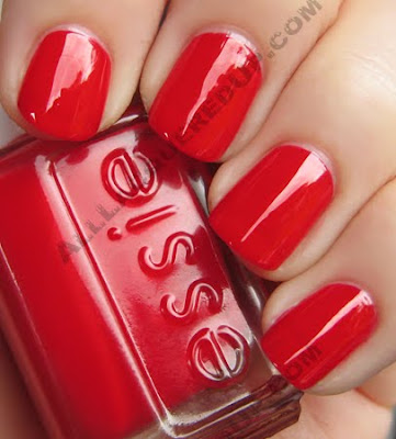 Mint Candy Apple is the pièce de résistance. You know how I’ve swooned over the other mint greens to date and this one is in a class all its own. This really does look like pastel after dinner mints. Oh how I love those. So delicious and melty in your mouth. This beauty is creamy, slightly blue and unfortunately for your wallets, utterly unique. Even though it took three coats for a completely even, opaque finish, I. Don’t. Care. It’s gorgeous!
I swatched it next to every mint green I own and not a one comes close. Lined up against its predecessors it totally stands out.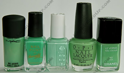
The Essie Winter 2009 collection launches in November though I’ve heard rumors that it will go on sale on Essie.com tomorrow October 15th.
What do we think Fanatics? Who’s up for mint green-a-palooza this winter?
StrangeBeautiful Color Volume 3 Review & Swatches
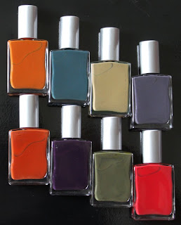
 To be Strange is to be Beautiful. This is the concept behind the StrangeBeautiful line of nail polish and it’s what makes their libraries of color so intriguing. Founder Jane Schub‘s love of art, architecture and design has been translated into a set of eight seasonal hues that I can only describe as achingly unusual.I’ve long said the reason I adore nail polish and started this site is because of my lifelong obsession with color. That while I don’t wear a lot of colorful clothing, I express my creativity and mood through nail color. This is why I was immediately drawn into this 3rd Volume of color from StrangeBeautiful. I swear I must have sat, staring at the polishes, for a good fifteen minutes remarking over and over how wonderfully brilliant and unique a collection this is. Let’s explore this new-to-me brand after the jump! To be Strange is to be Beautiful. This is the concept behind the StrangeBeautiful line of nail polish and it’s what makes their libraries of color so intriguing. Founder Jane Schub‘s love of art, architecture and design has been translated into a set of eight seasonal hues that I can only describe as achingly unusual.I’ve long said the reason I adore nail polish and started this site is because of my lifelong obsession with color. That while I don’t wear a lot of colorful clothing, I express my creativity and mood through nail color. This is why I was immediately drawn into this 3rd Volume of color from StrangeBeautiful. I swear I must have sat, staring at the polishes, for a good fifteen minutes remarking over and over how wonderfully brilliant and unique a collection this is. Let’s explore this new-to-me brand after the jump! |
The formula is 3-Free, including Formaldehyde Resin, highly pigmented and flows smoothly on the nail drying with a high gloss finish. The 220 strand brush is thin, long and pliable, easily spreading out for the perfect three stroke application. Like I said, the polish is pigmented, even the lighter shades, so you only need two coats to achieve complete opacity.
What I find interesting is that because the polishes are sold as a library, the individual shades are unnamed. They are also produced once in extremely limited edition so when a volume sells out, that’s it.
Because the inspiration for each color is so specific, and there aren’t descriptive names for each polish I thought including descriptors straight from StrangeBeautiful would be helpful in understanding the concept.
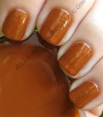
The saturated rusty iron color of an Irish bog caused by the reaction between tannin, wood and iron. The rich warm color of this polish reminds me of the peanut sauce that comes with chicken satay. It’s definitely best suited to a neutral or warm skin tone but I love its fabulous fall feel.
The veins of green mold running through Roquefort. I’m sure I don’t have to tell you that this deep teal green was the one I rushed to put on first. My love of all things green is infinite and there’s something about the aged feel of this hue that I can’t get enough of.

The dreadfully wonderful dirty almond color used on kitchen appliances. Growing up in a home that reveled in the 60s avocado, almond, red shag aesthetic, this shade takes me right back to the adorable ranch-style house I grew up in that my Dad built for us.

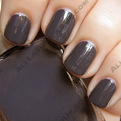
The belly of a pigeon. I suppose I’m fortunate to say that I haven’t been up close and personal with a pigeon though I doubt the Lake Erie seagulls are any less annoying. Regardless this moody, lilac tinged gray is so me it’s not even funny.
Aged Armagnac. There’s something about this burnt sienna that makes me long for a bonfire, hot cider and the smell of pumpkin pie on a cool, fall night.

The artist Sean Scully. Deep and vampy, this dark plum looks like Grape Dimetapp in the bottle but dries pretty dark on the nail. Think OPI LPAD.

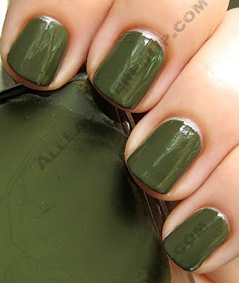
The rich black olive green color of Loden cloth. Hellooooo luvah!! There just aren’t enough mossy, olive greens in this world for me. So even though I own RBL No More War and Illamasqua Hectic, I love that this Swamp Thing hue is less yellow based therefore much more wearable on a range of skin tones.
The dull brown red of Redrope files. I truly wish the creaminess and slightly browned base of this red had translated better on camera. It’s very luscious and rich in person.
 Color Volume 3 from StrangeBeautiful is available now on LuckyScent.com. The library of 8 shades retails for $79, which is less than $10 each.
Who has tried StrangeBeautiful before? Thoughts? How do you feel about these colors and that they come as a set?
