Red
Dashing Diva Fall Collection 2007
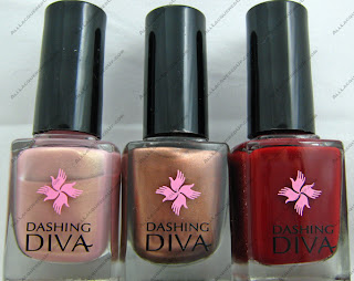 For Fall 2007 Dashing Diva has put together a palette of warm comforting shades that reflect the colors of the season. Instead of bombarding us with an overload of new polishes they chose to remain focused and deliver three distinct lacquers.
As with all the Dashing Diva shades I’ve worn in the past, the formula is smooth and free flowing; it doesn’t pool or streak. And I really must commend the pigmentation of their darker colors. The ones I’ve tested are one coat colors and, for a red, that’s a major feat without sacrificing formula consistency.
Champagne Nude is a hard shade to describe. Is it a dusty pink with peach and gold shimmer? Is it a metallic champagne that leans toward pink? Is it a shimmery nude? I really can’t decide. One thing’s for sure, it’s a unique shade with chameleon-like properties and a must have for my light tip lovers.
 Bronze Bombshell flashes both cool and warm depending on the lighting due to it’s champagne and silver shimmer. It’s a warm mocha hued metallic that doesn’t leave brush marks. Any metallic that can accomplish that is a winner in my books but the shade itself doesn’t do much for me personally.
 Black Raspberry lives up to it’s name. A deep berry based red creme, it dries to a high gloss shine without a top coat.
 Dashing Diva polishes are available on the Dashing Diva website and at Dashing Diva salons.
Essie Winter 2007 Preview
OK so I know I teased you with a lot of new goodies coming down the track but things have been absolutely insane. Does anyone want to join me in my fight to take down Time Warner Cable. They are evil, evil people and have made my life hell for the past few weeks. Things are still not resolved but I will battle on.
I did have time to snag some bottle pics of the new Essie collection for Winter 2007/2008. Styled to go with the glam styles and metallic accents seen on the runways for fall, this collection is filled with glitzy reds, gunmetal and pewter and, of course, a signature nude cream.
from l-to-r:
nude attitude – antique nude cream
steel-ing the scene – medium brushed pewter
over the top – dark metallic gray
who’s she red – four-alarm creamy crimson
wrapped in rubies – rich gold-dusted burgundy
showstopper – shimmery deep berry
I’ve only had a chance to swatch a few and so far Over The Top is a big winner as is Showstopper. I promise to have swatch pics up soon.
Lippmann Collection Fall 2007
 The new fall shades from Deborah Lippmann’s Lippmann Collection, I Want Candy and Rehab, are a departure from what you would normally expect to see for the fall season. They’re sheer with a jelly finish and very unique. The most versatile fall polishes I’ve seen in a while. The formula makes these bold shades something that a sheer fan can wear comfortably but buildable enough to please opaque wearers. If you want to learn more about jelly finish polishes, check out this fab article my pal Melanie wrote for Blogdorf Goodman.
I have to admit that when I saw Rehab in promotional photos I got all excited about finding a great navy creme. There are a lot of beautiful navy polishes out there but very few cremes. And then I heard about Rehab’s sheer quality and my heart sank. I wasn’t looking forward to testing it because I didn’t want to give a bad review of a blue. I love blue polish. So you can imagine my joy and surprise when I gave it a test run and discovered the exceptional glossy finish and pigmentation.
Here is my Rehab mani with 2 coats of lacquer. It’s more subtle, I’d call it a cornflower blue.

And here is 4 coats. Beautious navy goodness.

I Want Candy, as a sheer, reminds me of the Revlon Glimmer Gloss Strawberry Sizzle but without the glitter and a much prettier finish. With four coats, it reaches bottle color which is a great candy apple red. Both I Want Candy and Rehab apply smoothly without streaking so it’s easy to achieve a sheer or opaque look that is clean and even.
Here is I Want Candy with 2 coats of polish.

And with 4 coats.

Ok so the question I’m sure a lot of you are asking is, are they worth it? You know that I’m frugal, that spending $15 on polish is not my M.O. However, I do feel that for blue lovers Rehab is worth every penny. I can honestly say I don’t have another color like it and I own a LOT of blue polish. If I could find a less expensive alternative, I’d tell you. Now I Want Candy is one I’d personally pass on at retail price. But for people that love red as much as I love blue, go for it! If you have the means and love the finish, it’s a great shade but not one I’d consider a “must have” for my collection.
Alright lovelies, now it’s your turn to chime in. Share your thoughts on these shades.
Zoya Holiday 2007 – Utopia
 Releasing in November for the holiday season, the Utopia collection from Zoya is a group of fun, bold shimmering metallic shades that will add a splash of color and glitz to those dreary gray winter days. And All Lacquered Up is fortunate to be the very first to see it, outside of the Art of Beauty family.
This is going to sound silly but whenever I hear the word Utopia I think of that Drew Barrymore movie Ever After. It’s a feminist take on the tale of Cinderella and in it the heroine (played by Drew) loves the book Utopia by Thomas More. I still have my copy of Ever After on VHS and even though I haven’t had a VHS player hooked up in years, I refuse to get rid of it. I love that movie.
Ok, so either someone at Zoya loves me or green nails is a trend that I didn’t see coming. Of all the jewels tones green is the color I least expected to become mainstream. Outside of our small online nail community I’ve never seen anyone else wearing it. But you certainly won’t hear me complaining. Bring on the greens!
My one and only complaint with this collection is the pigmentation. The majority of the lacquers needed three coats to become completely opaque and achieve the bottle shade. Similar to Suvi and Kotori from the Downtown Collection. I wonder if it’s because the extra pigment would thicken the formula and Zoya’s polish is already thicker than the typical non-Big 3 Free brands.
Austine is a muted brushed gold. On the nail it has the appearance hammered metal and the silver shimmer keeps the color from becoming too peach. Austina is more metallic than shimmery which sets it apart from the other shades in Utopia but thankfully it doesn’t affect application.
Tama is the least “me” shade of the bunch. I’m not anti-pink or brights but I feel there’s something in this shade that doesn’t work with my skin tone. It’s a pretty color and definitely more rosy in the sun but it’s just not something I would intentionally buy for myself.
Kamilah is luscious crimson shade with a hint of gold shimmer that comes out in sunlight. As you can see in the individual swatch pics of this and some of the other shades, these polishes seem to have a slight duochrome effect. The color doesn’t completely change but it’s definitely more intense in direct light.
In the bottle Juno looks very much like a duochrome. The polish looks blue all along the edges of the bottle, similar to how Ki looks in the bottle. However on the nail, the blue isn’t that apparent which is a shame. A purple/blue duochrome would be amazing. Of all the purples I have, I feel that Juno will make my top 10 for sure, possibly even top 5. It has incredible depth, pigmentation and gloss. If you love purple, get Juno.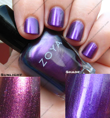
Akyra reminds me of a peacock feather. It’s not as bright but in the same vein. In the sun the green takes dominance and it’s the green that makes Akyra different than Kotori.
I saved the best for last. Irene is a stunning mossy sage green sprinkled with gold shimmer. This green is probably better suited to warm skin tones but a shade this gorgeous should not be limited by skin coloring. In case you haven’t guessed, this is my #1 pick from Utopia and a must have for anyone that loves or appreciates the beauty of green polish.
Which polishes will you be adding to your wish list?
Ding, Ding, Ding… We Have A Winner!!!
 I want to thank everyone who entered All Lacquered Up’s Guess Me game. I received a lot of great guesses but none of them were correct. Though a lot of you thought it was OPI Bogota Blackberry or Changing of the Garnet and I don’t own either of those shades.

Drumroll please… It’s Misa Wine Burgandy.
