Turquoise
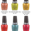
Essie Resort Collection Swatches, Review & Comparisons
 Last summer’s North Fork Collection from Essie was such a stellar sellout success that it’s no wonder she’s releasing the tropical themed Resort Collection that includes a new green and blue for us to drool over.
I have to say, Essie’s colors are starting to win my heart again. She’s introducing more “me” shades and I LOVE it. Granted the Art of Spring wasn’t my style but she has a pretty large fan base to please. I mean I get that she’s known for stunning reds, sheers and neutrals but I’m just not that kind of girl. I guess in NYC speak my nail flavor is more “downtown” than “uptown” so when Essie creates colors like Turquoise & Caicos and Lapis of Luxury, I’m ALL IN! Check them out after the jump! |
Illamasqua Hectic and Strike Nail Varnish
 In honor of the upcoming Illamasqua launch at Sephora, I thought I’d share a couple more fab shades from their Nail Varnish line. In case you missed my post last week, Illamasqua is coming to the US and will be sold on Sephora.com starting July 21st. That’s only SIX days from now!! Yippee!! Now I can make all the REST of their polishes mine. In honor of the upcoming Illamasqua launch at Sephora, I thought I’d share a couple more fab shades from their Nail Varnish line. In case you missed my post last week, Illamasqua is coming to the US and will be sold on Sephora.com starting July 21st. That’s only SIX days from now!! Yippee!! Now I can make all the REST of their polishes mine.
I’m also looking forward to snagging a few eyeshadows and lip glosses to try. The packaging is just so amazing I want it all. The eye quads are especially tempting. I could just go on and on but you’re here for the polish, right? Let’s take a look! |
As with all the other Illamasqua’s I’ve tried, the formula is phenom. On the thick side but spreadable and smooth. Strike was pigmented enough to only need two coats but Hectic’s semi-sheer jelly-ish consistency required three coats to go opaque.
Strike – Is a bright, metallic turquoise. In the bottle it looks like it has a bit of gold flash but that’s just a reflection off the metallic particles. On the nail that pearly effect creates dimension and unfortunately, a bit of brush stroke madness. It’s not so overly stroke-y that I can’t deal though. Hectic is an army green/pea soup creme. It’s like so fugly it’s cool, if that makes sense. I love its funky look as it reminds me of RBL’s No More War but on the lighter side of that. Color me smitten!
 These along with all the other Illamasqua Nail Varnishes will officially go on sale at Sephora.com
 on July 21st and in their Times Square location on July 30th. The polishes will retail for $14/ea and should be in stores across the country come fall.
If you need some more Illamasqua enabling check out my previous swatches HERE!
So who else is counting down the days, plotting their first Illamasqua order? Which colors are you dying to try?
Sally Hansen HD Hi-Definition Nail Color – Part 1
 Remember the Sally HD Hi-Definition line I told you about back in March? Well the wait is almost over. The collection will be on store shelves soon, July to be exact, and come in a rainbow of shades. The Tracy Reese designed, Opulent Cloud (click to view), will launch along with seven vivid, liquid crystal filled polishes. Remember the Sally HD Hi-Definition line I told you about back in March? Well the wait is almost over. The collection will be on store shelves soon, July to be exact, and come in a rainbow of shades. The Tracy Reese designed, Opulent Cloud (click to view), will launch along with seven vivid, liquid crystal filled polishes.
Are you scratching your head about how HD and nail polish go together? Unlike other HD beauty products, this isn’t going to make your nails look slimmer or flawless like a high def foundation intends to do. It’s working off the theory that liquid crystals, like those used in Hi-Def LCD TVs, will produce a true, vibrant multi-dimensional hue. Take a peek at the first half of the HD rainbow after the jump! |
The first thing I noticed about the formula is how thin and smooth it is. Using the same bottle shape and brush as the Lacquer Shines, the polish applies extremely even and dries quickly. The only downside is the pigmentation. I needed three medium coats to go opaque and even though it dried glossy, the first and second coats were a bit satin-esque. Odd. The overall finish looks like a cross between metallic and shimmer. It’s not all that brush-strokey yet not 100% blended either.
The end result is stunning. When Sally Hansen says vivid, they aren’t kidding. It’s not that the actual hues are uber-unique it’s just that they’re so alive. Pictures really can’t do justice to the vibrancy. The shades play with the light, changing at each angle. Not necessarily a duo-chrome effect more like they’re lit from within.
Cyber is a shimmering grape with a slight pink undertone. You know I love a purple so I’m all over this one.
Blu was the hardest shade to capture. To quote Danny Zuko, “it’s electrifying!!!”
Pixell Pretty is a pretty true Turquoise, a little bluer than Honeydew.![]()
Hi-Def is a bright green apple that reflects gold. I can’t tell if it’s just the liquid crystals catching the sun or if there is actual gold shimmer in the color but it’s a very fun. The Sally Hansen Hi-Definition Nail Color collection ($5.95) launches in July at drugstores and mass retailers like WalMart, KMart and Target.
Stay tuned for my review of the second half of the collection. In the meantime, what do we think? Is HD the future of polish or just a gimmick? Are there any colors you’re just dying to own?
Swatch Request Saturday – Search for Chanel Dupes
 Every time I post new nail polish pictures, I try to search through my stash for comparable shades but sometimes time just doesn’t permit that. And then the requests for comparisons start coming in. So to remedy the situation, I’m introducing Swatch Request Weekends. Every weekend that I have free, I’ll be addressing as many swatch requests as I can. Every time I post new nail polish pictures, I try to search through my stash for comparable shades but sometimes time just doesn’t permit that. And then the requests for comparisons start coming in. So to remedy the situation, I’m introducing Swatch Request Weekends. Every weekend that I have free, I’ll be addressing as many swatch requests as I can.
The unveiling of the Chanel Celestial Lights collection and my new Barry M shades brought up a lot of great dupe questions so I hope I answered them for you after the jump. Enjoy! |
MariahGem wanted to know how Finger Paints Turquoise Tile from the Sunburst Summer collection compares to Sally Hansen’s Honeydew. As you can see, Honeydew leans more green. After seeing Chanel’s new Mica Rose and hearing how it compares to fan favorite Flamingo, Denette requested a Flamingo dupe. Unfortunately I don’t have any polishes with Flamingo’s exact sparkle factor but Nubar Je t’aime comes pretty close. OPI Dancing In The Isles is just too metallic.
 Of course people always want a low cost version of Chanel’s stunning shades and Cosmic Violine is no exception. The closest I could come is with OPI Kris Kringle Makes Me Tingle, a holiday Trade Secret exclusive. Kris Kringle’s shimmer is more garish and the base is more brown without the same depth as Cosmic Violine. I threw in Tulipe Noire just for funsies.
 Reader Crotchfairy wanted to see Barry M’s Grey next to MAC On The Prowl and Rescue Beauty Lounge Stormy. The Barry M is much deeper.
 The only shade I have that is remotely close is a custom blended CND shade. Get the recipe here.
 That’s it for this week kids. If you have a request, leave a comment or email me at [editor] at [alllacqueredup] dot [com]. Enjoy the rest of your weekend.