White
NOTD: Creative Hyper Fresh
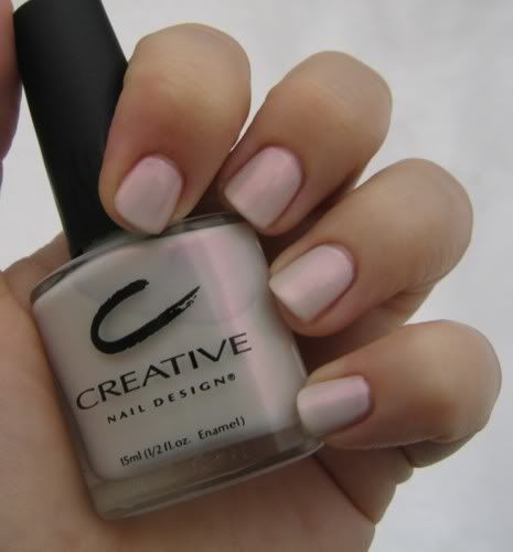 I’m continuing with my “Dare Week.” I was dared to do a white creme but I don’t own any of those so I chose Creative Hyper Fresh from their new Optix collection for spring.
Creative Nail Design Spring 2007 – Optix
 There isn’t a lot of info to be found about Creative’s spring line. These few pictures are the best I could do. Optix is the name of the new collection but to be honest, they might want to call it “Spring 2006: Part II” Some of these new colors look like they’re just a deeper version of what we saw last year. I’m just hoping they’re more opaque. Especially the green. You know I’ll have to have it.
 Top Row (l-r): Milky Way: a lilac patina, Cosmic Coral: an edgy peach shimmer, Hyper Fresh: an opalescent white
Bottom Row (l-r): Aqua Jet: an opal mint lustre, Blue Nirvana: a translucent periwinkle, Pink Chrome: an opalescent pink
Spring: The collections have layered, sheer fabrics in pastels with translucent undertones. To complement these we have nail colours such as cosmic coral, blue Nevada, which is great with jeans, a soft luminescent lilac called Milky Way, aqua green and pink chrome. Hems are shorter and necklines are higher, so the accent is on legs and perfectly polished toenails are important. There is also a trend for a futuristic look which will see longer nails with a metallic silver or gold tip and Swarovski crystals on the nails.
Summer: The little white dress is big. We have designed longer almond shaped white eyelet lace nails and marblising effects to go with the dress. Glittering gold nails will be big and we have experimented with crocodile prints with metallic chocolate brown on gold. Lavishly decorated feet will also be the trend in summer 2007. Red, fuchsia and gold are the main colours of the season.
Autumn/winter: The attitude of the season is imperial anarchy or a London punk rock look with a regal touch. There is a lot of plaid with metallic undertones. Our palette for the season includes burgundy with bronze undertones, anthracite metallic, copper pearl, royal purple, metallic burgundy and fuchsia.
The Worst Nails of the Golden Globes
I can’t just kiss celeb butt, I need to address what I thought were polish mistakes as well. This is the stuff you’ll never hear Joan Rivers talk about. She can hardly remember the star’s names, let alone what’s on their nails.

Access Hollywood’s Maria Menounos. I don’t know what she was thinking when she agreed to wear this hideous white polish. I know that white and pale colors are “in” for spring but it’s just not working for me.
Ellen Pompeo of Grey’s Anatomy. I thought she looked stunning. Her dress was unique and it kept her from looking like a bean pole but the nail color choice was completely wrong. That dirty nude shade made her hands look like they belonged on a corpse. Naked tips would have been better than that monstrosity.

The ladies of Grey’s Anatomy need some serious polish intervention. I think Katherine Heigel is one of the most beautiful women on television and at the 2006 Emmy’s she was a goddess on the red carpet. But, the combo of dark eyes, dark dress and dark nails was just too much for me.
She should have been the fashion forward gal sporting white polish.
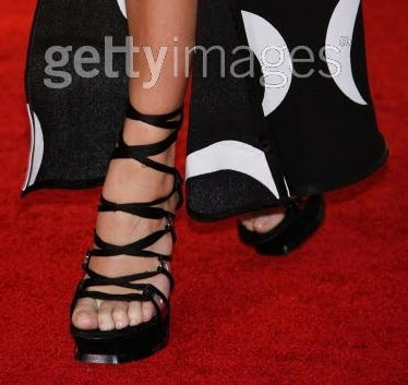
As much of a fashion plate as Chloe Sevigny of Big Love is, I expected more from her than naked toes in clodhoppers.
Chloe find Reese and become friends. Share pedi secrets and report back with some color on your toes.


