Creme
OPI Summer 2008 – Mod About Brights
When I first caught wind of a new Brights collection from OPI, I honestly wasn’t that jazzed. I figured, what could Suzi and her crew possibly come up with that would be fresh and new? But after three summers of Brights that were hit or miss, I will admit that I’m pleasantly surprised by the Mod About Brights collection. Instead of fooling us with beautiful in the bottle blues & greens that end up being sheer (I’m looking at you, Call My Cell-ery and Can’t You Sea?) these shades deliver a bold, funky punch of color that really stand out.
An entire collection of cremes, this rainbow lineup of nail polishes has a retro feel that reminded me of this drawing from the book 100 Years of Fashion Illustration by Cally Blackman (see above left). Don’t you just expect her to pop off the page and into a dance sequence from Austin Powers?
When these beauties arrived on my doorstep, I was jumping out of my skin to start swatching. I’ve been dying to show them to you all but time is not on my side. So what you see below is two coats of color with no top coat, exceptions are noted. As with the India collection, OPI is really hitting their stride with creme finishes in their Big 3 Free formula. They all applied smooth and even with a glossy finish.
Mod-ern Girl is a reddish coral shade that actually matches one of my favorite summer gauzy tunics. I can’t wait to pair them together.
That’s Hot! Pink is your typical bright summer pink. It’s La Paz-itively Hot without the blue undertone or shimmer.
Brights Power fits right in with the hot orange trend that is happening in nails but instead of being neon it’s just bright and fun. Definitely a better choice for people that are shying from the day-glo construction barrel shades I’m loving.
The “It” Color is a bit too French’s Mustard for me personally but I can see a darker skin tone rocking it on their tips. You know this is a total Rihanna shade, right? Unfortunately, it makes my skin tone look a bit dirty. I so wish I could pull it off though because I love seeing the reactions I get to wearing totally odd colors.
Green-wich Village. What do I even need to say? It’s perfect! Perfect I say. Can there ever be too many greens? Um, NO! And a green creme? You know I’ve been wanting a creme in every shade of green I can find. And even though Green-wich Village took three coats to achieve perfection, it’s worth it. Look at that color, look at it! You know you want to buy a bottle just to have, even if you’re too scared to wear it.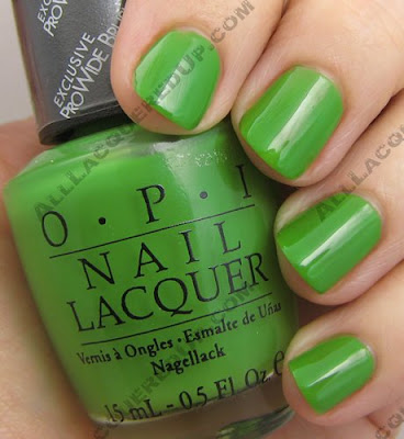
And before you even get a chance to ask I went ahead and swatched it next to Carolyn New York Greenwich Ave. You know someone was going to request it. The CNY shade is more pigmented and a bit deeper in color. It only required two coats to the OPI’s three. As you can see, they’re pretty close though not dupes. Do you need both? Only if you’re a fellow green freak.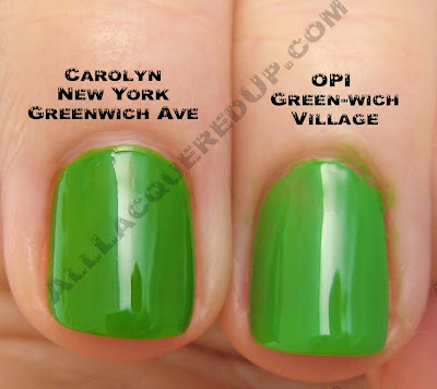
I swear, either I’ve become clairvoyant or the brands have been reading my 2008 Wish List. Because Dating A Royal not only fulfills my need for blues that aren’t “almost black” (e.g. Yoga-ta) but also for blue and green cremes. Where did this undying love for cremes come from? I have no idea. Maybe because I feel like my nails are imperfect and achieving a smooth creme finish makes them look flawless. Anywho, this deep cornflower confection is unlike any other lacquer I own.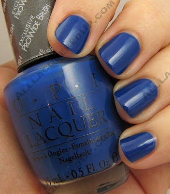
Of course, looking at all the bottles lined up like a little rainbow, I thought they’d make the perfect Skittles Manicure. Instead I ended up looking like the disembodied fingers that were put on ice during an episode of Dexter. Creepy, huh? I think I’ll stick to more candy/pastel shades from now on.
image: Frozen Barbie
The OPI Mod About Brights collection is on sale now at all professional salons and retailers including Pure Beauty, Regis, Trade Secret, Ulta, Beauty Brands, Beauty First, Dillard’s, and JCPenney.
OPI Summer 2008 Preview – Mod About Brights
The Brights are back everyone! OPI is adding to their ever so popular Brights series with a set of 6 vivid creme polishes dubbed the Mod About Brights collection.
“The mod look is back in a fresh, new way, both in fashion and beauty,†says Suzi Weiss-Fischmann, OPI Executive VP & Artistic Director. “The six shades in Mod About Brights capture the fun and edginess of the mod ‘invasion’ of the Sixties, but with a bright twist that makes them exciting and current for 2008. And with fashion right now being all about color and vivid, graphic prints, these are the shades that are perfect for fingertips and toes.â€
Yet again I’m getting giddy with delight over a fab looking green hitting the mass market. You know the frankeners on MUA will be adding black to Green-wich Village to try and duplicate RBL Recycle. And a royal blue creme… catch me as I swoon. If these cremes are as fantabulous as the ones from India, I’ll be in heaven. I’ve been on such a creme kick lately. Between that and my recent pink love you would think I had a polish lobotomy.
So here’s the line up and descriptions courtesy of OPI.
Mod-ern Girl – A pop of coral with more than 15 minutes of fame.
Brights Power – A brilliant orange that fashionistas find fab!
The “It†Color – This must-have yellow is the color to be seen in.
That’s Hot! Pink – Bright pink that sizzles with style.
Green-wich Village – A vivid green that’s downtown mod.
Dating a Royal – A royal blue that sets crowns spinning!
The Mod About Brights collection retail for $8.50 ($9.50 CAN) and will be avaiable in May at salons including the major chains; Beauty First, Beauty Brands, JCPenney, Dillard’s, Regis, Pure Beauty, Ulta, and Trade Secret.
Happy St. Patrick’s Day
 For ’tis green, green, green, where the ruined towers are gray,
And it’s green, green, green, all the happy night and day;
Green of leaf and green of sod, green of ivy on the wall,
And the blessed Irish shamrock with the fairest green of all.
~Mary Elizabeth Blake
I am not the least bit Irish but that doesn’t stop me from loving St. Patrick’s Day, the greenest day of the year. With my undying love of all things emerald, is it any wonder. It’s the one day when draping yourself in it is perfectly acceptable.
Of course that means green is shade of the day for nails and I’ve put together my picks to best express your Irish Pride or just join in the fun. All the polishes featured are current and available for purchase.
My St. Paddy’s Day manicure is of the gorgeous Sinful Colors San Francisco. Sinful Colors is a drugstore brand that you can find at Walgreens. They have a wide variety of shades and are very reasonably priced. The formula on this one is similar to a jelly finish. It spreads like jam on the nail. But the color is so outstanding that I’m willing to play to get it right. For a darker more forest green look, check out NYX Las Vegas, butter London Thames, Zoya Suvi, China Glaze Outta Bounds and Rescue Beauty Lounge Recycle.
 And if you want a bolder emerald or springier green, look for Rimmel Underground Camouflage, Carolyn New York Greenwich Ave, Sinful Colors San Francisco or China Glaze Treehugger.
 So what are you wearing for St. Patrick’s Day? Have a favorite green I left out?
Rescue Beauty Lounge Recycle
 Well I can tick one item off of my 2008 Wish List. Thanks to the brilliant Ji Baek, founder of Rescue Beauty Lounge, my dream of finding a quality green creme has come true.
Recycle, part of RBL’s Spring collection, is a glossy forest green creme. The highly pigmented lacquer applies smooth and even; a steady hand could get away with just one coat. I needed two.
The wear on this one really impressed me. I had swatched it on a bare nail to show my mom and thanks to my own laziness I left it on for a couple days. To be honest, when I realized there was no tip wear or chipping after two days I decided to leave it on, just as a test. By day four I had to lose the crazy one green nail look. That’s when I gave it the true test. A five day run with base and top coat and let me tell you, this one really holds up.
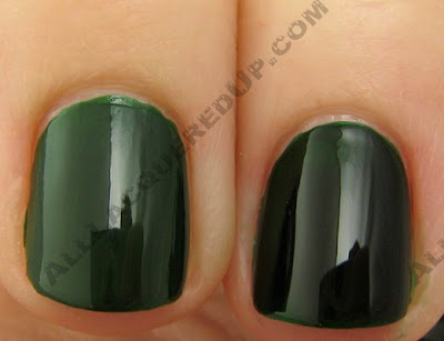 Overall, Recycle gets two enthusiastic thumbs up. I just wish it wasn’t so expensive because I really wanted to get Yellow Fever as well. I kind of hate the my eternal love of green forced me to shell out $18.00+ shipping. I know compared to a lot of beauty products on the market that’s nothing but in nail world it is.
China Glaze Summer 2008 – INK
Tattoos are a controversial topic. You either love or hate them. They’re regarded as both beautiful and tacky, depending on who you ask. But no matter what your opinion is, tattoos are extremely personal; a memorial, an artistic expression, a memento of a wild escapade, a drunken regret, a terrible reminder of past events or loves. Inspired by this colorful body art, China Glaze has put together a collection of neons that you can use to create your own tattoo-like nail designs.
Tattoo art has moved out of back alley parlors onto the couture collections of fashion’s top designers. INKâ„¢ by China Glaze is a collection of neons for brilliant self expression. Customize and personalize
…Ink My Nailâ„¢.
INK includes six bold new shades, a set of nail decals and rhinestones, a black nail art lacquer with fine tipped brush, a limited edition bottle of their yummy smelling Orange Cuticle Oil AND the six existing neons from the WOW collection. Now that’s a lot of neon. A quick word about the finish. As with other neons I’ve used, these all dry to a semi-matte finish. It must have something to do with the type of pigment used to create neon shades. So if you’re looking for high gloss you’ll have to add a shiny top coat. Therefore I’ve shown all the lacquers with two coats of color on the nail and no top coat; exceptions are noted.
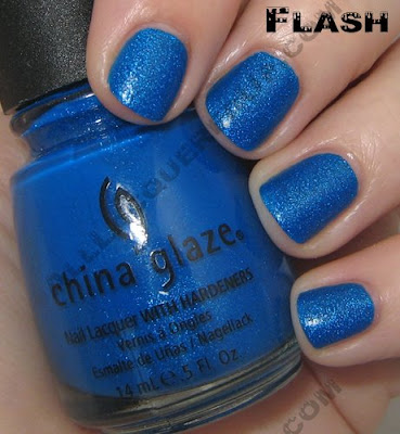
Blue Sparrow is a royal blue peppered with light blue glitter. The glitter leaves a gritty feel to the dried polish so between that and the matte finish you really need to use a coat of a thick glossy top coat to bring out the lacquer’s true brilliance. I’m showing you the color without top coat but I included an up close swatch with a coat of Seche Vite.
 Celtic Sun is a neon yellow with a hint of green undertones. The polish is shown with three coats on the nail yet the smile line still shows through. I personally prefer a more lemony yellow. This color has a very 80s retro feel to me. It’s a shade right out of the Wham! Wake Me Up Before You Go Go video.
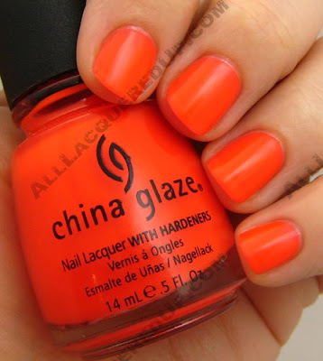
 Japanese Koi is the shade of a perfectly ripe tangerine. It’s got a slightly pink base that keeps it from being day-glo orange.
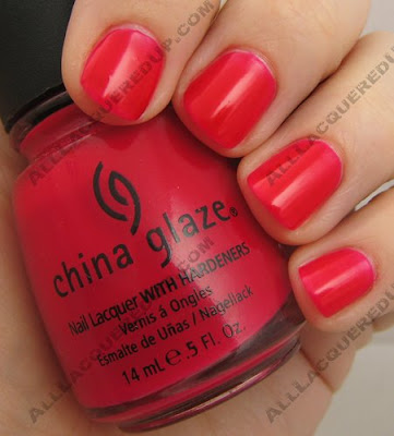
 With it’s hot pink base Rose Among Thorns is no average rose. I found this image of the beautiful Cerise Rose and thought this could have been the inspiration for the shade.
  Sacred Heart is a dusty red that is unlike any red I own. There’s something about the satin finish on this one that reminds me of the skin on cherries. Odd reference I know, but it keeps popping in my mind.
  Flying Dragon is my personal favorite from the collection. It is a deep purple that has a reddish tone to it in person. The red and blue glitter really makes this polish unique. Like I mentioned above, the finish is my only real issue with both glitters. For some reason this seems to be a bigger problem with Flying Dragon. According to a rep for China Glaze it is the unfortunate downside of blending neon with glitter. Their suggestion, two coats of Seche Vite to avoid a rough finish.
 The INK collection is available now in salons and online at 8ty8Beauty and coming soon to Head2ToeBeauty.
So who’s going to be sporting bold, bright neons this summer? Which colors are standouts?


