Creme
China Glaze Spring 2008 – Ecollection
It seems like “going green” and focusing on the environment is on everyone’s minds and it is affecting every aspect of our daily lives. And if it’s not everyone, it certainly should be. Now more and more beauty companies are starting to get on the “green” train and China Glaze is no exception. This Spring they introduce the ecollection a set of polishes with an earth conscious theme that comes in recycled paper packaging.
To preserve the beauty of our world’s colors, tread lightly and leave only footprints. In Blahniks or Birkenstocks, going green is always fashionable.
Overall I’m a fan of this collection. I’ll admit the grouping is odd in terms of shade until you read the names and reflect on the theme. So let’s talk formula. As you may already know this new Big 3 Free formula that was introduced last summer is thicker than the old formula and therefore requires a bit of getting used to. I’ve found that it applies best in two medium coats. Too thin and it pulls/drags on the nail, too thick and you get bubbles. All the manicures pictured below were done with two medium coats of lacquer.
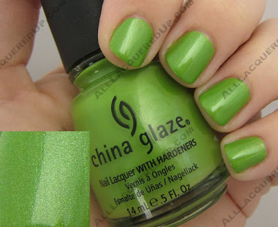
Tree Hugger reminds me of a green apple but with multi-tonal green shimmer. It’s like the perfect spring shade for me. Just looking at it makes me happy. I could go on and on about how gorgeous this polish is but it really speaks for itself.
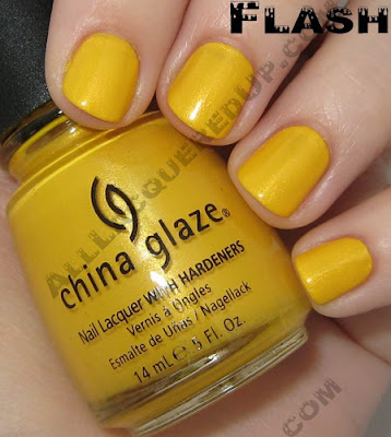
 Solar Power can only be described as “taxi cab yellow.” It is a loud and proud shade and with the yellow trend popping back up for spring/summer Solar Power, with it’s golden shimmer, fits right in. I have to admit that I prefer the jelly finish of last year’s Yell-O-Neil from the Surf collection. Simply because its glass like look is so completely unique.

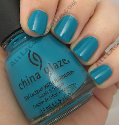
 Shower Together is a slightly lighter version of the oh so popular Aqua Baby from the Patent Leather collection. It’s like Aqua Baby and For Audrey had a baby which makes this blue green stunner is a color I could just swim in. Doesn’t it look like pool water?
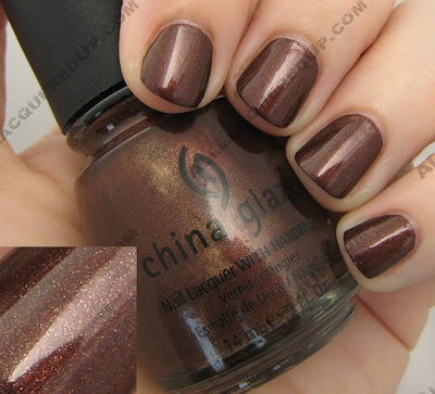
 Unplugged isn’t a shade I normally think of when I look towards Spring but it adds a nice balance to the collection. A red based brown with ribbons of gold shimmer running throughout, the overall color is that of a deep bronze with flecks of gold.
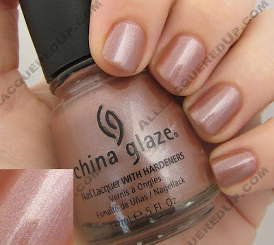
 Hybrid is a pinky beige with silver shimmer. In other lighting it’s a dusty nude rose. So hard to describe which is what makes it stand out. Does anyone else think it’s similar to Chiaroscuro but without the green shimmer? I’m just not sure I love this on me. What do you think?
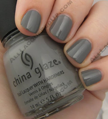
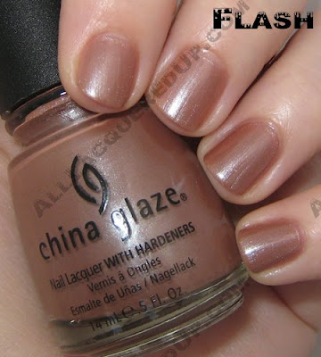 Recycle is a shade a lot of us have been longing for. A mid-tone gray creme that reminds me of rubber wire coating. Even though some of the MUA nail girls have franken’d their own gorgeous grays, I love being able to get it without the muss and fuss. Gray is going to be the next big shade in polish, especially in fall so, I’d get this one now before gray becomes a scarce commodity.
 The China Glaze ecollection is available now in salons and online at 8ty8Beauty and Head2ToeBeauty
Thoughts? Questions? Comments? Weigh in lovelies!
OPI Spring 2008 Collection – India
 OPI, you don’t know this but we’ve been broken up for some time now. The fighting began when you revamped your formula last spring. The inconsistencies in every collection since Australia has been frustrating. I understand the pressure to go Big 3 Free but sacrificing quality in order to satisfy the protesters was a bad call if you ask me. Of course our fight occurred entirely in my head but I’m sure you’ll be happy to know that we’ve called a truce.
Why the change of heart? Well, two reasons really.
1. You finally delivered a navy blue shimmer that actually looks navy. No purple undertones. Not just another blue-black. Yoga-ta Get This Blue, it’s like you knew I needed you.
2. You realized that I was not the only unhappy camper in regards to formula and you found a way to deliver pigmented, streak-free, non-goopy cremes.
The OPI India Collection for Spring 2008 made me remember what it was that caused me to fall for OPI in the first place. How compared to all the drugstore brands of polish I had used, there was a line that applied smooth and even with a beautiful range of colors. My first OPI obsession was the classic; I’m Not Really A Waitress. My latest; Yoga-ta Get This Blue.
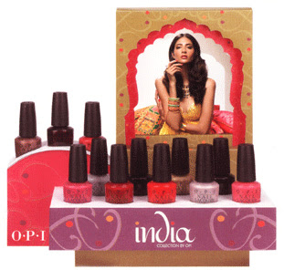
With a color range pulled from the fashion and culture of India, this collection is filled with vibrant pinks and reds, rich berries and luxurious metallics. Do I think every shade is utterly unique and rave-worthy? No but let’s get real girls. Us hardcore nail fanatics are a finicky group to please. I say formula improvements are a good step. Giving us the next Rainforest would be a fabulous and giant leap.
So this formula I am raving about, is it really that different? I wouldn’t testify in a court of law but, to me, there really is a noticeable improvement. I can’t find the change in the ingredient list but I’m telling you, something happened. With a couple exceptions, every shade applied like a dream. And disregarding the two sheers, these lacquers are highly pigmented requiring no more than two coats. Each image below was taken without a top coat and only two layers of lacquer.
Black Cherry Chutney – a blackened red with subtle shimmer for depth. In most lighting all you see are a few specs of shimmer and otherwise it’s just another almost black berry. The brush on mine has a few bent strands so that affected application. I hope it was just the brush but I can’t promise anything.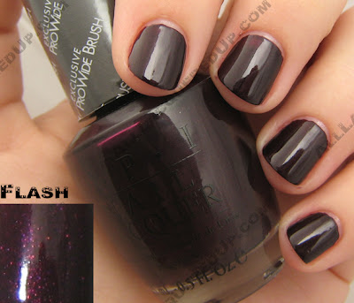 Charmed by a Snake – a lighter bronze, more appropriate for Spring. The champagne shimmer keeps this shade from being too warm and too Fall. Definitely one of my favorites.
 Curry Up Don’t Be Late! – I’m not gonna lie, this will be a hard shade to pull off. Brushed yellow gold is too much for my pale skin but, I would think with a faux tan or darker skin tone this shade could really pop.
  ElePhantastic Pink has been creating a buzz before it even hit shelves. It’s the shade I’ve received the most inquiries about. A bold carnation pink creme, this isn’t for the demure pink wearer.
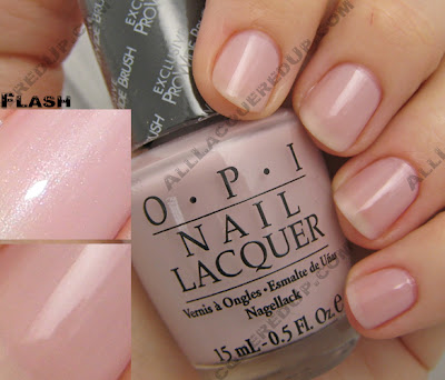
 Get Me to the Taj on Time – is a safe opalescent semi-sheer. Yes, it applies well but we’ve seen this before.
 I’m Indi-a Mood for Love – a hot pink creme that leans towards blue, giving it a slight purple undertone.
 Keys to My Karma is your basic maraschino cherry red creme. This one has a lot of pink in its base and needs two coats to achieve the bottle shade. It’s a good staple color but not something you need. Still I’m feeling the urge to pull out my reds again.
 Lunch at the Delhi has been dubbed a “coral” but I’m not seeing it. If anything, I think of it as a dusty, muted red. Yes, it’s warm and orange based but not the pinky peach I typically think of when I hear coral. Sometimes an OPI description is so far off from what I’m seeing, I wonder if I’m colorblind. What shade do you see?
 MonSooner or Later is a tomato red creme. Orange and red combine to create this glossy confection. I can totally see this on toes at the beach.
 Moon Over Mumbai – get on the gray train now before it runs you over, leaving you face first in the dust. Of course the uber-chic nail boarders over at Makeup Alley have been frankening their own grays for months now but if you don’t want to make your own, here’s a nice soft version to ease you into the trend.
 Royal Rajah Ruby is the other vampy berry shade included in India. A rich wine shimmer, this shade would have made me take notice had it been a bit lighter. It just doesn’t stand out in the crowd. The shimmer adds character but no real charm.
 Yoga-ta Get this Blue! – I saved the best for last. I had to keep you scrolling. From the very second I got my hands on this shade I’ve been talking it up to anyone who would listen. Deeper and richer than Blue My Mind from the 2005 Brights yet lighter than all the 2007 OPI blues, Yoga-ta is everything I’ve been wanting a navy to be. It’s visibly blue in most lighting situations which is something many of the blues that came before it have failed to achieve. In the simplest of terms, it’s perfect.
 The OPI India collection is available in stores and online now and retails for $8.50 ($9.95 CAN). No that’s not a misprint, there was a price increase.
 Now let’s hear from you? What are you loving/hating, buying/passing on?
Comparisons are in the works but before I finish, are there any requests? I already have down Ms. DQ2′s desire for a China Glaze X comp but what else do you want to see? I can’t fulfill all your demands but I’ll do my best to please the majority.
Essie Spring 2008 – In The Mood
 In the mood for all his kissin’
In the mood his crazy lovin’
In the mood what I was missin’
It didn’t take me long to say
I’m in the mood now
When I hear Glenn Miller’s “In The Mood“ I can’t help but picture the scene from Cannery Row in which Debra Winger and Nick Nolte swing dance with competitive ferocity. The same image came to mind when I first saw Essie’s Spring 2008 collection, In The Mood, with it’s cheeky names and sweet girly shades.
For the most part all the polishes applied smoothly with no streaking. Looking For Love being the exception. It was just too difficult to get a fluid sheer look. Even after the three coats I applied it was still semi-sheer and splotchy (see below).
Body Language - Is a pinkish gray nude. A very neutral and wearable creme. I honestly didn’t expect to like this one at all, this is so not a part of my normal color range. But once I had it on, I loved the clean chic look. Great Expectations – An opalescent gray, the shimmer is extremely subtle to add depth. I see light to medium grays becoming more and more popular. In fact this color would have fit right in with the silvery/pearly whites that were seen on the red carpet at the SAG Awards.
 Hard To Get – A bubblegum pink creme with a hint of lavender in it’s base. It didn’t really mesh with my skin tone but I think it would be a fun pedi shade. With it’s high gloss shine, Hard To Get is the slight deeper sister of one of my favorite patent finish polishes, China Glaze Go Go Pink.
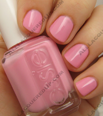 Hi Maintenance – You know sheers and I aren’t friends so even though this milky pink makes a great french manicure base, it’s not for me.
 Looking for Love – This one was the big disappointment for me. Lilac and lavender shades make my hands look alien-esque so even though I love wearing purples, the lighter ones are a no go. Though regardless of the color the formula bit it, big time. Major application issues makes me give Looking for Love a double “thumbs down”.
 Secret Affair – Is my other favorite from the collection. The shade is hard to describe which is why I find it so intriguing. Is it nude, pink, taupe or a combination of all three? With this one, it really depends on the light which makes a Secret Affair a winner in my book.
  The In The Mood collection is available for sale now online and is slated to be in stores and salons on February 1st.
Who’s buying what? How many of you are going to clutch your dark polishes, run and hide in a cave vampire-style until all this pale sheer madness goes away? And who is starting to venture towards the light? As much as it pains me to say, I’m kind of loving the freshness of these light colors. Shh, don’t tell! My green and blue polishes may revolt and run away.
Live From The Red Carpet – It’s Essie
 Ok so I’m sad about the fate of the Golden Globes this weekend. A news conference style awards show? That’s more pathetic than the Seacrest-In-The-Round Emmys. I’m all for the actors supporting their Writers Guild brothers & sisters by not crossing the picket line but, I still want my red carpet coverage and ten thousand re-runs of E!’s Fashion Wrap.
So what do we have to comfort ourselves? A little bit of the red carpet, in a bottle. Essie and E! Entertainment Television have teamed up to create a limited edition polish inspired by “E! Live From The Red Carpet,” appropriately named Live From The Red Carpet.
A glossy cherry red creme, Live From The Red Carpet is so well pigmented, you hardly need a second coat. And I know all you Big 3 Free lovers are going to hate me saying this but there is something to be said for keeping the chemicals. This formula is so easy to control and apply that I don’t care what’s in it.
 Live From The Red Carpet is available now through the end of February at salons and beauty outlets such as ULTA ($8).
Sponsored Link
Shop For Essie Nail Polish
Zoya Spring 2008 Preview – Blissful
 It looks like sheers and soft girlie shades are on their way this spring. And as much as I love my bold and vampy shades I will try my best to embrace the coming trend. You’ll rarely find me sporting a sheer but ever since I discovered my holy grail sheer last spring, Zoya Bailey, I’m definitely more open-minded towards them.
Enjoy the nail color of the moment… Blissful.
The beauty of Spring radiates from Zoya’s latest collection, Blissful. 6 wearable shades selected to enhance natural beauties of every age and skin tone.
Laurie (sheer pink cream), Lulu (sheer peach cream) and Miley (sheer lilac cream)
Felicity (sparkling golden rose), Penelope (apricot rose cream) and Zanna (mauve rose cream)
As always, Blissful features Zoya’s best-selling, professional natural nail lacquer formula. Zoya healthy nail colors are free of harmful industrial chemicals like toluene, formaldehyde, dibutyl phthalate (DBP) that are known to cause cancer and birth defects.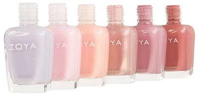
Find Zoya’s Blissful collection along with over 200 other ultra high-fashion Zoya shades and the exclusive Zoya Color-Lock system (for guaranteed long-lasting color) at fine salons and spas across the country, or online at www.zoya.com.
info and images courtesy of Art Of Beauty
