Summer 2007
Buckle Up with Essie
 Thanks to the good people at Essie, I was able to test out their summer collection, Buckle Up! An interesting mix consisting of signature Essie shades like pink and coral thrown together with clean white, purple and silver, this collection has me torn. While this is a departure from collections of the past filled with pinks, sheers, nudes and reds, I just can’t love all “out of the box” colors like I hoped.
The standout shade for me is Huckle Buckle. Even though it’s on the sheer side, it becomes opaque with 3 coats. It’s a smokey grape with pink shimmer that gives the color depth. The shimmer reminds me of the polish I made last winter using MAC Entremauve pigment (pictured below). The pink shimmer in the pigment didn’t show up on my skin, only on the nail. While Huckle Buckle is a lighter color, and Entremauve has more blue in it, they both have that amazing hint of pink.
 I tried on the pinks and coral shades first. As I expected, they applied beautifully, were well pigmented and only needed 2 coats to be opaque. The “oops” in the picture below are operator error and not the fault of the polish.
Chastity is a cool toned pink creme. Leaning towards lavender, it’s a very mod shade in my opinion. It wasn’t streaky and has a great glossy finish.
It’s A Cinch reminds me of my favorite pink Essie, Ball-timore. They have similar finishes and belong in that soft bubblegum pink category. It’s A Cinch is a bit warmer in spite of the silvery shimmer. This is my 2nd favorite shade in the collection.
Click It Or Ticket! is very similar to It’s A Cinch in finish and shade. They’re almost hard to tell apart in bad lighting. Click It Or Ticket! is a warm coral with what looks like a beige shimmer.
Chastity, It’s A Cinch and Click It Or Ticket!
 After having such great success in applying the first half of the Buckle Up! collection, I was excited to try what I consider the “fun colors.” I can’t help it, I love the unusual shades. Unfortunately, I was disappointed. Aside from the lovely Huckle Buckle, the other two just didn’t cut it.
Below The Belt was so streaky. It took 3 coats to get it even and by that point it was getting gloppy. Even the color itself couldn’t save this polish. It’s chalky, white-out white but not in an attractive mod way. As much as I’m loving white polish this summer, I just can’t love this one. It looks a tad creamy in the swatch pic below because the sun was setting by the time I shot it.
Loophole could have been and should have been a great metallic silver. The finish and application are what mucked it up for me. It has the same problem most metallic polishes have, it shows brush marks. But, that wasn’t Loophole’s only issue. It’s too thick, making it difficult to brush on evenly. I ended up with pooling even after I removed my first application. The shade is a fab brushed silver and I’m sure if you have patience and a steady hand, it could be a winner. It just wasn’t for me.
Creative Summer 2007 – Flash Point
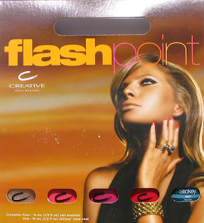 So I just got my blue-tipped claws on the summer collection from Creative Nail Design. It’s called Flash Point and consists of a nice selection of brights and a metallic sheer.
I have to be honest with you all, I’m not wowed by this lineup. But I know that having so many polishes makes me extremely jaded. After seeing hundreds of red and pink polishes over the years, it takes a lot to get me jumping up and down over a color.
That’s not to say that these aren’t pretty colors or that Creative doesn’t make a great product. They absolutely do. The pigmentation in their lacquer is fantastic. It’s just that for the hard core collectors, there isn’t a truly unique shade here. I’m sure it must be hard for all the brands to come up with 4+ collections a year and try to make them special and trendsetting.
 Let’s talk about the colors. I was so excited to read that Glow is a “nude gold shimmer” only to have my heart sink when I saw how sheer it is. But fear not, there is a silver lining on this one folks. For any of you still on the hunt for the discontinued FingerPaints Snow Angel, you can stop searching and pick up a bottle of Glow. The shimmer/glitter is a bit less dense but otherwise they’re dead on dupes. That’s a reason to rejoice!
Flare is a medium carnation pink creme. It’s a great pedi color that will compliment most skin tones. Even without my full on self-tan happening, holding Flare against my skin instantly warms me up.
I held Scorch up to my Bright Pink Lemming Wheel (or nail art wheel) and it falls somewhere between OPI La Pazitively Hot and Zoya Fergie (closer to Fergie). The pink shimmer is very fine and gives Scorch a lot of depth in bright light.
Describing Burn as a “bright hibiscus red creme” does absolutely nothing for a plant killer like me. I have murdered many an expensive flora over the years. In dissecting a color what works best for me is comparison. So in Burn’s case, I look to my collection.
Although it’s described as a creme, I see some minute shimmer up close. And even though Burn is slightly on the orange side, it’s nothing like OPI Cajun Shrimp. I think the fuchsia shimmer that prevents that from happening. China Glaze Hot Lava Love comes close but Burn is brighter and much more pigmented.

A close up look at Burn and Scorch
 Opinions? Got suggestions for duplicate shades? Let’s here it!
Creative Nail Design Summer 2007 – Flash Point
I just got this info in a press release. I had heard that Creative would have a metallic in their summer lineup, I’m happy to see it’s true.
Courtesy of Red PR:
Introducing
Creative Nail Design’s Summer 2007 Enamel Collection: Flash Point
Feel the heat with this exotic sunset-inspired palette:
Glow – an ethereal nude gold shimmer
Burn – a bright hibiscus red crème
Flare – a juicy watermelon crème
Scorch – a lively and sparkling magenta
Essie Summer ’07 – Buckle Up!
Nocti – For the person who’s not afraid of color
Brought back from the archives, Art of Beauty has revived their Nocti line of polishes.
Known for their bright, fun colors, Nocti was retired years ago but now they’re back with a vengeance. Responding to the popular demand for bold colors, this line is not for the shy. Dubbed “The Return of Strong Creative Color,” they’re perfect for a summer pedi that is sure to attract attention.
Formulated with the same formaldehyde, toluene and DBP free composition as Zoya, this line is sure to please both the color crazed and health conscious.
Speaking with a rep from Art of Beauty, we discussed the quirky polish names in this line. Straying from Zoya’s strategy of using women’s names, the Nocti line shows its’ personality with cheeky names like Nip Tuck, TMI and Flying Naked. In case you didn’t know (I didn’t), Flying Naked is a reference to flying with no luggage and buying what you need as you go. Perfect for the sky blue shade.
The colors in this line are all matte with the exception of Nip Tuck’s subtle shimmer. The pics below are with Seche Vite top coat to bring out the true color of each lacquer.

(l-r) Swag (bright lime green matte creme), Nip Tuck (sea green shimmer), Flying Naked (royal blue matte creme)
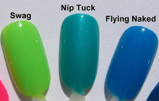 I haven’t been able to give these a full test run on my nails yet but that will be happening soon. Just from applying them onto the nail art wheels, the matte colors were a little thicker than a what I’m used to with Zoya. Even though the end result was a nice even finish, it was tricky getting them that way. Further investigation is needed. Be on the lookout for Nip Tuck mani pics from me by the end of the week.


