Summer 2008
Estee Lauder Pearls of Light Summer 2008
For Summer 2008 Estee Lauder released two color collections, Pearls of Light and Bronze Goddess. Pearls of Light is soft and glowy, filled with lustrous pinks and champagnes including two sparkling but subdued Pure Color nail lacquers.
I’ve never used Estee Lauder nail polishes before so I jumped at the chance to test them out. The bottles have always intrigued me, they’re so luxe with a great weighty feel. Don’t you just adore how the sphere of polish is encapsulated in the square glass? Or is it just me?
EL polishes have a flat brush that makes application a breeze. I really love that so many brands are using that style of brush. And the formula, well I’m super impressed with the formula’s staying power. I gave my Mom a set to try out, they’re very much her kind of shades, and when I realized she hadn’t done a polish change in two weeks I gave her a scolding. Much to my surprise, she showed me her nails and can you believe that with the exception of one massive thumb nail chip the rest had just some tip wear. TWO WEEKS LATER. Unreal! Holy staying power Batman!
Champagne Pearl‘s metallic quality gives it a duo-chrome appearance. It fluctuates between a champagne metallic and a reddish shimmer and feels very water-washed beachy. The multi-colored shimmer is what keeps both these shades from being another boring color. Is it me? Not so much. It’s not “pretty ugly” enough for me.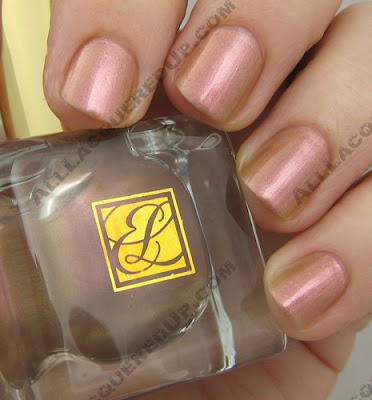 Pink Pearl is a bit more sheer as you can see in the pic. I used two coats with both shades yet I can still see the line of my whites through Pink Pearl. This is a very soft girly pink. Very work appropriate, even with all the fun shimmer.
So either Mom read my layering post or she just didn’t feel like redoing her nails and added more polish on top because she layered champagne pearl over pink pearl to create her own unique shade. I tried layering both ways and the results are pretty similar to the camera’s eye but in person they really are different. I think the Pink Pearl over Champagne Pearl is my favorite. The pinkness really stands out with the opaque nudish base underneath. Estee Lauder’s Pearls of Light collection is available for purchase on the EL website however Pink Pearl is unfortunately sold out. Fear not fellow fanatics, you can still snag a bottle of your own. How? Stay tuned!
MAC Summer 2008 – Naughty Nauticals
 As someone that grew up spending every weekend on a sailboat, I have an inherent love for all things sea-lated. So when I read that MAC was releasing a nautical themed collection, I was overjoyed. I realize Naughty Nauticals has been on the shelves for a bit now but I hope you can still snag some goodies if you haven’t had the chance.
Navy is one of my favorite shades to wear in both clothing and makeup. I collect navy eyeliners and own more navy polishes than I’ll ever need. And pairing navy with crisp white pants is a yacht club classic. Now I realize that red, white and blue can be over the top patriotic or super Tommy Hilfiger but if you inject the red subtly, like on your nails, it can be so very chic.
Let me take a moment to intro you to “the floating condo”, my nickname for my parents’ sailboat. She (boats are always ladies, even those noisy Cigarette racers) is 12 years young and gives the folks some much deserved weekend R&R all summer long. The boyfriend and I will be spending a long weekend on Her in a couple weeks to celebrate my birthday and enjoy the insanity that is Put-In-Bay; an island with the world’s longest bar.
Normally I fret about what nail colors I should wear for my annual b-day trek. In fact I’m usually painting my nails down in the cabin living room as we sail over to the island, much to my dad’s chagrin. I still claim it wasn’t me that got remover on the teak floors, it was Mom! Anywho, this year I don’t have to contemplate, I’ll be rockin’ the Naughty Nauticals shades. Oh so apropos, no?
For my toes… Naughty Nautical. A slightly purple based navy shimmer, this shade applies smoothly and only requires two coats. It’s luscious and rich, like it came right from Van Gogh’s Starry Night.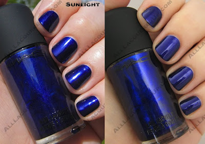
And for my tips… Shirelle. Shirelle is a permanent lacquer but this classic red shade pairs perfectly with Naughty Nautical. It’s retro yet the creme finish gives it a fresh feel. And even though I’ve had application issues with some MAC cremes in the past, Shirelle slid right on the nail. You do need two coats because of the slight berry-ness that appears in the first layer. So the bad news is that Naughty Nautical is sold out online but the good news is that I’m still seeing it at some MAC counters. Just give your local counter a ring and put a bottle on hold if you can’t live without it.
What did you scoop up from this collection? Or did you pass because you’re lusting after the Neo Sci-Fi shades?
OPI Summer 2008 – Mod About Brights
When I first caught wind of a new Brights collection from OPI, I honestly wasn’t that jazzed. I figured, what could Suzi and her crew possibly come up with that would be fresh and new? But after three summers of Brights that were hit or miss, I will admit that I’m pleasantly surprised by the Mod About Brights collection. Instead of fooling us with beautiful in the bottle blues & greens that end up being sheer (I’m looking at you, Call My Cell-ery and Can’t You Sea?) these shades deliver a bold, funky punch of color that really stand out.
An entire collection of cremes, this rainbow lineup of nail polishes has a retro feel that reminded me of this drawing from the book 100 Years of Fashion Illustration by Cally Blackman (see above left). Don’t you just expect her to pop off the page and into a dance sequence from Austin Powers?
When these beauties arrived on my doorstep, I was jumping out of my skin to start swatching. I’ve been dying to show them to you all but time is not on my side. So what you see below is two coats of color with no top coat, exceptions are noted. As with the India collection, OPI is really hitting their stride with creme finishes in their Big 3 Free formula. They all applied smooth and even with a glossy finish.
Mod-ern Girl is a reddish coral shade that actually matches one of my favorite summer gauzy tunics. I can’t wait to pair them together.
That’s Hot! Pink is your typical bright summer pink. It’s La Paz-itively Hot without the blue undertone or shimmer.
Brights Power fits right in with the hot orange trend that is happening in nails but instead of being neon it’s just bright and fun. Definitely a better choice for people that are shying from the day-glo construction barrel shades I’m loving.
The “It” Color is a bit too French’s Mustard for me personally but I can see a darker skin tone rocking it on their tips. You know this is a total Rihanna shade, right? Unfortunately, it makes my skin tone look a bit dirty. I so wish I could pull it off though because I love seeing the reactions I get to wearing totally odd colors.
Green-wich Village. What do I even need to say? It’s perfect! Perfect I say. Can there ever be too many greens? Um, NO! And a green creme? You know I’ve been wanting a creme in every shade of green I can find. And even though Green-wich Village took three coats to achieve perfection, it’s worth it. Look at that color, look at it! You know you want to buy a bottle just to have, even if you’re too scared to wear it.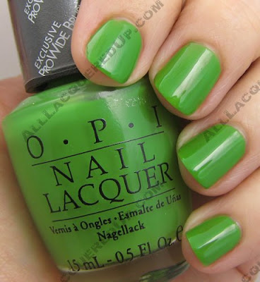
And before you even get a chance to ask I went ahead and swatched it next to Carolyn New York Greenwich Ave. You know someone was going to request it. The CNY shade is more pigmented and a bit deeper in color. It only required two coats to the OPI’s three. As you can see, they’re pretty close though not dupes. Do you need both? Only if you’re a fellow green freak.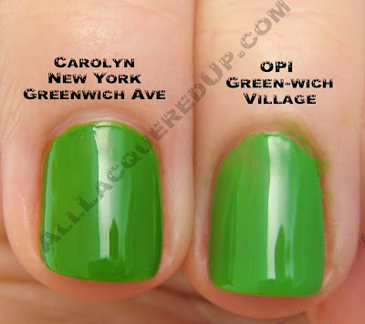
I swear, either I’ve become clairvoyant or the brands have been reading my 2008 Wish List. Because Dating A Royal not only fulfills my need for blues that aren’t “almost black” (e.g. Yoga-ta) but also for blue and green cremes. Where did this undying love for cremes come from? I have no idea. Maybe because I feel like my nails are imperfect and achieving a smooth creme finish makes them look flawless. Anywho, this deep cornflower confection is unlike any other lacquer I own.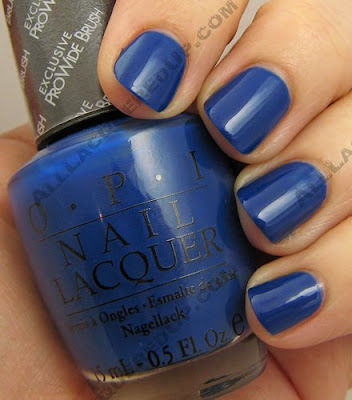
Of course, looking at all the bottles lined up like a little rainbow, I thought they’d make the perfect Skittles Manicure. Instead I ended up looking like the disembodied fingers that were put on ice during an episode of Dexter. Creepy, huh? I think I’ll stick to more candy/pastel shades from now on.
image: Frozen Barbie
The OPI Mod About Brights collection is on sale now at all professional salons and retailers including Pure Beauty, Regis, Trade Secret, Ulta, Beauty Brands, Beauty First, Dillard’s, and JCPenney.
Chanel Preview – Robertson Boulevard Collection
Just when I thought summer bright streak was slowing down, I catch wind of this. Chanel, in celebration of their new boutique on Robertson Boulevard in LA, is releasing a set of four limited edition polishes designed by Peter Philips.
MELROSE – A fun, hot pink destined to become spring’s must-have pedicure
SUNRISE – A primary yellow as bright and cheerful as its name
L.A. SUNSET – A warm tangerine — just the thing for an afternoon shopping splurge
RODEO DRIVE – A purple splash: girl power meets the power lunch L.A.
Is Chanel going pop art on us? I have to say that just seeing the product image has me excited. Such a bold nail color statement seems out of character for the brand but I’m loving it. Who would have thought that such crazy shades would make it to high end chic? Maybe it means I’ll stop getting stares or comments when I have bright green or yellow on my tips.
The lacquers will be available exclusively in-store at the Robertson Boulevard Chanel Boutique beginning May 30th and on Chanel.com in July 2008. Price: $25.00
OPI Summer 2008 Preview – Retro Fun in the Sun
Like a frothy beach party flick (think Gidget, Beach Blanket Bingo), the OPI Retro Fun In The Sun collection will be surfing onto shelves this summer. Filled with kitschy, fun shades the lacquers are perfect for those long sunny days of lazing in the sand. To add to the fun, each bottle comes with a retro ponytail holder. Takes me right back to elementary school when I had a ballerina jewelry box filled with hair ties in every color imaginable.
“In summer, glamour really moves from the city out to the sand, and these shades combine a retro pin-up-girl look with a beach party attitude – think ponytails, Frankie and Annette, and romance under the stars,†says Suzi Weiss-Fischmann, OPI Executive VP & Artistic Director. “The colors are rich, playful, and sexy – a great way to accessorize one of fashion’s most colorful summers ever!â€
Peach-a-Boo! – Take a peek at this apricot sparkle!
Sit Under the Apple Tree – A tempting, light apple green.
Lemonade Stand by Your Man – You’ll stay loyal to this refreshing yellow.
Give Me a Coral Sometime – I’ll answer in this inviting pink-orange.
Sea Ya Later, Sailor! – A fun, flirtatious turquoise shimmer.
Calendar Girl – A pin-up, perfect pink-red.
Like previous beach themed OPI collections (It’s Summer for Shore, Surf Party) I’m expecting the Retro nail polishes to have a unique shimmer that will make the nail girlies go gaga. I can’t wait to see them in person and find out! Will this line become just as collectible? We’ll just have to wait and see.
The Retro Fun in The Sun collection drops (I’m so street) in June and will be available at salons including Pure Beauty, Regis, Trade Secret, Ulta, Beauty Brands, Beauty First, Dillard’s, and JCPenney. MSRP $8.50 ($9.95 CAN)

