Vampy
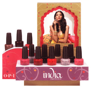
OPI Spring 2008 Collection – India
 OPI, you don’t know this but we’ve been broken up for some time now. The fighting began when you revamped your formula last spring. The inconsistencies in every collection since Australia has been frustrating. I understand the pressure to go Big 3 Free but sacrificing quality in order to satisfy the protesters was a bad call if you ask me. Of course our fight occurred entirely in my head but I’m sure you’ll be happy to know that we’ve called a truce.
Why the change of heart? Well, two reasons really.
1. You finally delivered a navy blue shimmer that actually looks navy. No purple undertones. Not just another blue-black. Yoga-ta Get This Blue, it’s like you knew I needed you.
2. You realized that I was not the only unhappy camper in regards to formula and you found a way to deliver pigmented, streak-free, non-goopy cremes.
The OPI India Collection for Spring 2008 made me remember what it was that caused me to fall for OPI in the first place. How compared to all the drugstore brands of polish I had used, there was a line that applied smooth and even with a beautiful range of colors. My first OPI obsession was the classic; I’m Not Really A Waitress. My latest; Yoga-ta Get This Blue.
With a color range pulled from the fashion and culture of India, this collection is filled with vibrant pinks and reds, rich berries and luxurious metallics. Do I think every shade is utterly unique and rave-worthy? No but let’s get real girls. Us hardcore nail fanatics are a finicky group to please. I say formula improvements are a good step. Giving us the next Rainforest would be a fabulous and giant leap.
So this formula I am raving about, is it really that different? I wouldn’t testify in a court of law but, to me, there really is a noticeable improvement. I can’t find the change in the ingredient list but I’m telling you, something happened. With a couple exceptions, every shade applied like a dream. And disregarding the two sheers, these lacquers are highly pigmented requiring no more than two coats. Each image below was taken without a top coat and only two layers of lacquer.
Black Cherry Chutney – a blackened red with subtle shimmer for depth. In most lighting all you see are a few specs of shimmer and otherwise it’s just another almost black berry. The brush on mine has a few bent strands so that affected application. I hope it was just the brush but I can’t promise anything.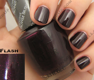 Charmed by a Snake – a lighter bronze, more appropriate for Spring. The champagne shimmer keeps this shade from being too warm and too Fall. Definitely one of my favorites.
 Curry Up Don’t Be Late! – I’m not gonna lie, this will be a hard shade to pull off. Brushed yellow gold is too much for my pale skin but, I would think with a faux tan or darker skin tone this shade could really pop.
  ElePhantastic Pink has been creating a buzz before it even hit shelves. It’s the shade I’ve received the most inquiries about. A bold carnation pink creme, this isn’t for the demure pink wearer.
 Get Me to the Taj on Time – is a safe opalescent semi-sheer. Yes, it applies well but we’ve seen this before.
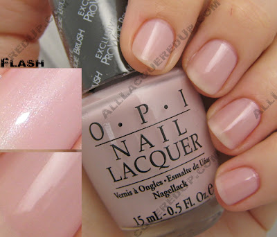 I’m Indi-a Mood for Love – a hot pink creme that leans towards blue, giving it a slight purple undertone.
 Keys to My Karma is your basic maraschino cherry red creme. This one has a lot of pink in its base and needs two coats to achieve the bottle shade. It’s a good staple color but not something you need. Still I’m feeling the urge to pull out my reds again.
 Lunch at the Delhi has been dubbed a “coral” but I’m not seeing it. If anything, I think of it as a dusty, muted red. Yes, it’s warm and orange based but not the pinky peach I typically think of when I hear coral. Sometimes an OPI description is so far off from what I’m seeing, I wonder if I’m colorblind. What shade do you see?
 MonSooner or Later is a tomato red creme. Orange and red combine to create this glossy confection. I can totally see this on toes at the beach.
 Moon Over Mumbai – get on the gray train now before it runs you over, leaving you face first in the dust. Of course the uber-chic nail boarders over at Makeup Alley have been frankening their own grays for months now but if you don’t want to make your own, here’s a nice soft version to ease you into the trend.
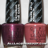
 Royal Rajah Ruby is the other vampy berry shade included in India. A rich wine shimmer, this shade would have made me take notice had it been a bit lighter. It just doesn’t stand out in the crowd. The shimmer adds character but no real charm.
 Yoga-ta Get this Blue! – I saved the best for last. I had to keep you scrolling. From the very second I got my hands on this shade I’ve been talking it up to anyone who would listen. Deeper and richer than Blue My Mind from the 2005 Brights yet lighter than all the 2007 OPI blues, Yoga-ta is everything I’ve been wanting a navy to be. It’s visibly blue in most lighting situations which is something many of the blues that came before it have failed to achieve. In the simplest of terms, it’s perfect.
 The OPI India collection is available in stores and online now and retails for $8.50 ($9.95 CAN). No that’s not a misprint, there was a price increase.
 Now let’s hear from you? What are you loving/hating, buying/passing on?
Comparisons are in the works but before I finish, are there any requests? I already have down Ms. DQ2′s desire for a China Glaze X comp but what else do you want to see? I can’t fulfill all your demands but I’ll do my best to please the majority.
OPI Holiday in Hollywood: Dazzling Darks & Neutrals
 When I think of glitz and glam, my mind immediately drifts to Hollywood, award shows and the red carpet. For Holiday 2007 OPI takes us there with the Holiday in Hollywood Collection. It includes two distinct sets of six polishes: Dazzling Darks & Neutrals and Glamour Reds.
The Dazzling Darks & Neutrals are up first. The Glamour Reds are soon to follow.
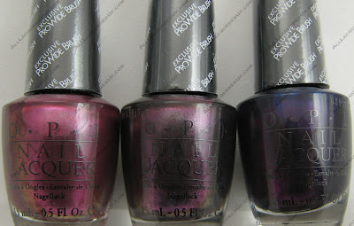 Stars in My Eyes is a semi-sheer sparkly silver. What you see below is two thin coats. I’m sure a third coat would make it completely opaque. As I was applying Stars in My Eyes and the majority of the sparklers in this collection I noticed a great multi-colored shimmer in the lacquer but it doesn’t appear on the nail. Instead this shade has a slightly pinkish cast and amazing depth. It dries semi-matte so if you really want to put on the glitz, add a super shiny top coat.
 Hollywood Blonde is my surprise of the collection. I totally didn’t expect to like, let alone love, this shade. From the few pics I’d seen of it online, it looked like a blah nude. Wow was I wrong. A glistening nudish pink semi-sheer, this is my kind pale. The gold shimmer gives it depth and a fairy dust quality. I would totally rock this on my tips or toes for a holiday party. I love when a polish blows my expectations out of the water.
 I’d Like To Thank… is described by OPI as a “copper shimmer.” I don’t know what Suzi has been smoking but I see no copper here. I’d Like To Thank is a duo-chrome; a shade that changes from one shade to another depending on the lighting. This one changes from a mid-tone peachy pink a deep golden rose thanks to the magical gold metallic shimmer. This is a shade I’d say is more suited to warm skin tones. The only real downside of this color is that the metallic quality made my brush strokes more apparent.
 My Big Break has the same consistency and duo chrome effect as I’d Like To Thank. And the same visible brush stroke issue but it’s not nearly as visible. There is a small amount of green shimmer in the formula that shows up on the nail at certain angles. Overall it’s a lovely berry rose shade that leans towards a deep lilac depending on the light.
 Have You Seen My Limo? gets the prize for most unique. Yet another duo-chrome, the deep grape base has silver and green shimmer that allows the shade to transform from reddish purple to a dark silvery plum. I really hope OPI adds this to their permanent Classic Collection.
 Who Are You Wearing? is a tough color to accurately capture. I must have shot 40+ images of it and I still had to add swatch shots from other images to give you an idea of how truly cool this polish is. When I first saw online swatches of it I thought it was just another blue, like OPI Ink or Russian Navy but, oh no it’s so much more! The final duo-chrome in this collection, Who Are You Wearing? has a red shimmer that only appears in warm indoor lighting. Otherwise it’s a battle between the blue shimmer and the purple base as to which color you’ll see. The purple being the hardest to capture digitally. This is a shade you MUST see for yourself.
 The Holiday In Hollywood collection is available now at professional salons, including Ulta, Trade Secret, Regis, Pure Beauty, JCPenney, Dillard’s, Beauty First, and Beauty Brands.
Now it’s time for you to weigh in. Which shades have you drooling? Which ones have you bought? What’s on your wish list? What didn’t work for you? Any lemmings killed?
Ding, Ding, Ding… We Have A Winner!!!
 I want to thank everyone who entered All Lacquered Up’s Guess Me game. I received a lot of great guesses but none of them were correct. Though a lot of you thought it was OPI Bogota Blackberry or Changing of the Garnet and I don’t own either of those shades.

Drumroll please… It’s Misa Wine Burgandy.
Helen Mirren
 My pal, DramaQueenie2, brought this fantastic picture of Helen Mirren to my attention. Commenting that, “the black nail polish trend isn’t just for young starlets.” It’s actually freaky that I was thinking something similar as I watched the great Dame on the red carpet at the SAG Awards last night.
From what I’ve seen, women of a certain age tend to keep their nails very neutral. Sheers, pales or clean and buffed. It’s a tasteful look but I don’t think you should have to give up color as you age. I certainly don’t plan to. I understand giving up glittery makeup, bright in-your-face eyeshadow, mini skirts and belly baring tops at some point but, ladies, you can still have some fun with your look. You don’t have to go from 20 to grandma in one fell swoop. I’m not talking crazy blues and greens like your’s truly, just a nice red creme, a shimmery pink, a gorgeous espresso.
It’s refreshing to see someone like Helen Mirren, with her red lips and vampy nails. I can only hope to look that stunning at her age. She is elegant, regal and beautiful. Here are a few of my favorite nail moments from Ms. Mirren. Isn’t she radiant? I’d love to know her beauty secrets. If anyone has read an article about her skincare regime, please share with the group.


The Worst Nails of the Golden Globes
I can’t just kiss celeb butt, I need to address what I thought were polish mistakes as well. This is the stuff you’ll never hear Joan Rivers talk about. She can hardly remember the star’s names, let alone what’s on their nails.

Access Hollywood’s Maria Menounos. I don’t know what she was thinking when she agreed to wear this hideous white polish. I know that white and pale colors are “in” for spring but it’s just not working for me.
Ellen Pompeo of Grey’s Anatomy. I thought she looked stunning. Her dress was unique and it kept her from looking like a bean pole but the nail color choice was completely wrong. That dirty nude shade made her hands look like they belonged on a corpse. Naked tips would have been better than that monstrosity.

The ladies of Grey’s Anatomy need some serious polish intervention. I think Katherine Heigel is one of the most beautiful women on television and at the 2006 Emmy’s she was a goddess on the red carpet. But, the combo of dark eyes, dark dress and dark nails was just too much for me.
She should have been the fashion forward gal sporting white polish.
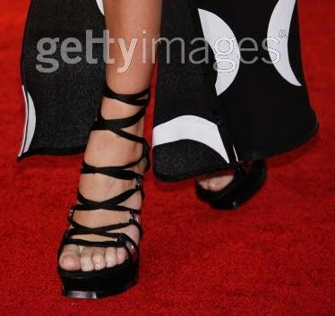
As much of a fashion plate as Chloe Sevigny of Big Love is, I expected more from her than naked toes in clodhoppers.
Chloe find Reese and become friends. Share pedi secrets and report back with some color on your toes.


